

Firefox is currently undergoing a system overhaul, with creator Mozilla looking to create new, cohesive branding for its browser and other related ventures. In an attempt to avoid the same backlash it received for its impromptu Moz://a stylisation, the firm wants to know what users think based on pre-established criteria.
Mozilla wants its Firefox branding to stand for much more than just the browser, encompassing an entire family of applications and services “from easy screenshotting and file sharing to innovative ways to access the internet using voice and virtual reality.” The fast fox icon with a flaming tail struggles to do this, according to Mozilla, with a lack of “design tools to represent this entire product family. Recolouring that logo or dissecting the fox could only take us so far. We needed to start from a new place.”
A team of brand designers and Mozilla’s product division has come up with two options, starting with the masterbrand icon, followed by a line of singularly-focused browser icons, then a line of icons for applications within the browser such as Firefox Focus and Firefox Reality and finally five icons for new services at the bottom.
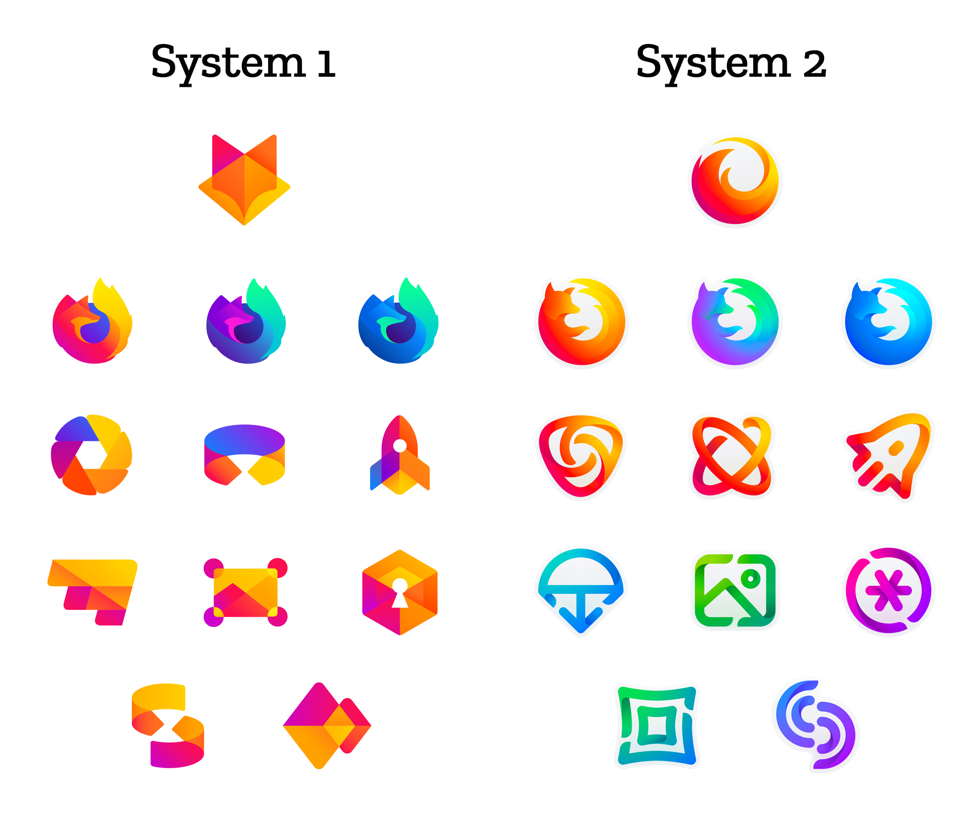
“Extreme caveat: Although the products and projects are real, these design systems are still a work of fiction,” stresses Mozilla. “Icons are not final. Each individual icon will undergo several rounds of refinement, or may change entirely, between now and their respective product launches. Our focus at this point is on the system.”
While the firm is still looking into various design elements, such as typography, graphic patterns and animation, it plans to introduce a final candidate “over the next few months.” Currently, it’s in the user feedback stage, where Mozilla wants to know what you think based on a number of questions:
- Do these two systems still feel like Firefox?
- How visually cohesive is each of them? Does each hold together?
- Can the design logic of these systems stretch to embrace new products in the future?
- Do these systems reinforce the speed, safety, reliability, wit, and innovation that Firefox stands for?
- Do these systems suggest our position as a tech company that puts people over profit?
Given that this is the second rebrand for Mozilla in recent years, it could be called into question just how much this is needed, particularly after the last attempt netted the company some criticism. That being said, image is important and I’m no marketing expert.
KitGuru Says: Personally, I’m quite the fan of the first set of designs. It’s less familiar than the second but revitalises the brand while each logo conveys the same ‘stained glass’ feel as the masterbrand. The second feels a little cleaner on the logo designs, but less relevant to the masterbrand and the variety of colours seems to detract from the cohesiveness for me. What do you think about the two design choices?