

When Street Fighter 6 was revealed, many fans were taken back by the game’s new logo. Designed unlike any other Street Fighter game logo, SF6 looks to be taking the franchise in a new direction. That being said, the new logo may also simply be a placeholder, as a stock Adobe logo looks eerily similar to the announced title.
Street Fighter logos have historically been designed in a way that simulates the rapid and forceful motion of fighting, combined with warm and aggressive tones of red, orange and yellow. The new logo has none of this, instead replaced with an angular and spray painted aesthetic. As the teaser trailer for SF6 showed very little, the logo actually offers the greatest insight into how the identity of the franchise is changing with the upcoming sequel.
Then again, perhaps it is not worth analysing the logo, as Ars Technica’s Aurich Lawson discovered that SF6’s logo looks nearly identical to an $80 stock asset on Adobe’s website. While there are SOME differences between the two logos, the resemblance is uncanny.
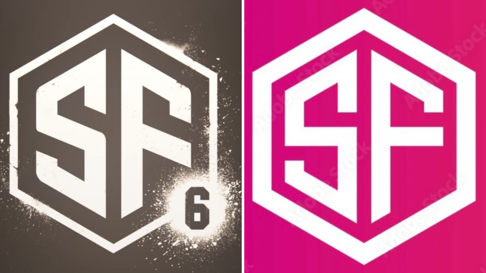
This could mean one of two things: either the logo is simply a placeholder, or Capcom has decided to use an $80 stock asset for the logo of one of the biggest fighting games in the world. Hopefully it’s the former.
Fortunately, we won’t have too long to wait to find out whether Street Fighter 6 will eventually be treated to a new – more permanent – logo, as more information on the game is scheduled for this Summer.
Discuss on our Facebook page HERE.
KitGuru says: What do you think of the logo? Do you think the design is final? Would you like to see Capcom change it? Let us know down below.