

Maker of network attached storage devices and their accompanying software, Synology, has launched the latest version of its DiskStation Manager software, V5.0 and it hopes that with its release, it will create a whole new method of NAS interaction, through more streamlined interfaces and added features.
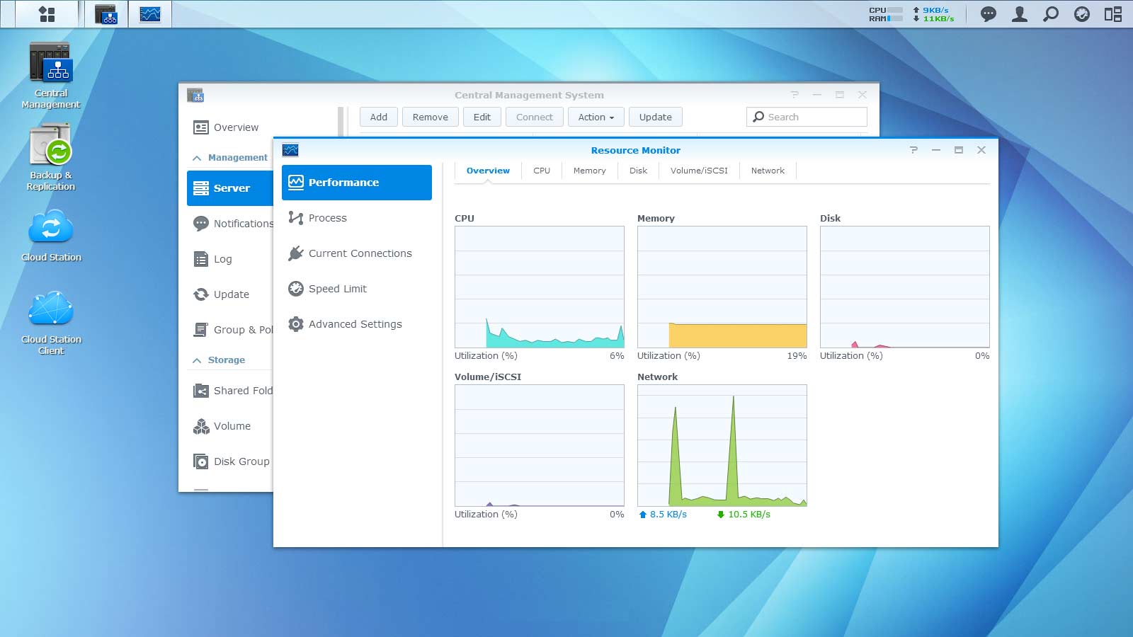
The most obvious change up for those that update, is the revamped user experience. Support for ultra-high definition and retina displays has been added, as well as an entire overhaul of the UI to make it more untuitive. On top of that though, Synology has also implemented a “quick connect service,” which is designed in conjunction with Synology's mobile apps, to make it possible to check out your storage from wherever you are, with no waiting time.
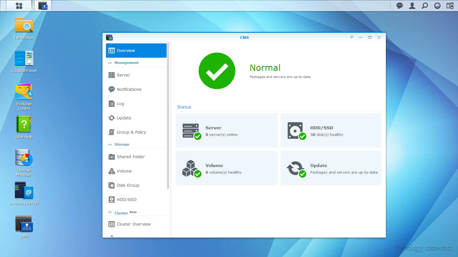
If you've found yourself maxing your NAS storage capabilities in the past, Synology wants to maintain you as a customer, so it's scaled up the software to support as much as a petabyte of storage, all of it accessible and manageable through a single interface. You can even link it up with the cloud for further storage or redundancy, twinning your network storage with Dropbox, Google Drive and other solutions.
SSD read/write cache support has been added too for those oft-accessed files and memory compression should improve the overall experience for those using solid state technology to speed up regular data access.
For more information or to download DSM 5.0, have a look here.
KitGuru Says: Any of you guys make use of Synology NAS drives? I've tested a few of them over the years and found them to be pretty good, though I've never used one for my personal storage solutions.

Revamped user experience? Yes. Better experience? Not a chance. This is a HUGE step backwards in terms of usability and aesthetics. Everything is slightly harder to find now, instead of streamlining they’ve buried settings in a scrolling list that you have to click through to find what you want. Cartoonish, garish, unsophisticated design that fatigues the eyes. The flat design fad claims yet another victim. It’s hard to take synology seriously with this update.
I like this new user interface quite well, myself. I don’t know what Brent is referring to when he says you have to scroll through a list and things are hard to find. You still have the search box at the top, and the interface really hasn’t changed dramatically. I have always been able to search for things I’m looking for, and still can. The flat style doesn’t bother me, but clearly it bothers some people (“cartoonish”, “garish”, “unsophisticated design”, etc).
I would suggest reading the research that Microsoft has done regarding interface “chrome” before taking such a stance. There is a lot to be said for simplicity.
The new interface works, and my system actually seems to run faster and need less caching.
John seems to be yet another flat design hipster/Microsoft apologists. Flat design is a fad. A fad which made advanced/power users really uncomfortable and made average/basic users non wiser. A fad which turned many OS’s into Fisher Price toys. Android seems to be the only OS which managed to make the flat not so sucky, same can’t be said about iOS 7 (I still throw up a little bit in my mouth while using my iPad). Windows 8 is another disaster which, if it wasn’t for hackable desktop, might have been even worse disaster than Windows ME. Just as a side note, both Office ribbonification and Windows flatification were introduced by the same person. Just stating facts.
Anyone claiming that everything can be found through search… Well of course. It doesn’t feel natural but it can be done. I wouldn’t like to drive a car which would require using search to execute basic functions. And by the looks of things we are heading in that direction.
Well, “not flag John”, you seem to really hate Microsoft.
Sorry, I am not a “hipster.” I am a 44-year old country boy from rural West Virginia that ventured into software development when I was 14 and stayed there after getting two degrees in it. I am the IT Manager for a major organization, and I direct software development for our organization.
The lack of chrome in a user interface was innovative, and will stick around long-term. It was ingenious to remove it, after so many of us developers spent decades trying to “fancy it up.”
I don’t believe I, or Brent, said ‘Search’ was the only way to find things. In Windows 8+, you can simply look at the Start Menu and pick your item (much like you always could) or you can search for it. It’s really not hard. It is different than what people are used to, and some people adjust to change better than others.