

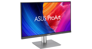
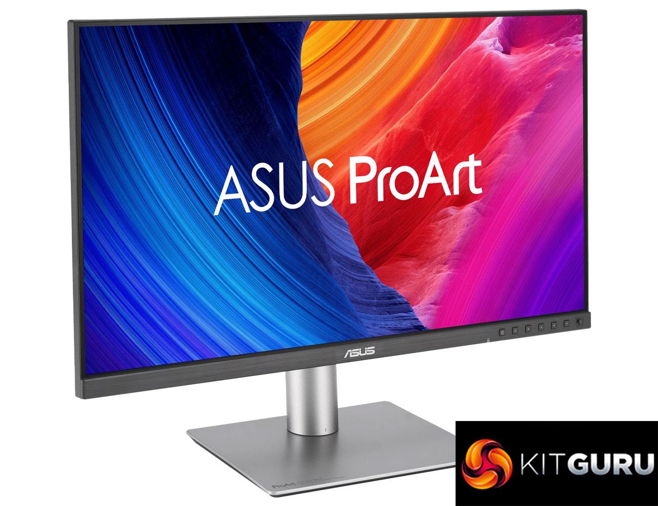
While we mainly focus on consumer and gaming-related products from ASUS, the company also has a burgeoning professional range. Today we assess the latest monitor to join the ProArt series, in the form of the PA27JCV. This is a 27in IPS screen offering a pin-sharp 5K resolution, wide gamut support and Calman Verified colour accuracy, alongside an anti-glare coating that ASUS calls ‘LuxPixel AGLR'. Hitting the market at $799, with UK pricing still to be confirmed, we put this screen through its paces today.
Specification:
- Panel Size (inch) : 27
- Pixels Per Inch (PPI) : 218
- Aspect Ratio : 16:9
- Display Viewing Area (H x V) : 596.74 x 335.66 mm
- Display Surface : AGLR (Anti-Glare, Low-Reflection)
- Backlight Type : LED
- Panel Type : IPS
- Viewing Angle (CR≧10, H/V) : 178°/ 178°
- Pixel Pitch : 0.116mm
- Resolution : 5120×2880
- Color Space (sRGB) : 100%
- Color Space (Adobe RGB) : 95%
- Color Space (DCI-P3) : 99%
- Brightness (HDR, Peak) : 500 cd/㎡
- Brightness (Typ.) : 400cd/㎡
- Contrast Ratio (Max) : 3000:1
- Contrast Ratio (Typ.) : 1500:1
- Display Colors : 1073.7M (10 bit)
- Response Time : 5ms(GTG)
- Refresh Rate (Max) : 60Hz
- HDR (High Dynamic Range) Support : HDR10
- Flicker-free : Yes
- LCD ZBD Warranty : Yes(3 yr)
- Trace Free Technology : Yes
- Color Temp. Selection : Yes(5 modes)
- Gamma Adjustment : Yes (Support Gamma 1.8/2.0/2.2/2.4/2.6 )
- Color Accuracy : △E< 2
- ProArt Palette : Yes
- QuickFit Plus : Yes
- PIP / PBP Technology : Yes
- HDCP : Yes, 2.2
- VRR Technology : Yes (Adaptive-Sync)
- ProArt Chroma Tune : Yes
- DisplayWidget : Yes, DisplayWidget Center
- Low Blue Light : Yes
- KVM Switch : Yes
- Audio Feature
- Speaker : Yes(2Wx2)
- I/O Ports
- USB-C x 1 (DP Alt Mode)
- DisplayPort 1.4 x 1
- HDMI(v2.1) x 1
- USB Hub : 3x USB 3.2 Gen 2 Type-A + 1x USB 3.2 Gen 2 Type-C
- Earphone Jack : Yes
- USB-C Power Delivery : 96W
- Signal Frequency
- Digital Signal Frequency : 15~135 KHz (H) / 48~60 Hz (V)
- Mechanical Design
- Tilt : Yes (+23° ~ -5°)
- Swivel : Yes (+30° ~ -30°)
- Pivot : Yes (+90° ~ -90°)
- Height Adjustment : 0~130mm
- Ambient Light Sensor : Yes
- VESA Wall Mounting : 100x100mm
- Kensington Lock : Yes
- Accessories (vary by regions)
- Color pre-calibration report
- HDMI Ultra High Speed Cable
- Microfiber cloth
- Power cord
- Quick start guide
- USB-C cable
- Warranty Card
- Welcome Card
- Certificates
- Energy Star
- EPEAT Gold
- TÜV Flicker-free
- TÜV Low Blue Light
- VESA DisplayHDR 500
- VESA MediaSync Display
- Calman Verified
- FSC MIX
Firmware tested: MCM101
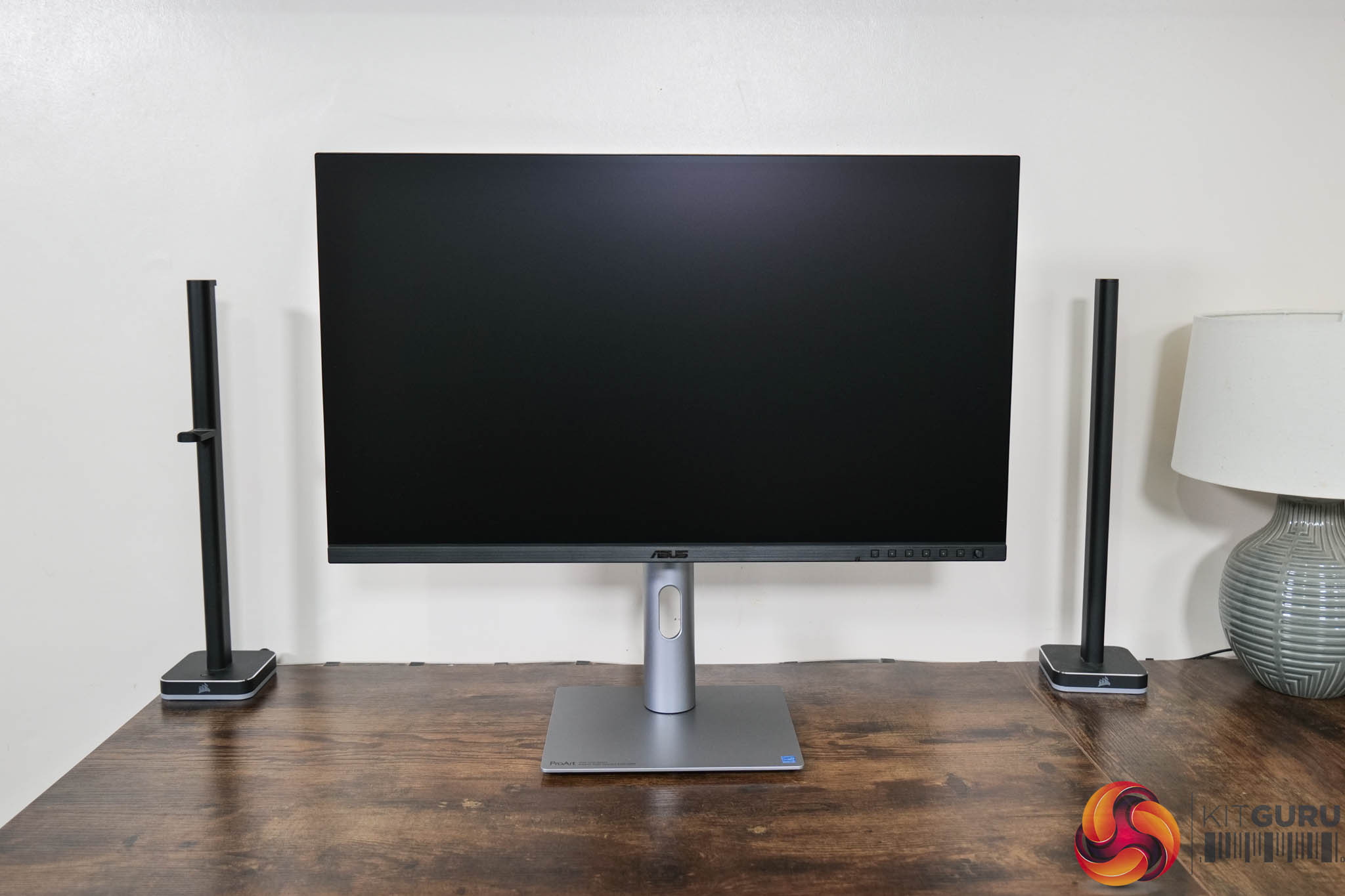
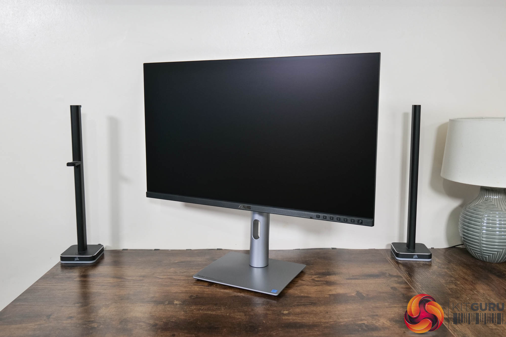
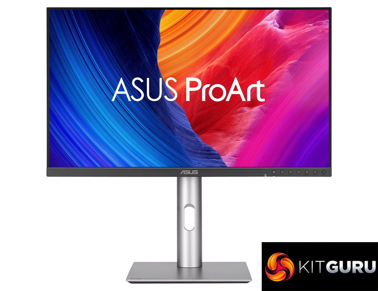
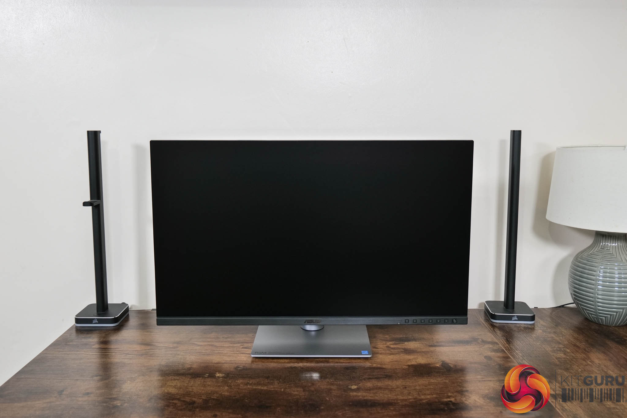
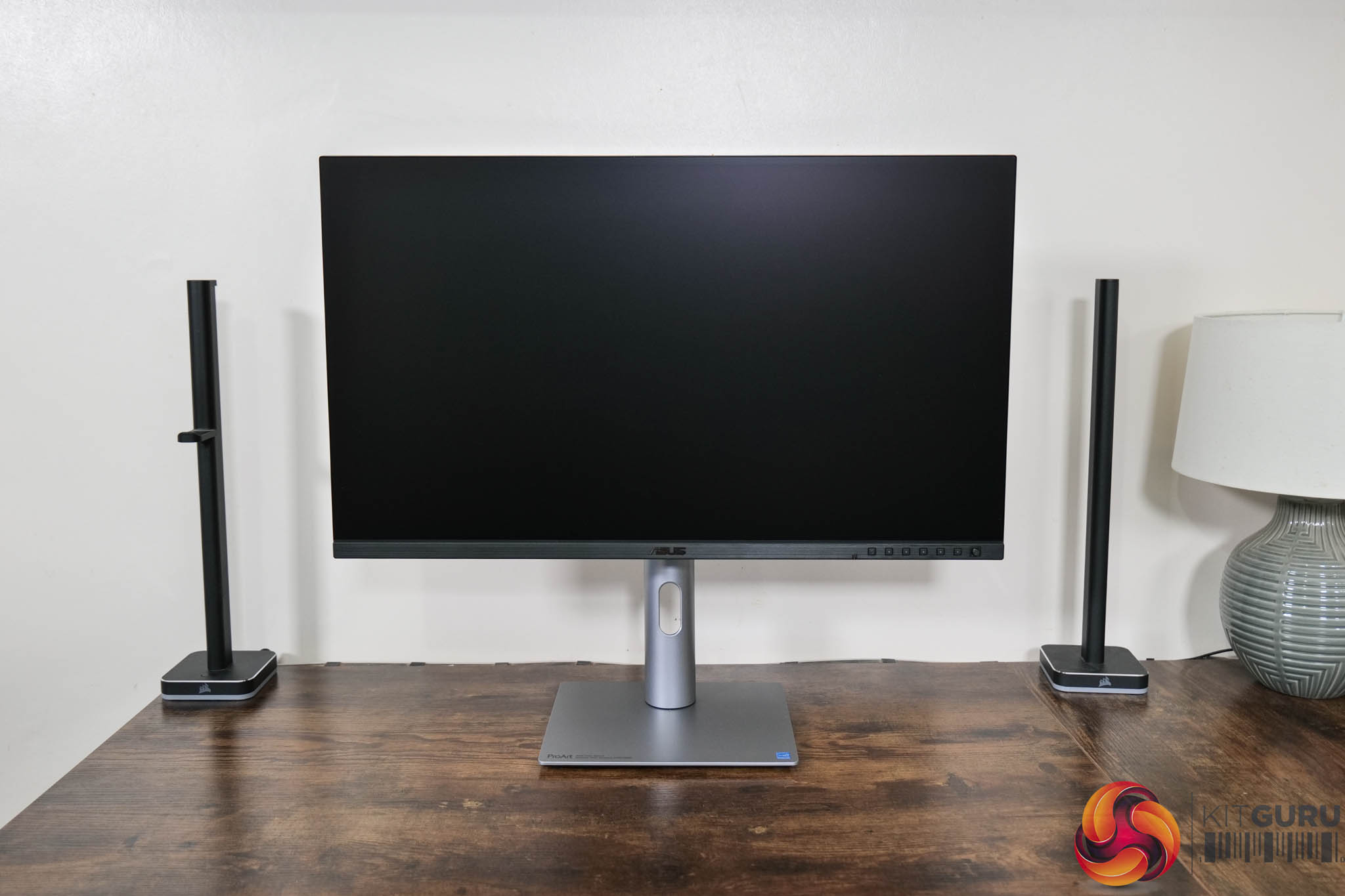
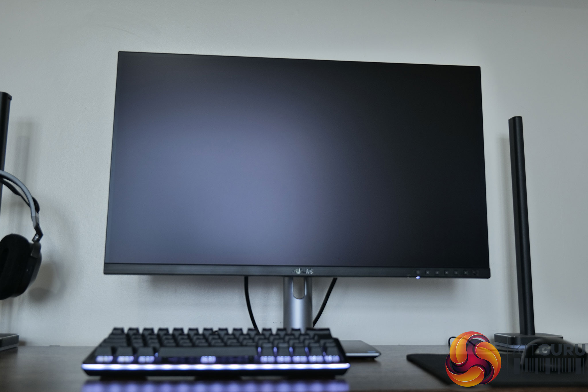
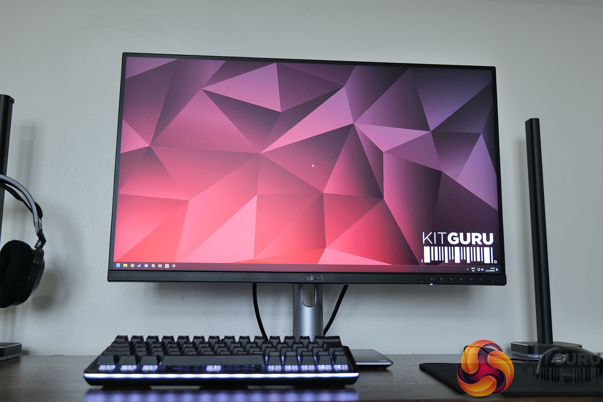
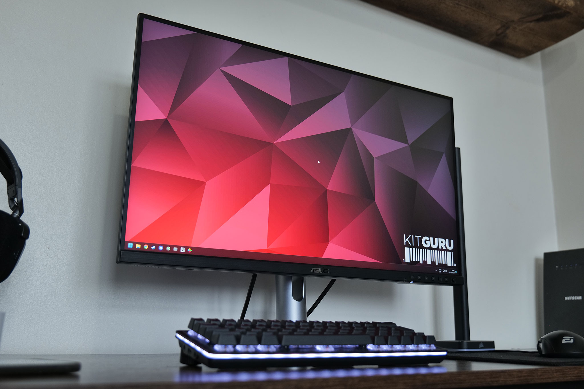
Kicking things off with a look at the design of the monitor, it's a very clean overall aesthetic. The front features a 3-side frameless design, along with a bottom chin which measures approximately 16mm thick. The chin, while made of plastic, has a brushed-effect finish which adds to the modern styling.
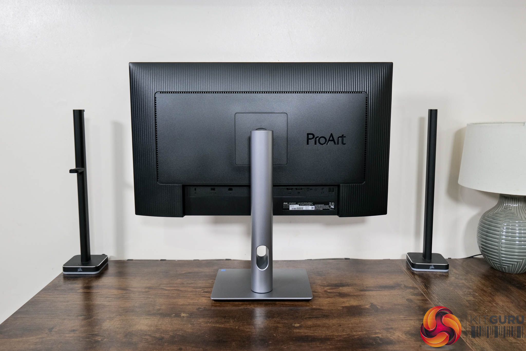
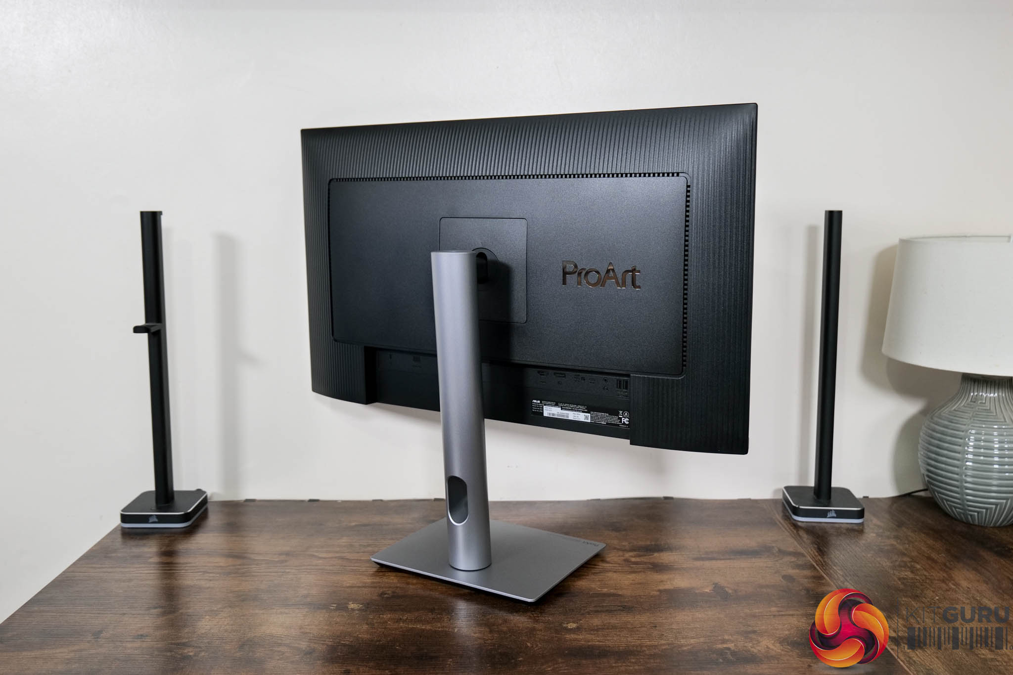
Round the back, the rear is mostly matte black plastic, but with some textured design elements which add visual interest. The ProArt logo is also positioned to the right of the stand. ASUS has also opted for a compact rectangular foot, and this measures approximately 22.7cm across and 18.9cm deep, so it doesn't take up much room at all.
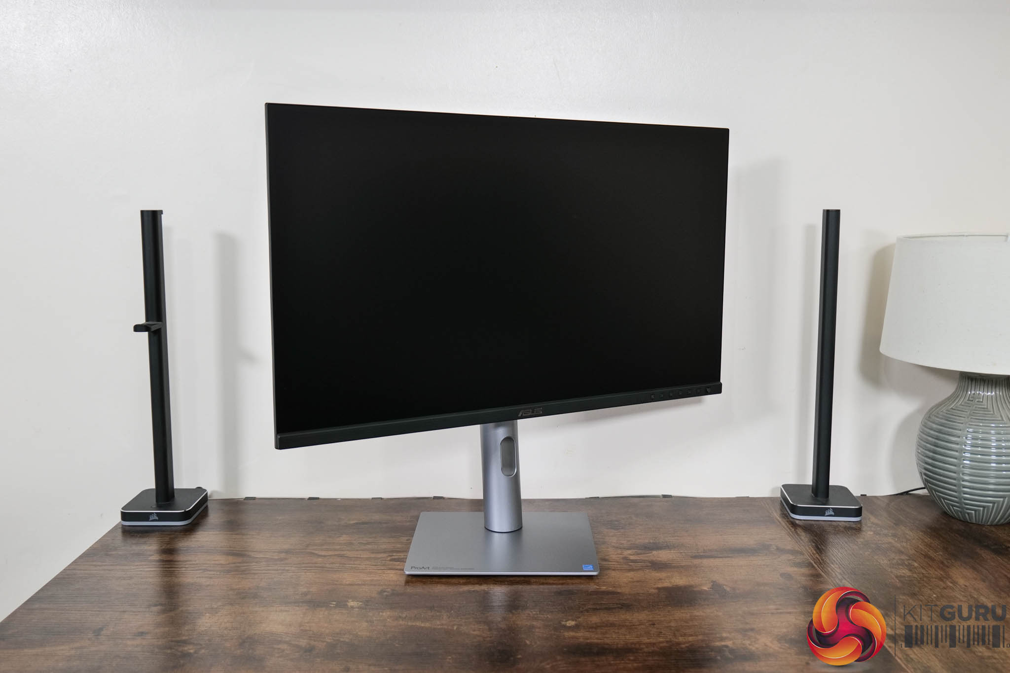
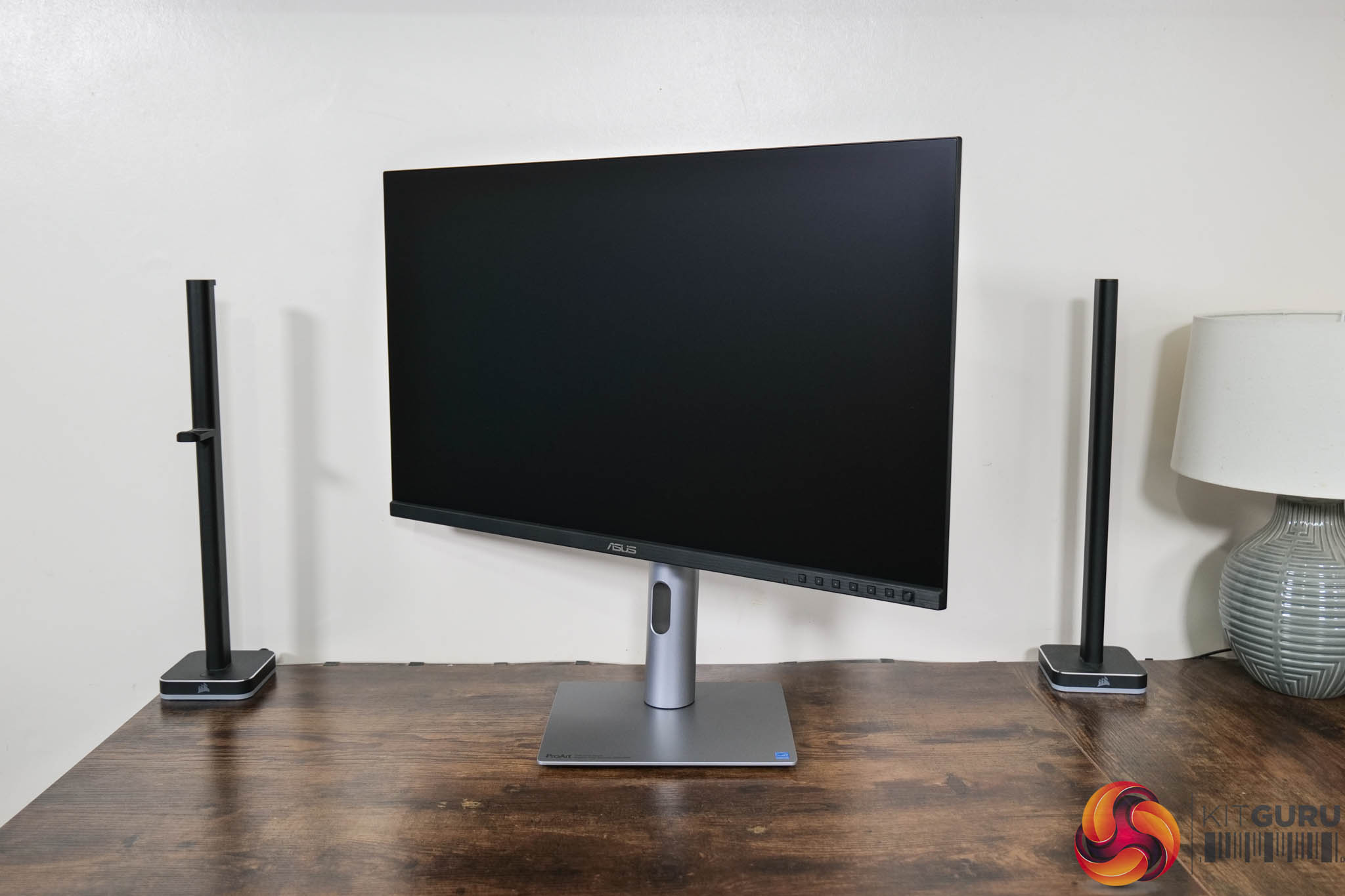
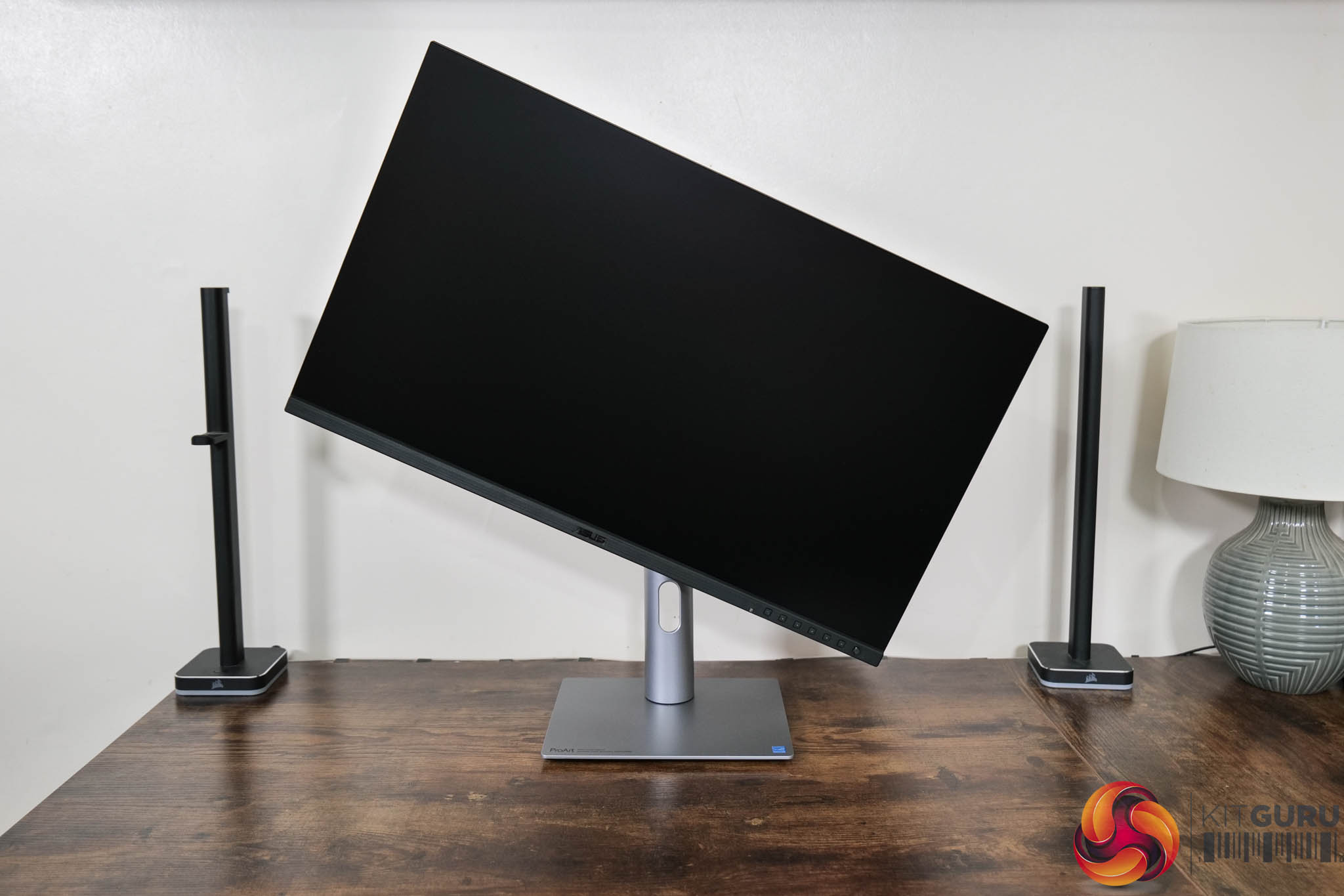
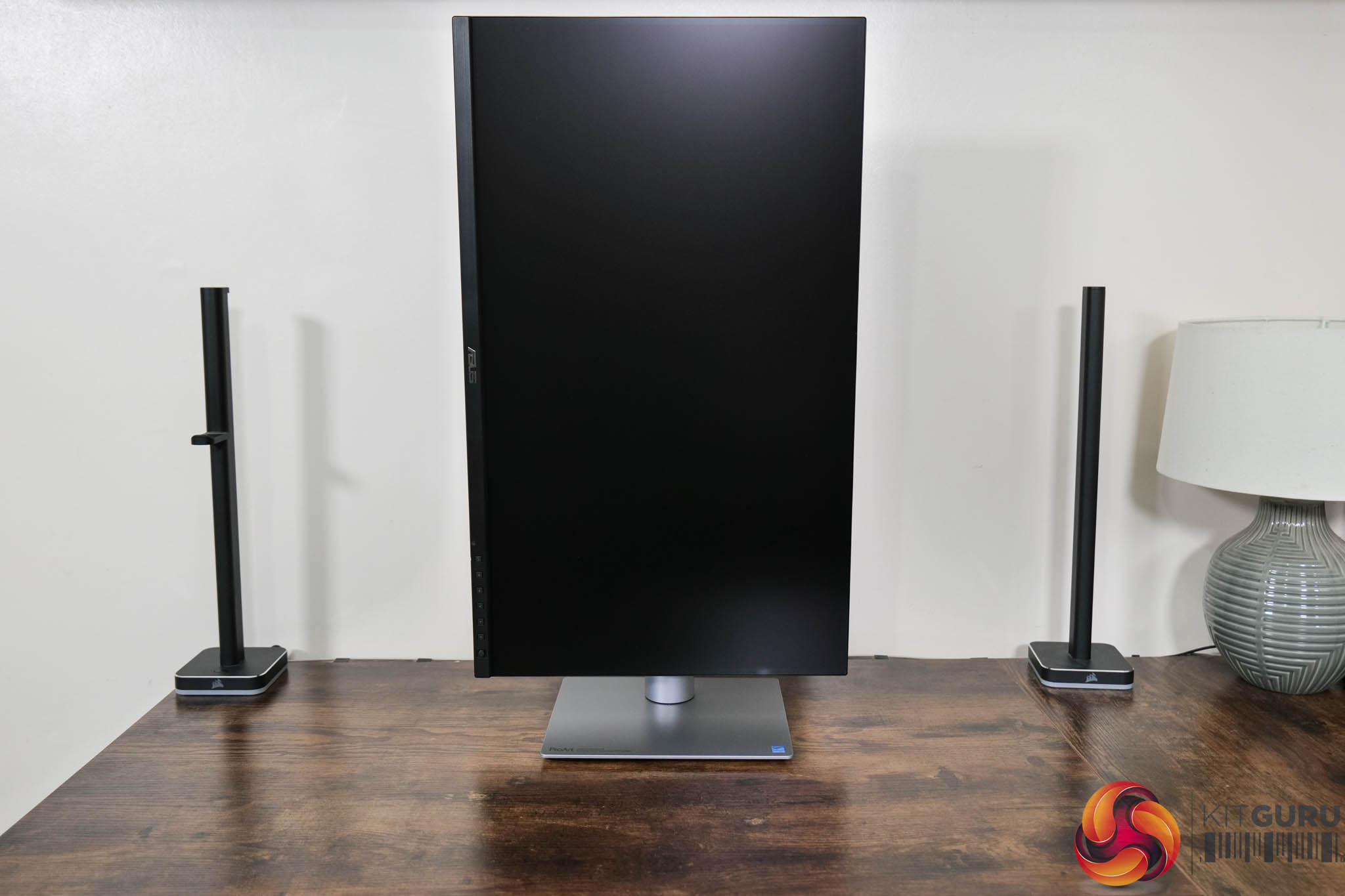
Speaking of the stand, this offers a full array of ergonomic adjustments. This includes up to 130mm of height adjustment, 30 degrees of swivel both left and right, tilt from -5 to +23 degrees, and 90 degree pivot. VESA 100×100 mounts are also supported if you have an existing desk mount or monitor arm.
That may come in handy as while I do like the look of the PA27JCV, I do find the build quality to be a bit lacklustre considering the price. It just feels very plasticky to me – the silver stand and foot may look like metal from a distance, but it becomes apparent as soon as you assemble the thing that it is plastic, and not a particularly high-quality feeling material either.
I appreciate that most of the R&D for a monitor like this goes into the panel itself, but I really think a metal stand should be included at this price point. It's $800 after all, and I've tested plenty of gaming screens that are half the cost – if not more! – yet still come with metal stands, so that definitely a disappointment.
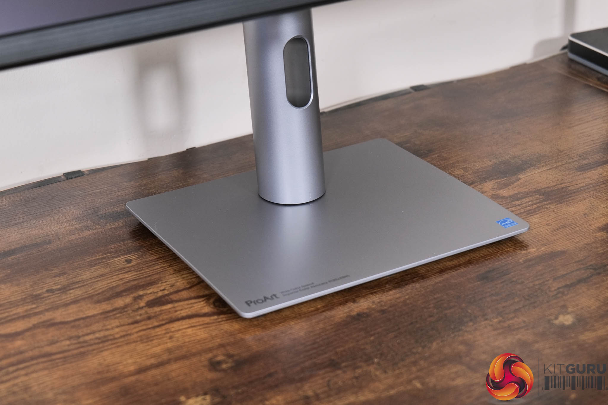
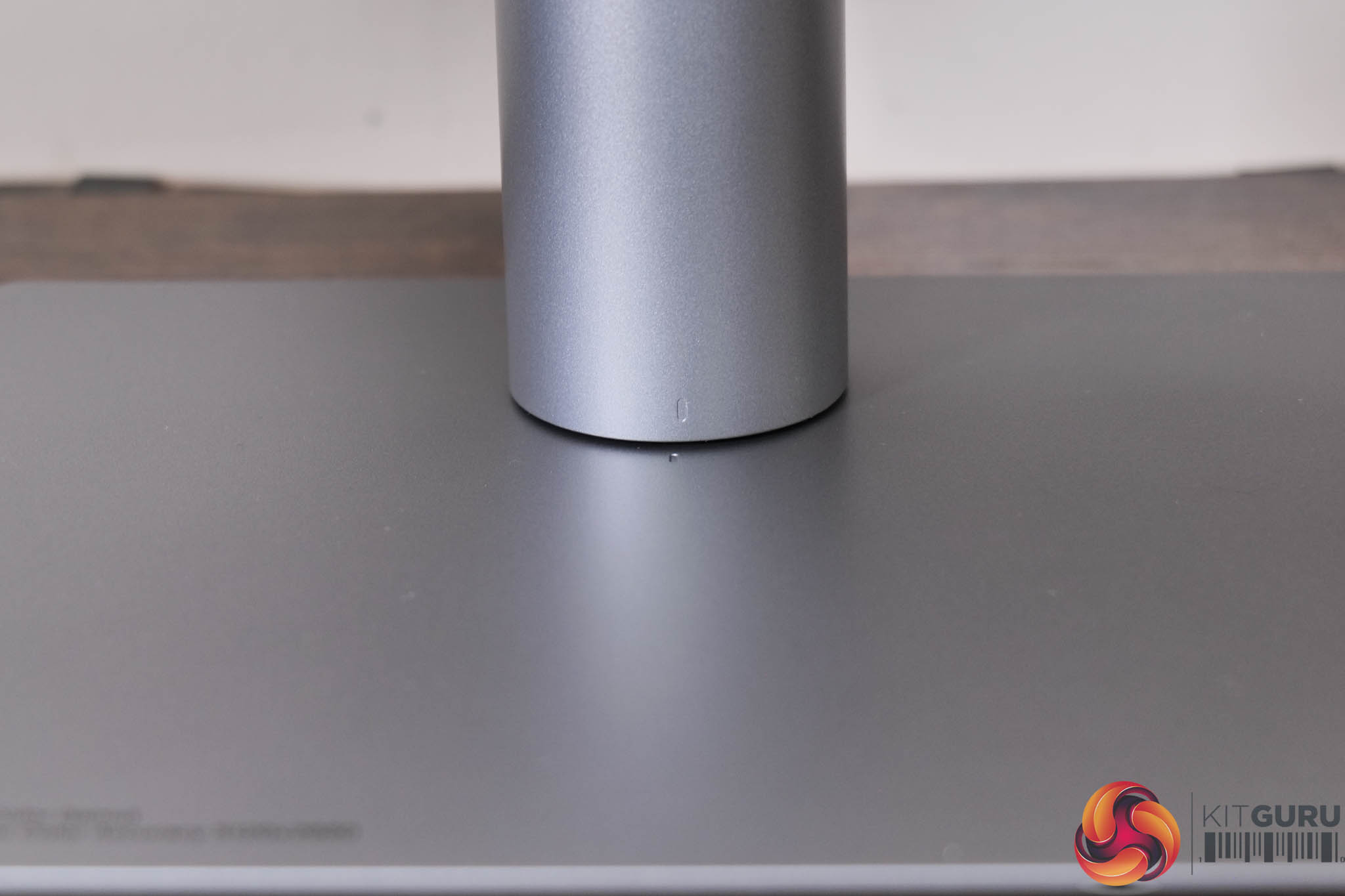
I do, however, like that there is a built-in alignment feature on the stand and foot, so you can see if the base and stand are perfectly lined up!
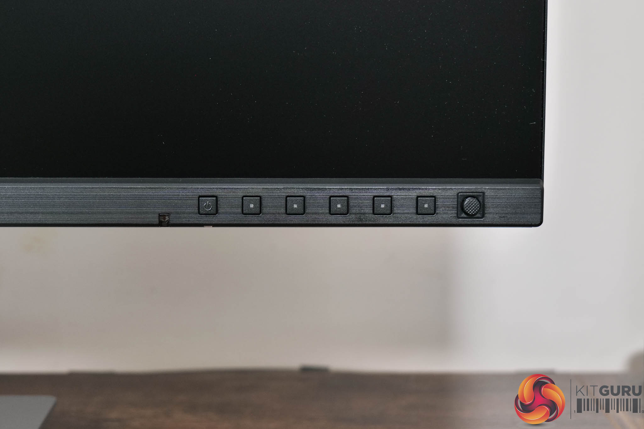
Back to the front of the screen, here we find a total of six buttons used to power on the monitor and control the OSD. There is also a small front-facing joystick to the right of those buttons, something I was very relieved to see as this makes navigating the OSD so much easier.
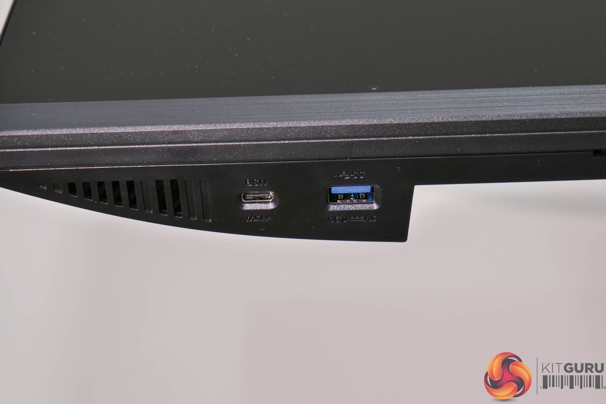
On the underside of the chin, on the left hand side of the screen, we also find both a USB-C and a Type-A port positioned for easy access.
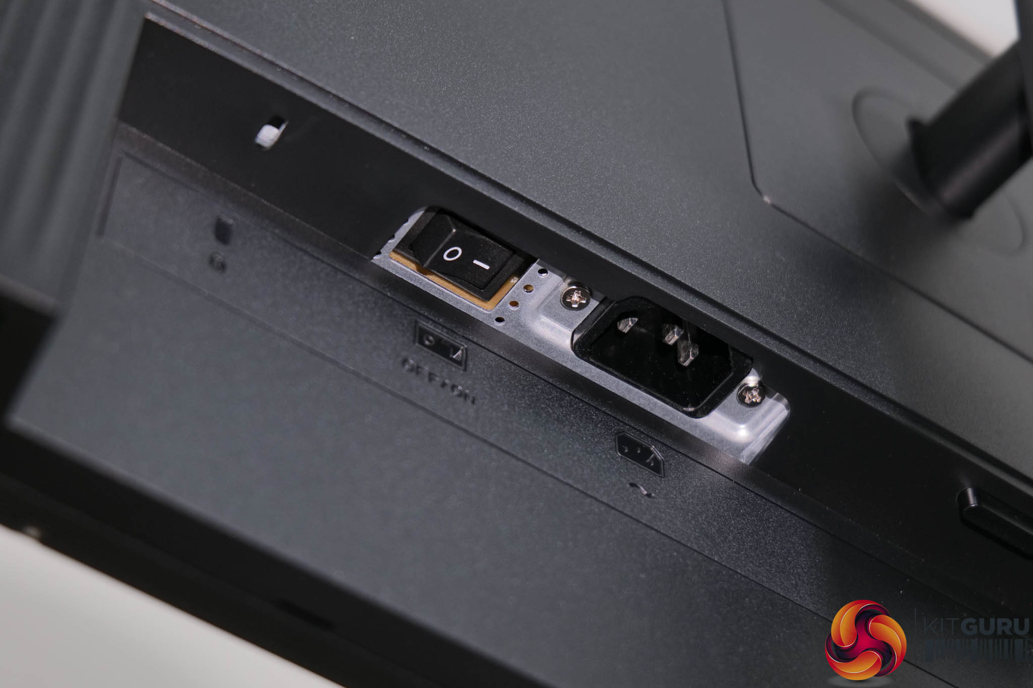
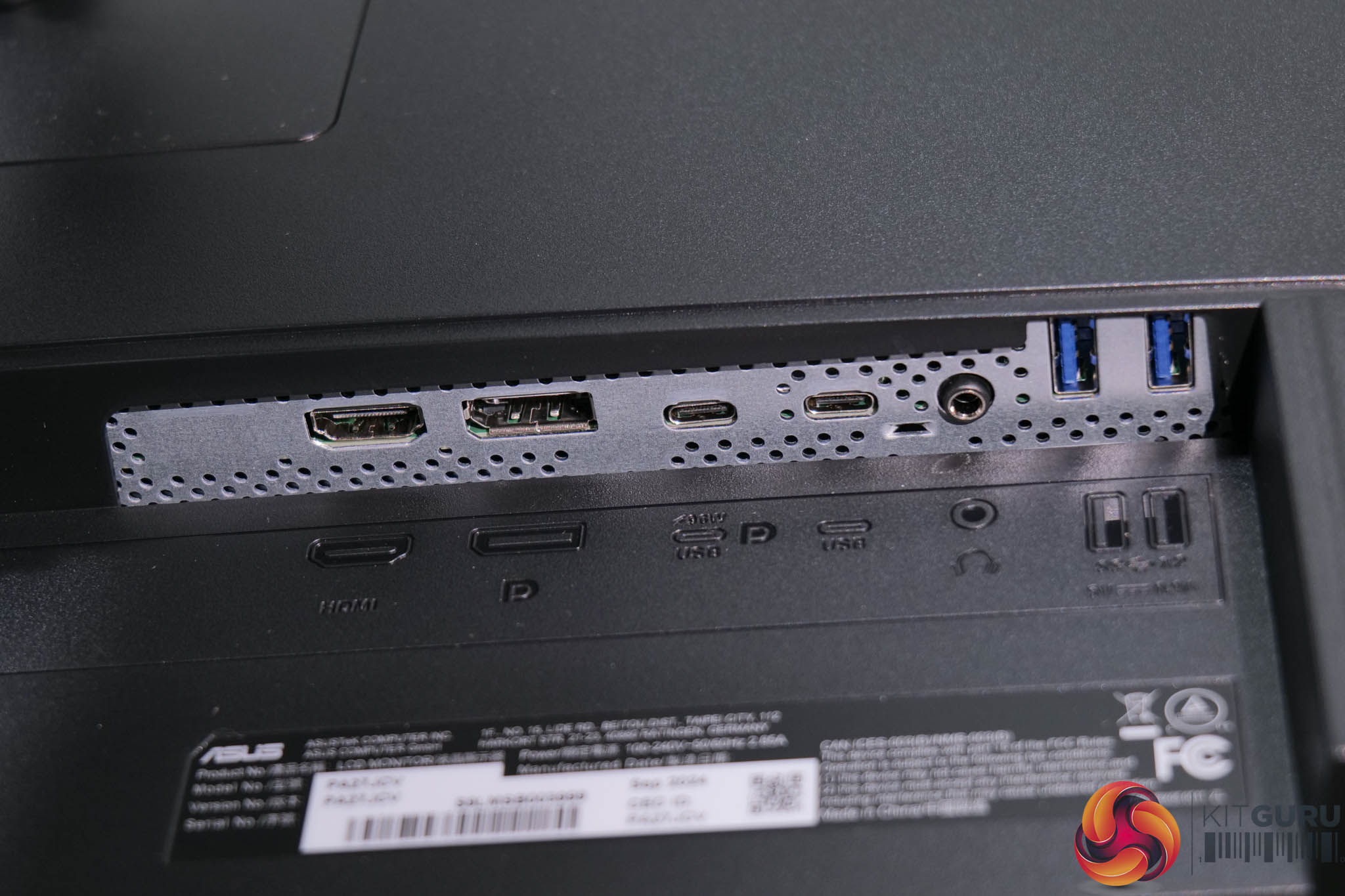
The bulk of the I/O is at the back of the monitor though. The left-hand side features the power input, power switch and a Kensington lock. Over on the right-hand side, ASUS includes 1x HDMI 2.1 and 1x DisplayPort 1.4 inputs (both of which can handle 5K/60Hz), alongside two USB-C ports. The left-hand one supports DP Alt mode and 96W power delivery, while the other only supports data upstream. Then there's an audio jack, and two USB 3.1 Gen1 Type-A downstreams.
The ProArt PA27JCV OSD is split into eight main tabs, which we will break down below.
Shortcut options
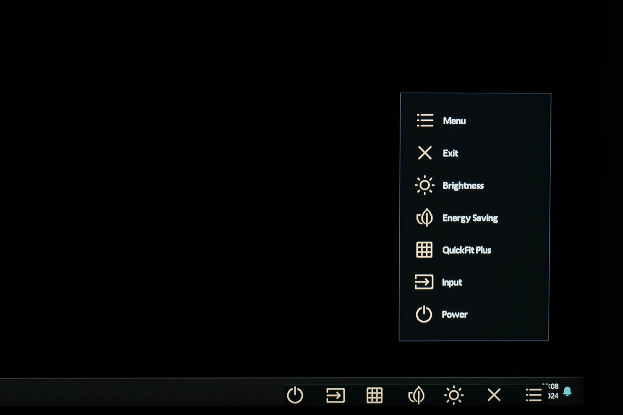
Before you get into the main settings menu, an initial pop-up menu appears, giving quick access to the above settings via the buttons on the chin. Two of these shortcuts can be customised, as we show at the bottom of this page.
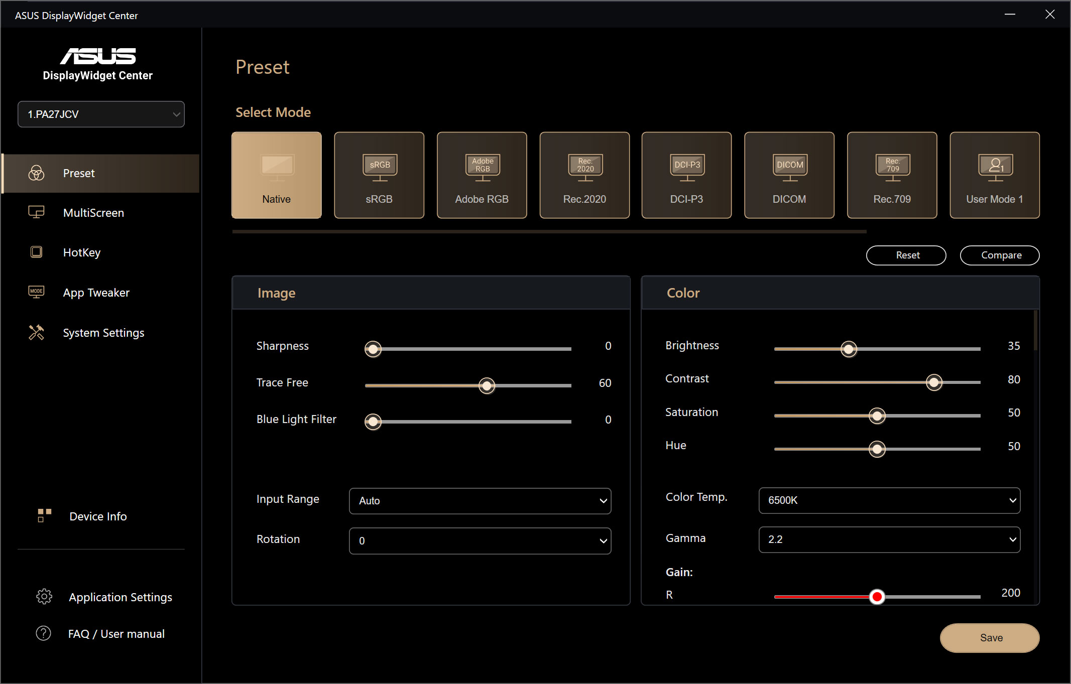
Preset settings
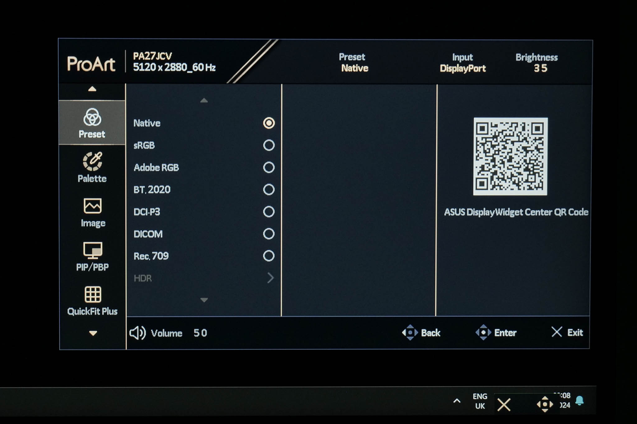
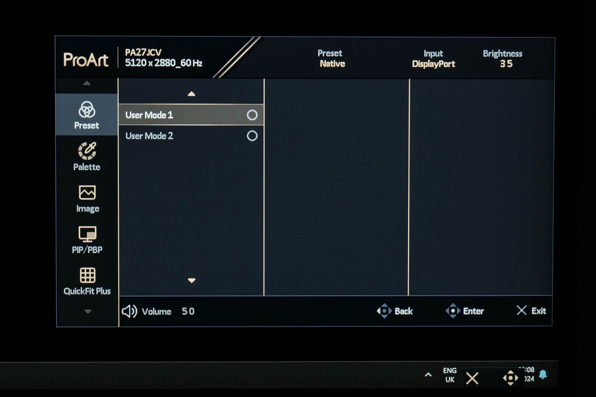
Clicking in the joystick brings up the main menu, with the first tab being the Preset settings, where you can choose between various colour space modes.
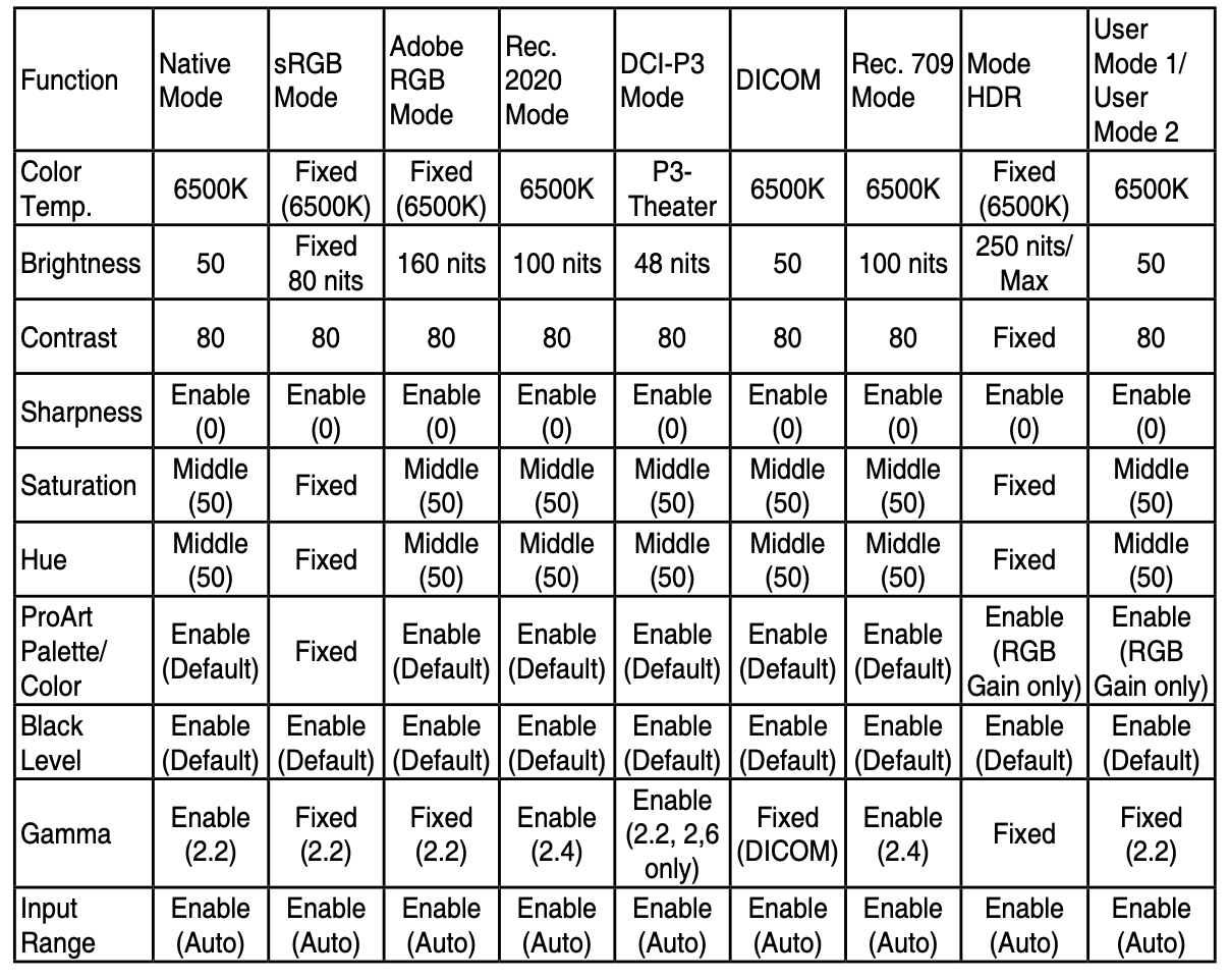
Above is a screenshot from the PA27JCV manual which outlines the exact settings used for each of the colour space modes.
Palette
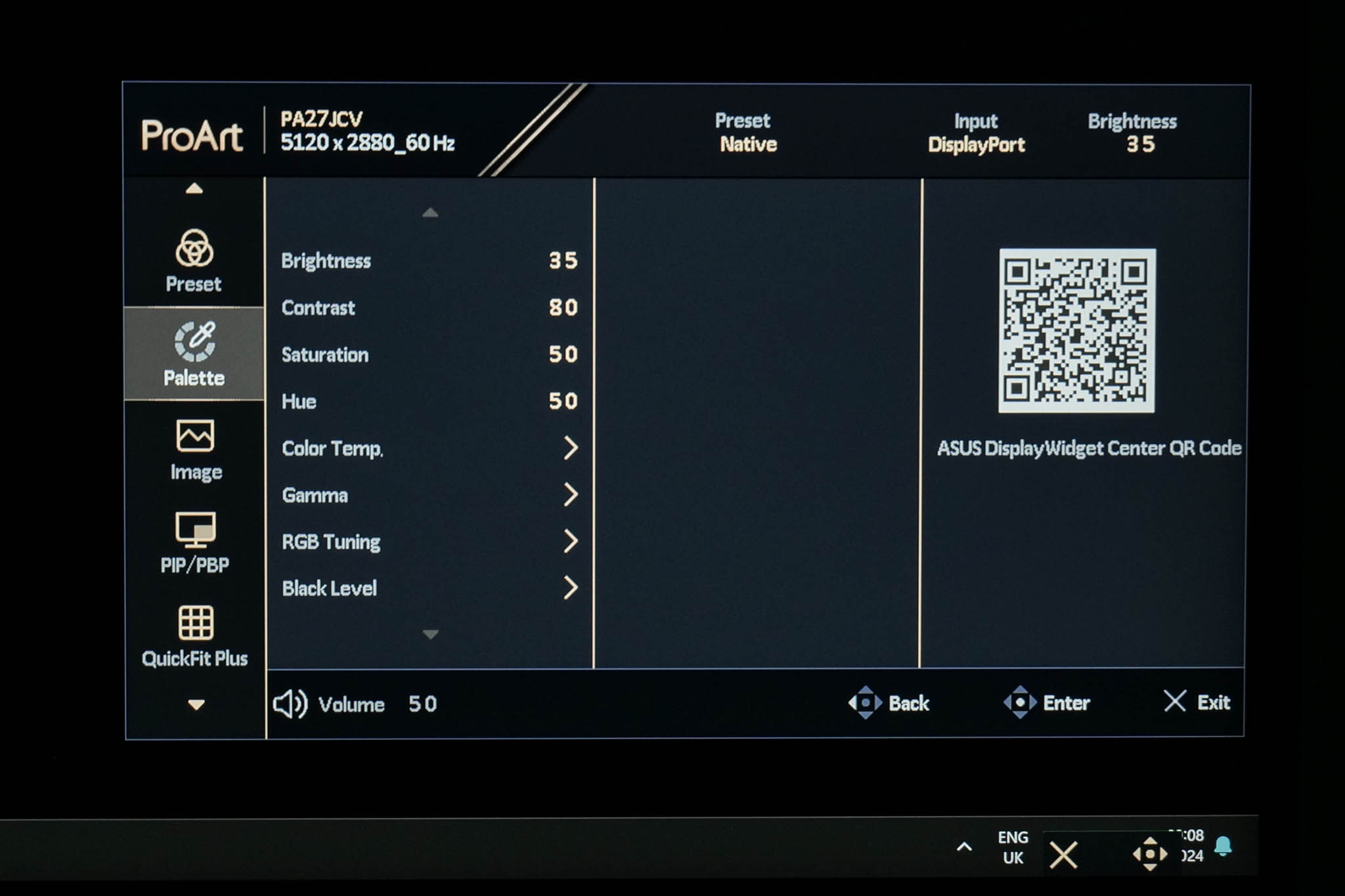
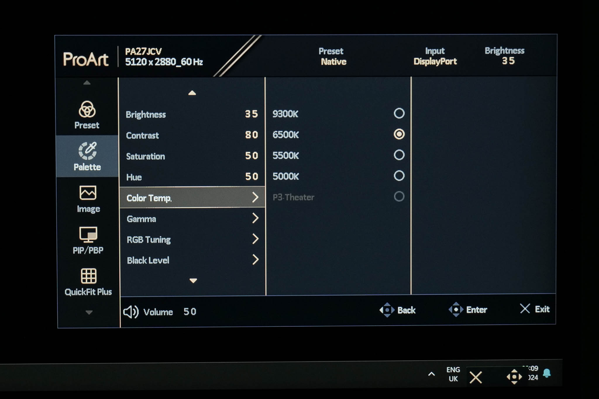
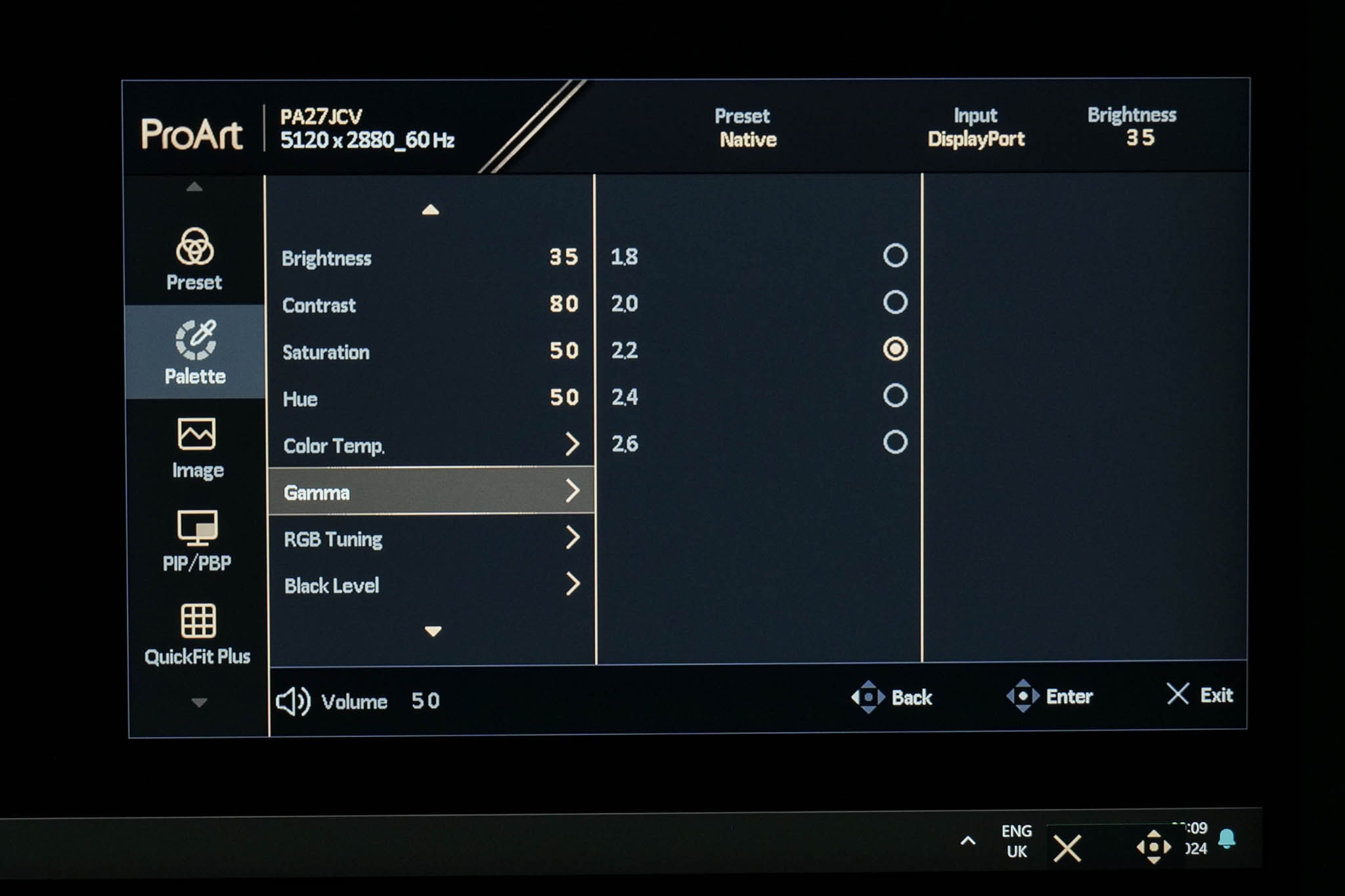
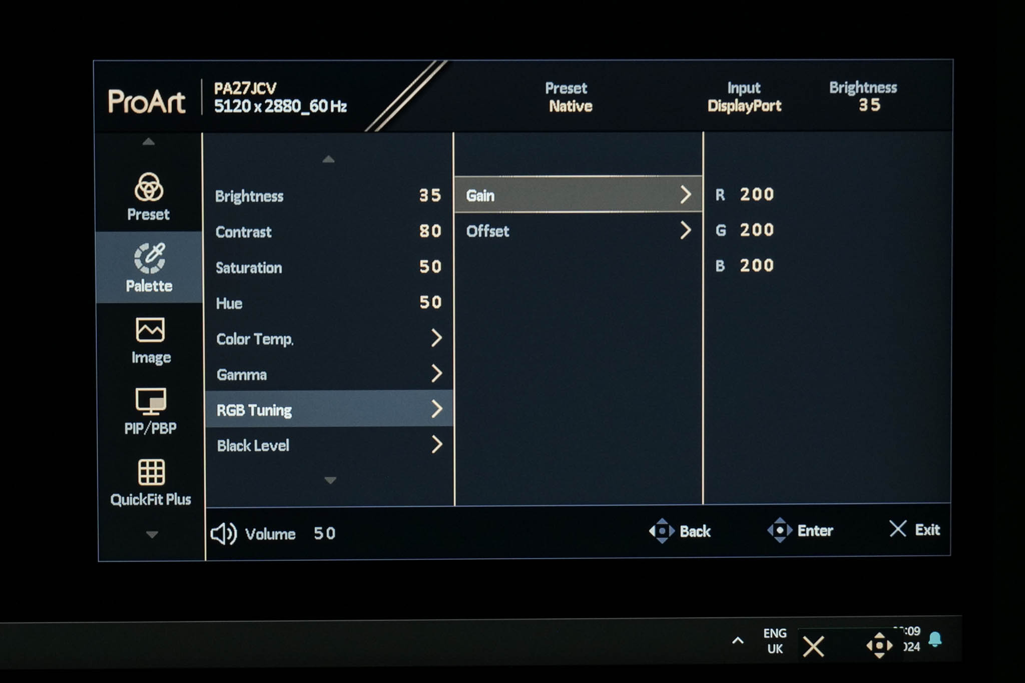
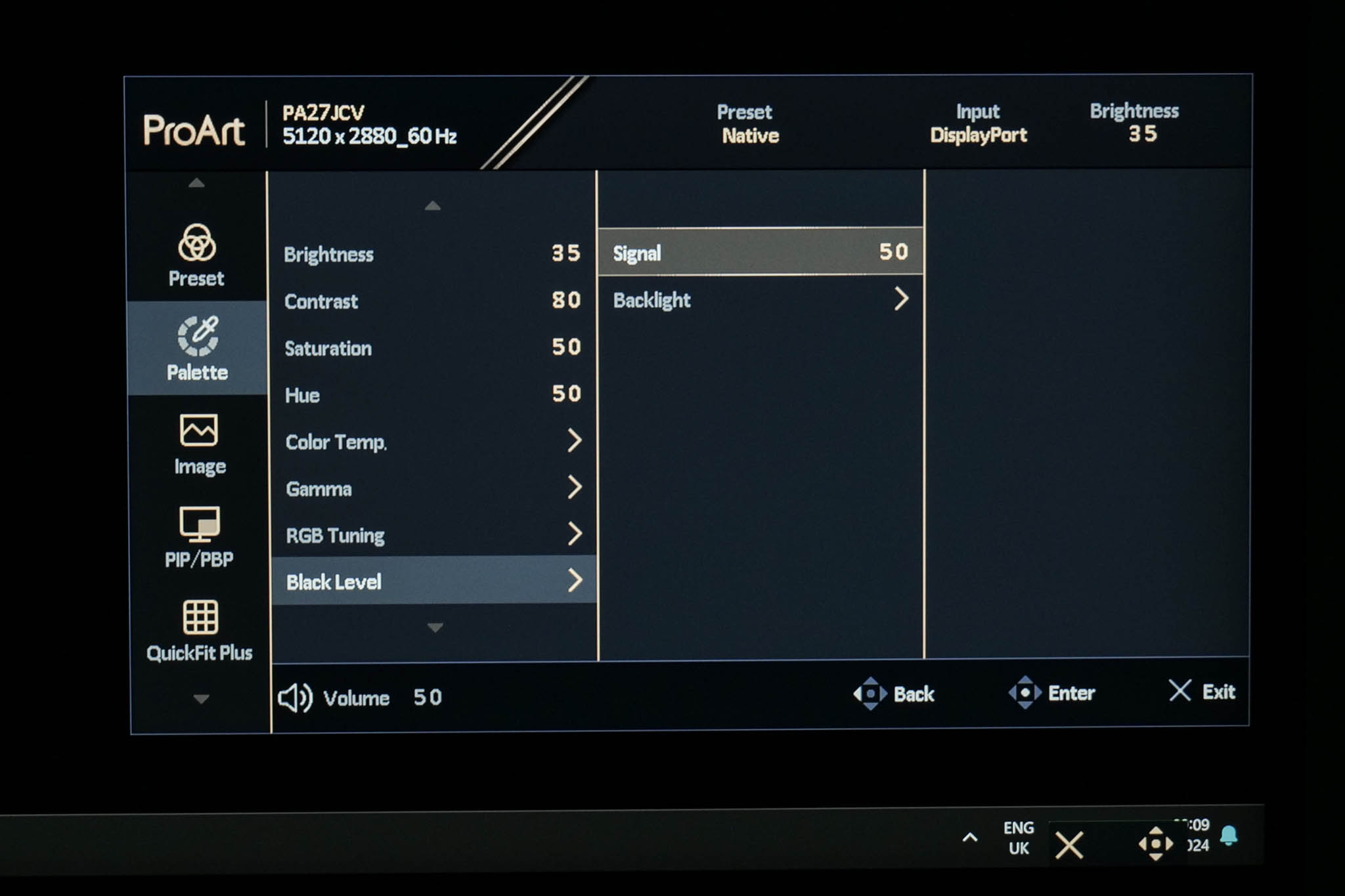
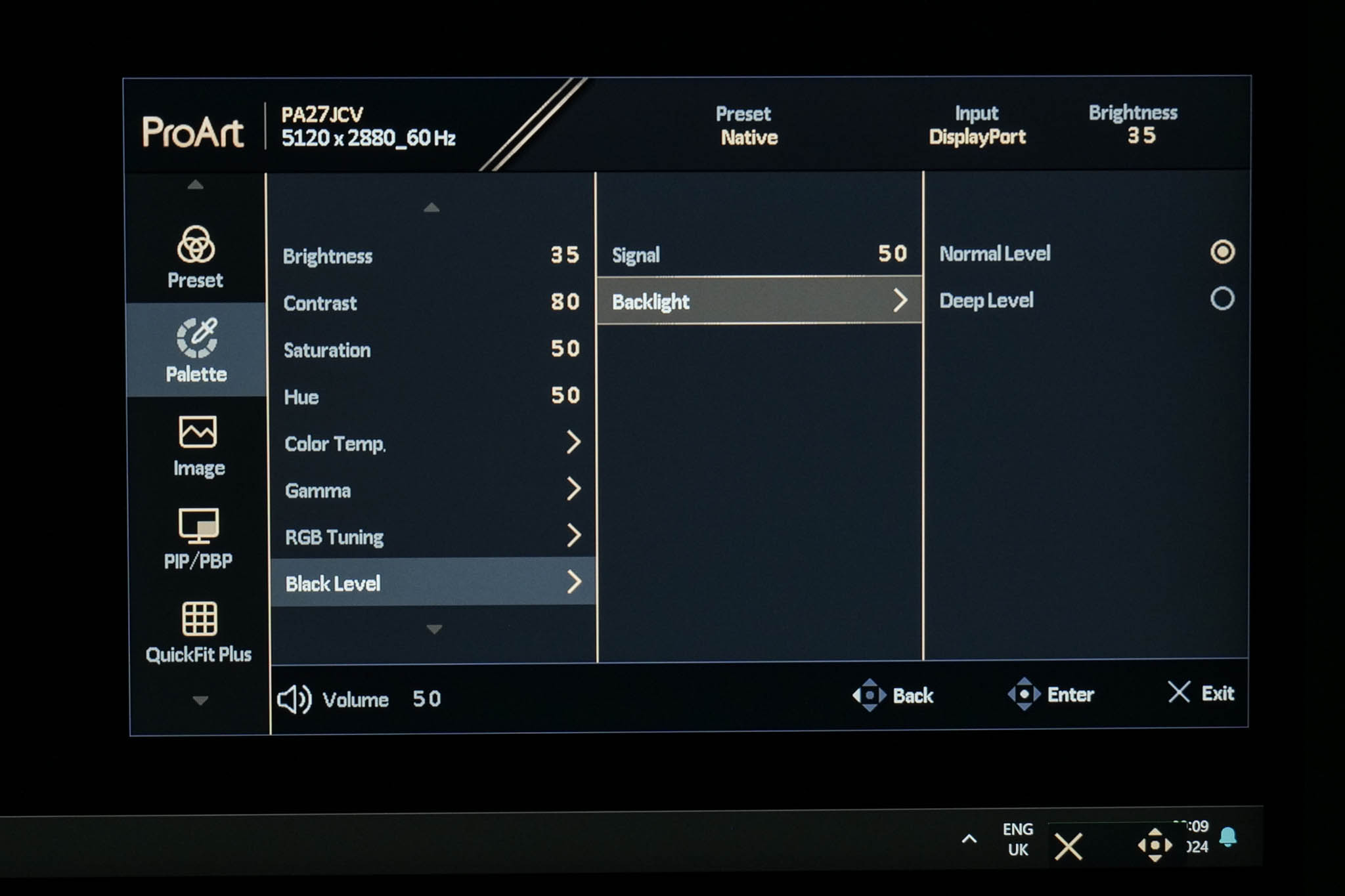
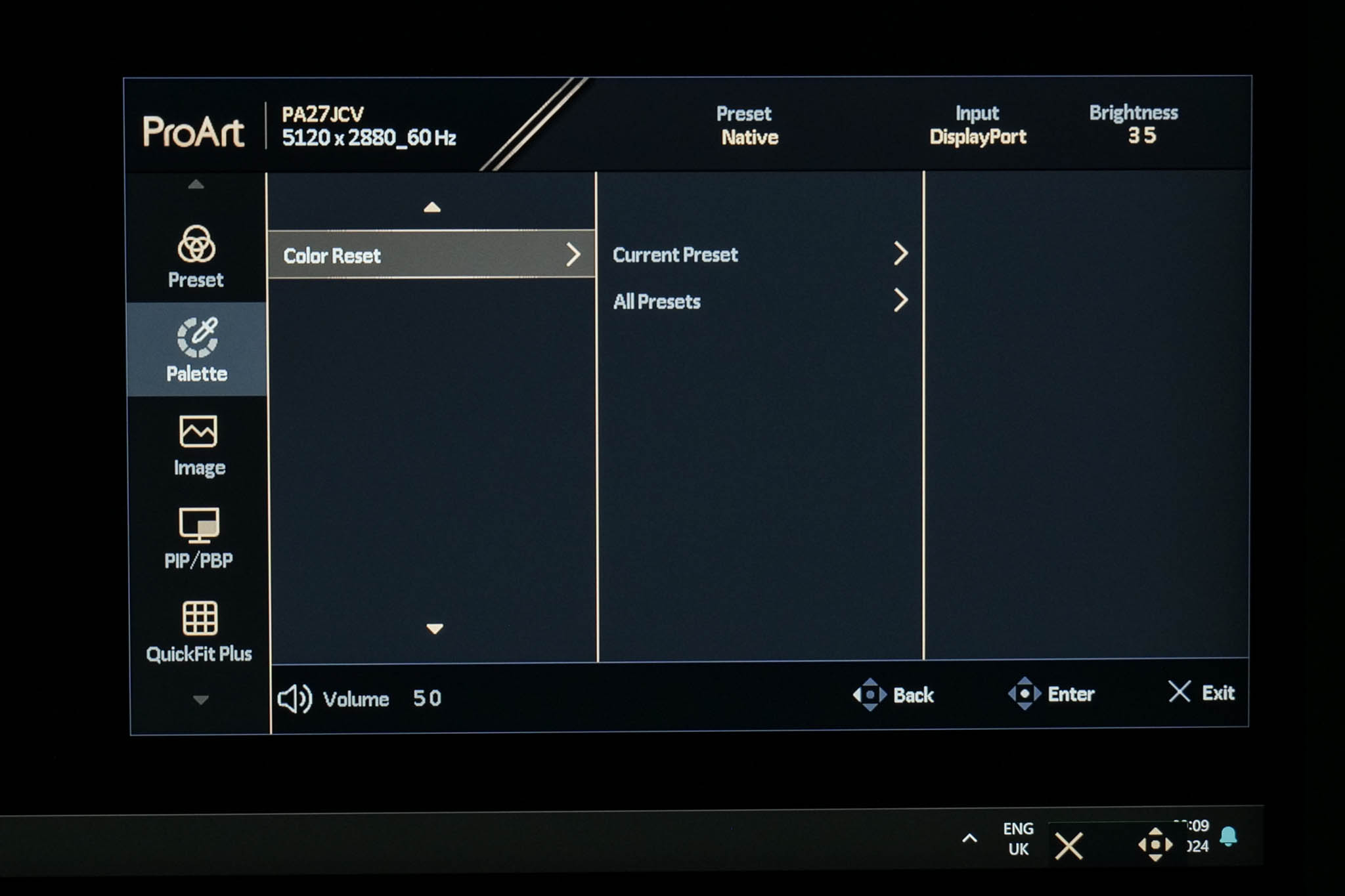
The next tab is called Palette, offering control over brightness and contrast, alongside gamma and RGB controls to manually adjust the colour balance.
Image
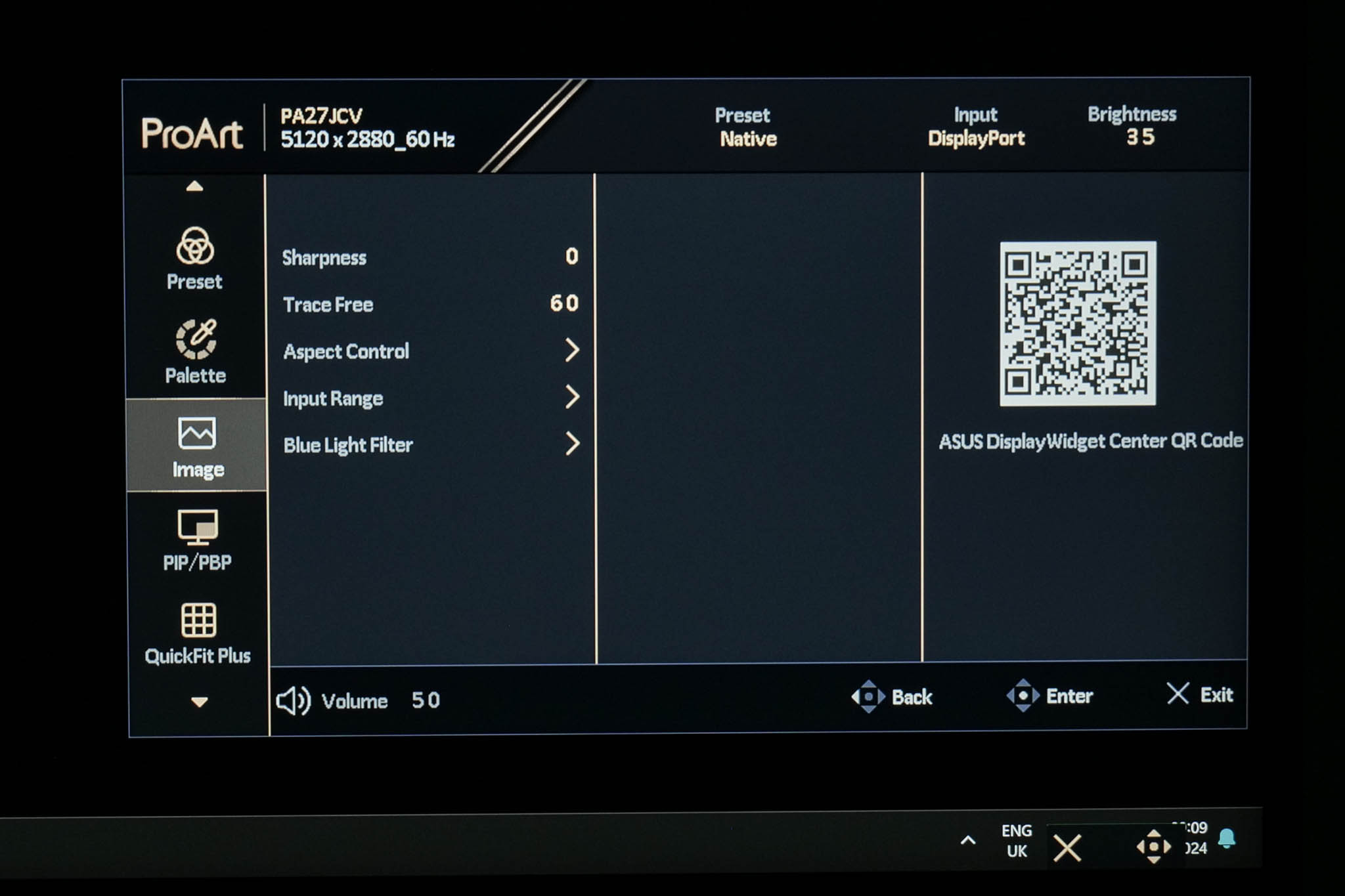
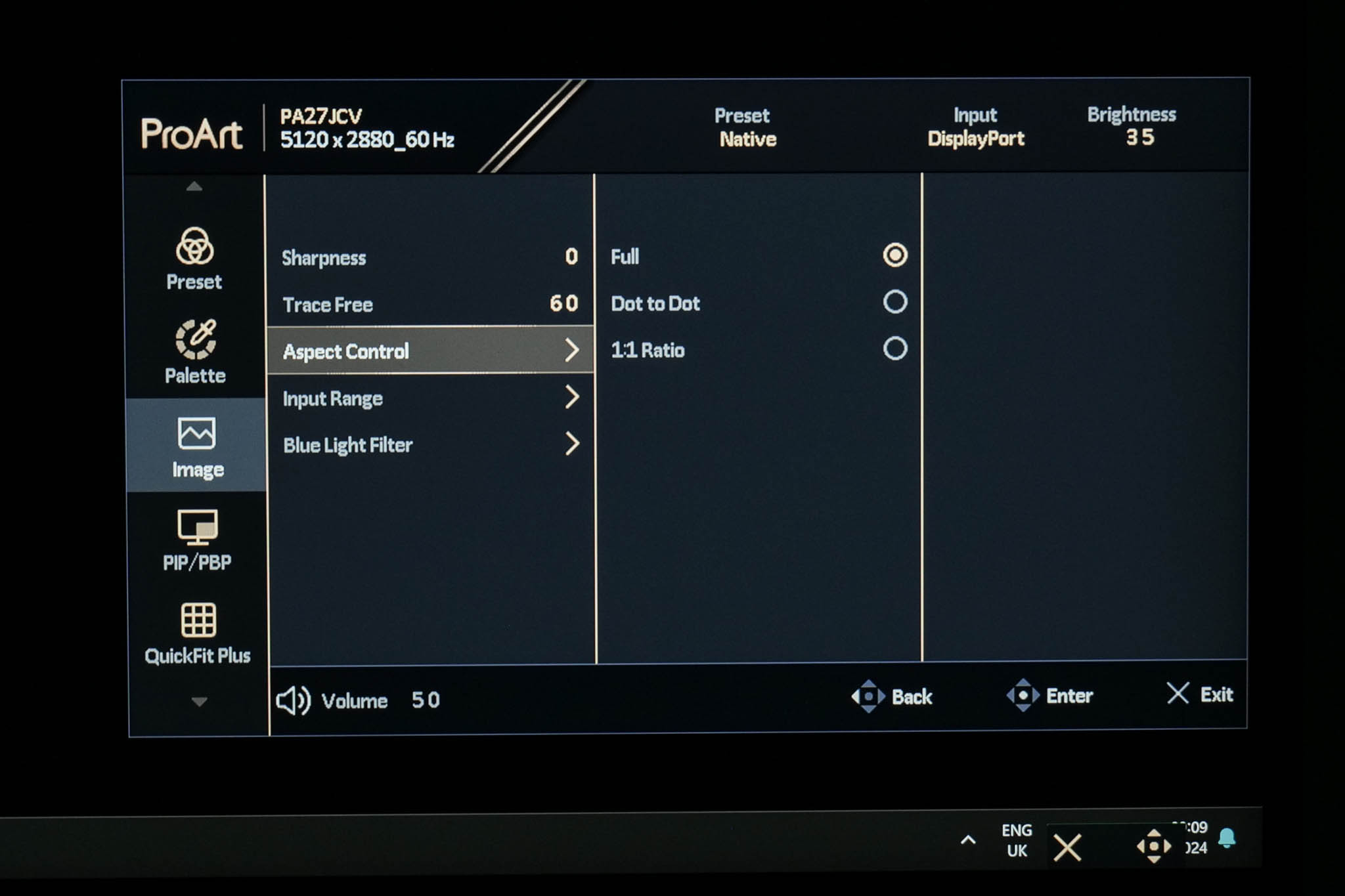
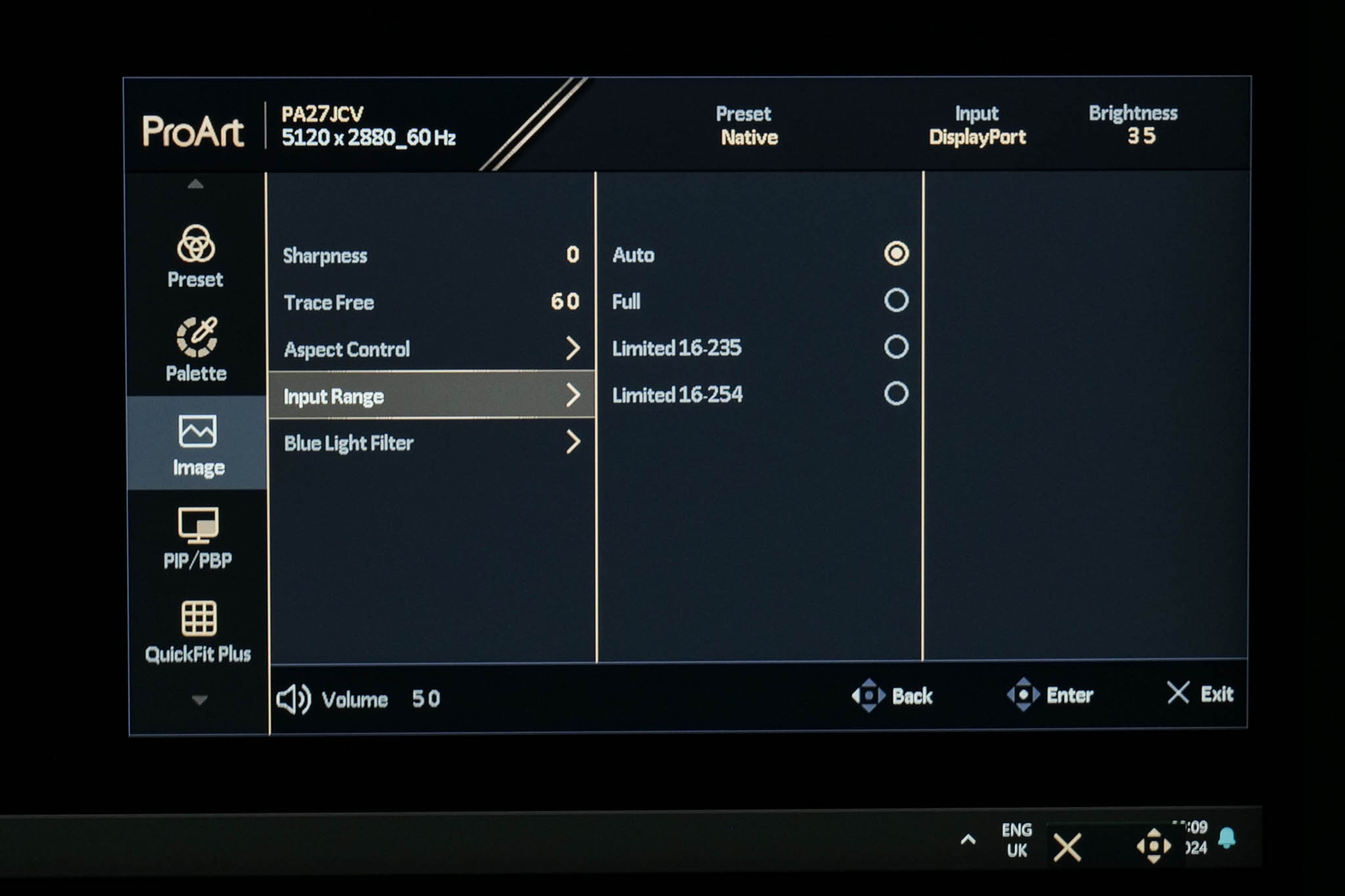
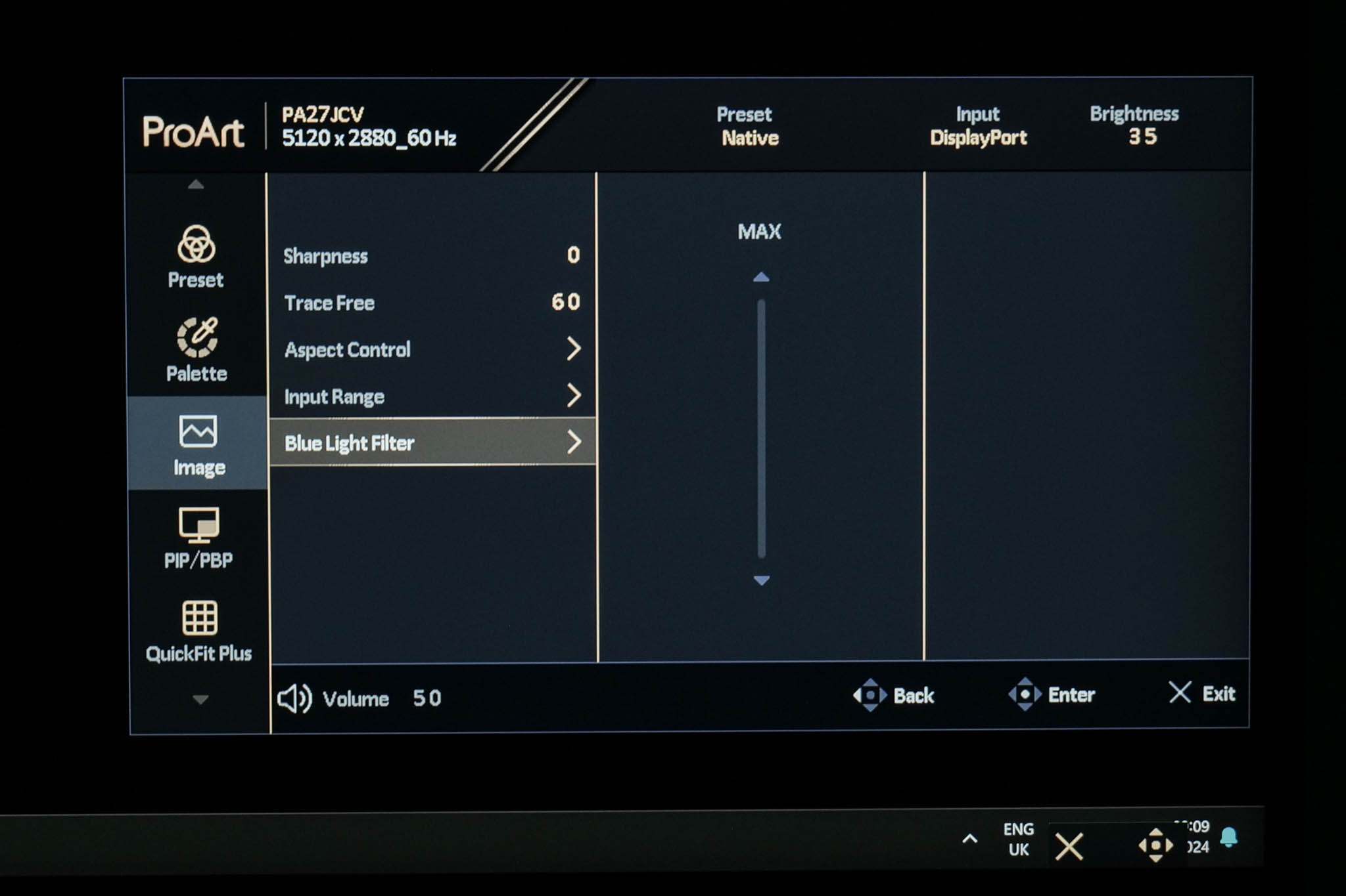
Then there are the Image settings, which includes sharpness, Trace Free (ASUS' term for overdrive), aspect ratio adjustment, input range control, alongside a blue light filter.
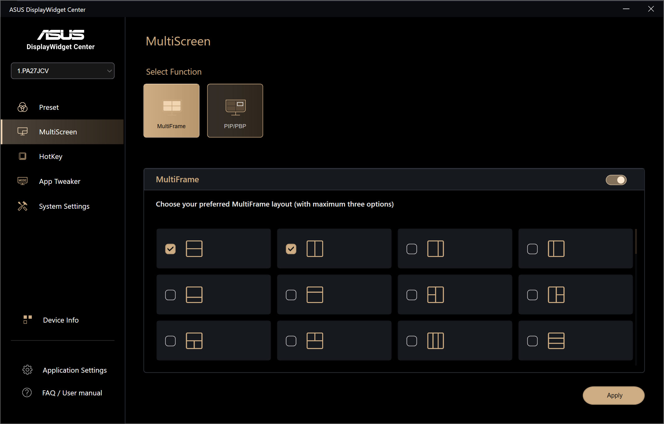
PIP/PBP
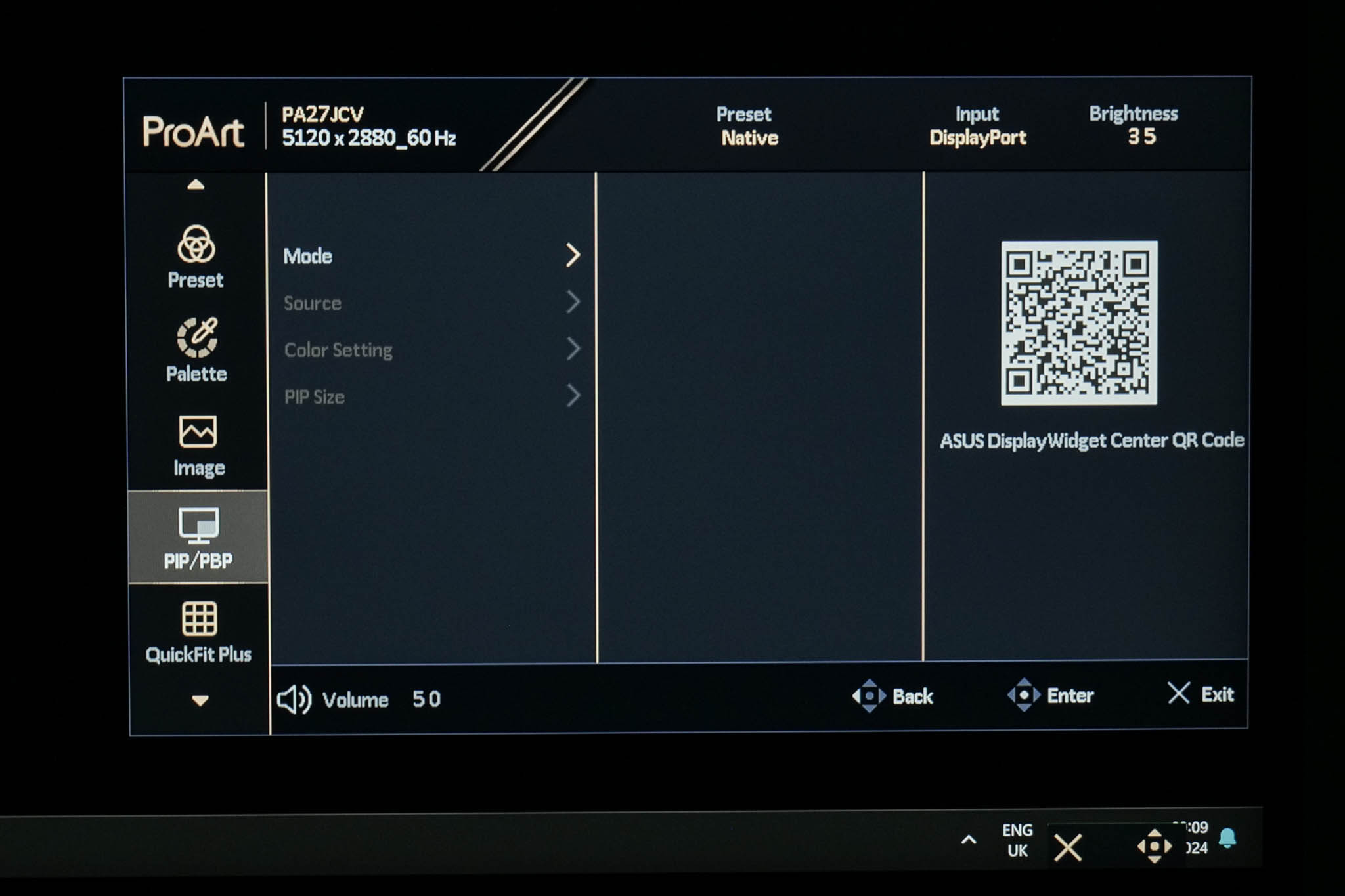
The next tab is quite self-explanatory, offering PIP/PBP settings if you have a second source connected to the monitor.
QuickFit Plus
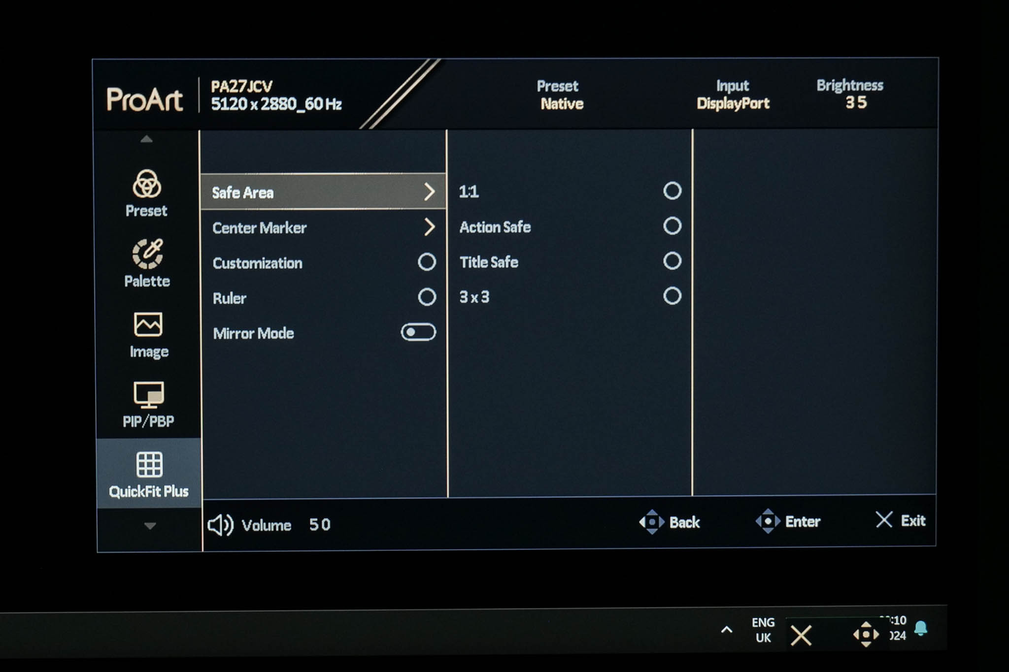
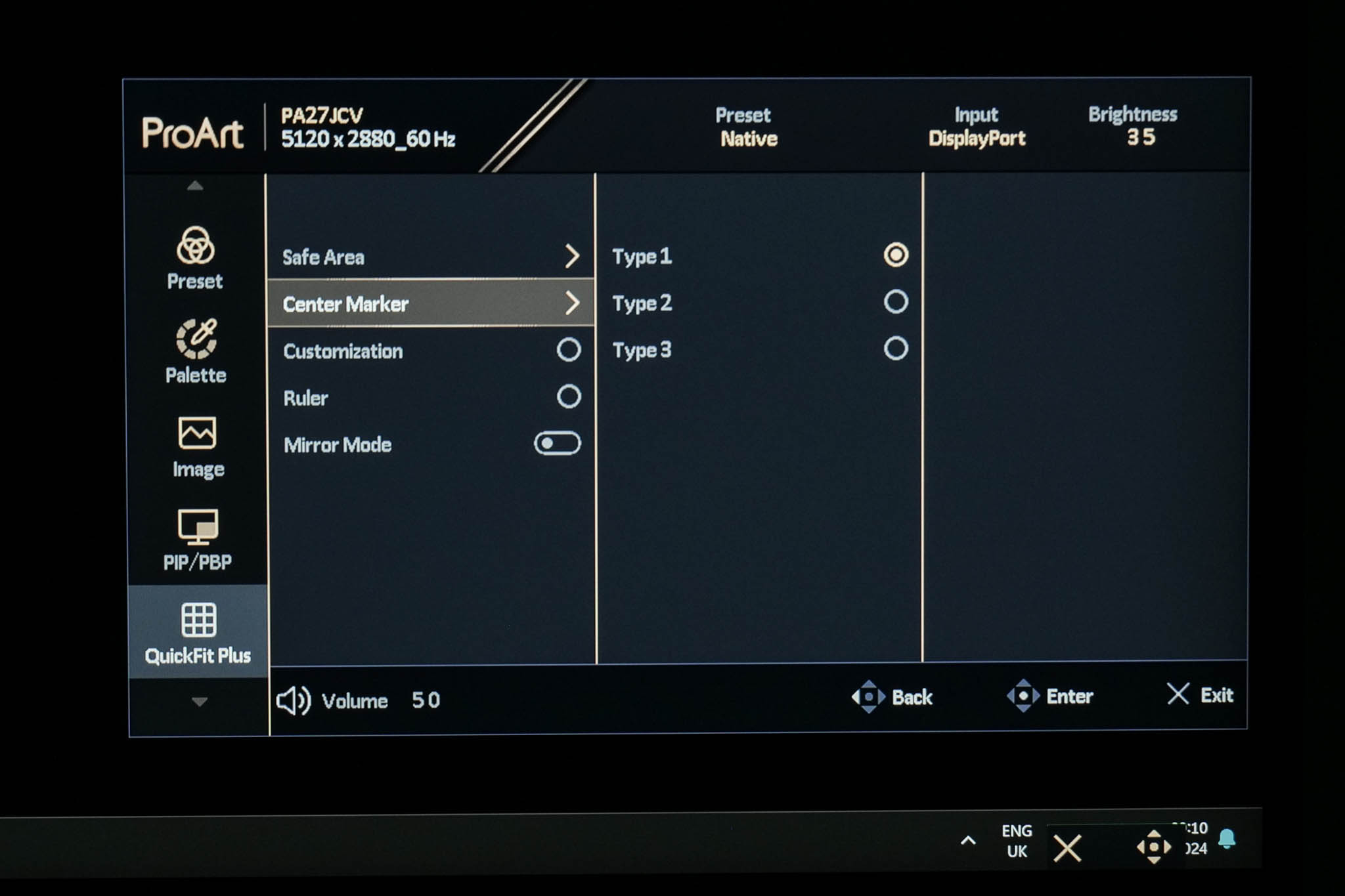
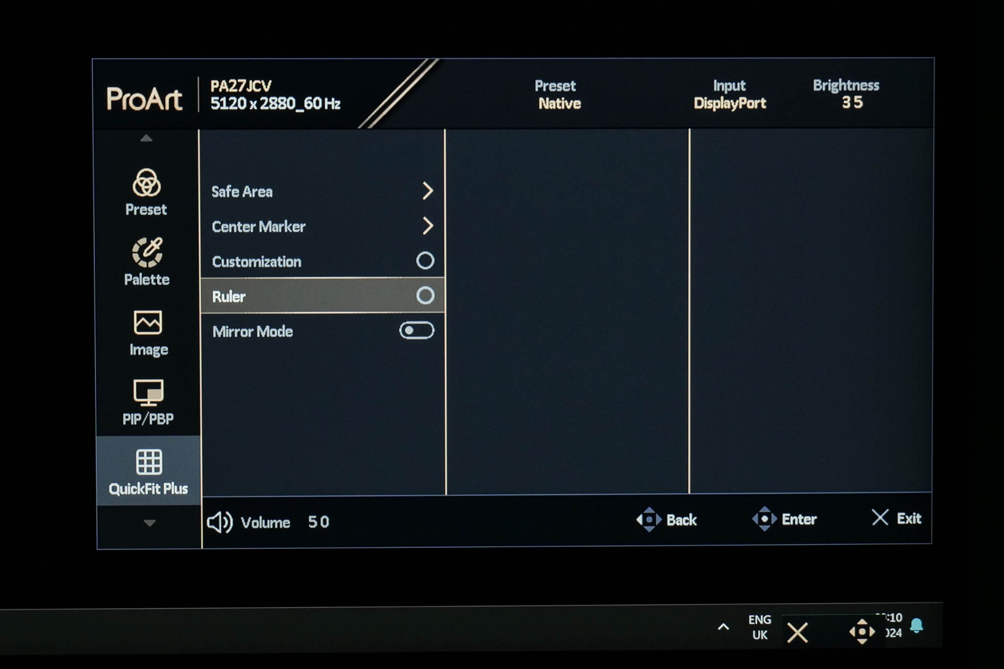
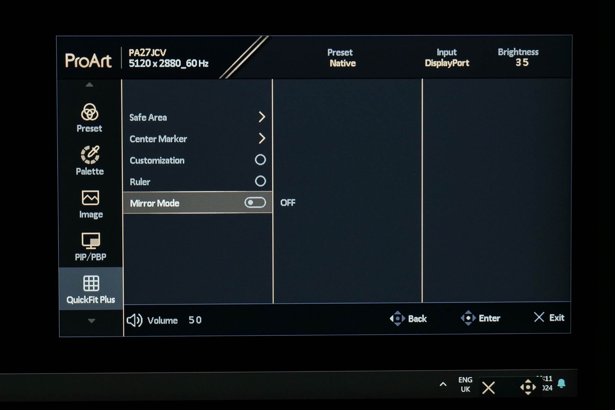
QuickFit Plus offers a range of settings that might help with certain design tasks. You can configure a centre marker to appear on screen, or have a ruler run alongside the edges of the monitor. It's even possible to mirror the entire contents of your screen if you wish.
Input
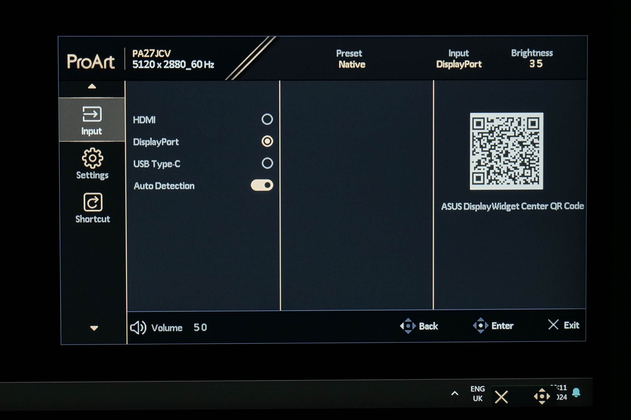
Input is also pretty self-explanatory, giving you the choice between the various video inputs, or an Auto Detection option.
Settings
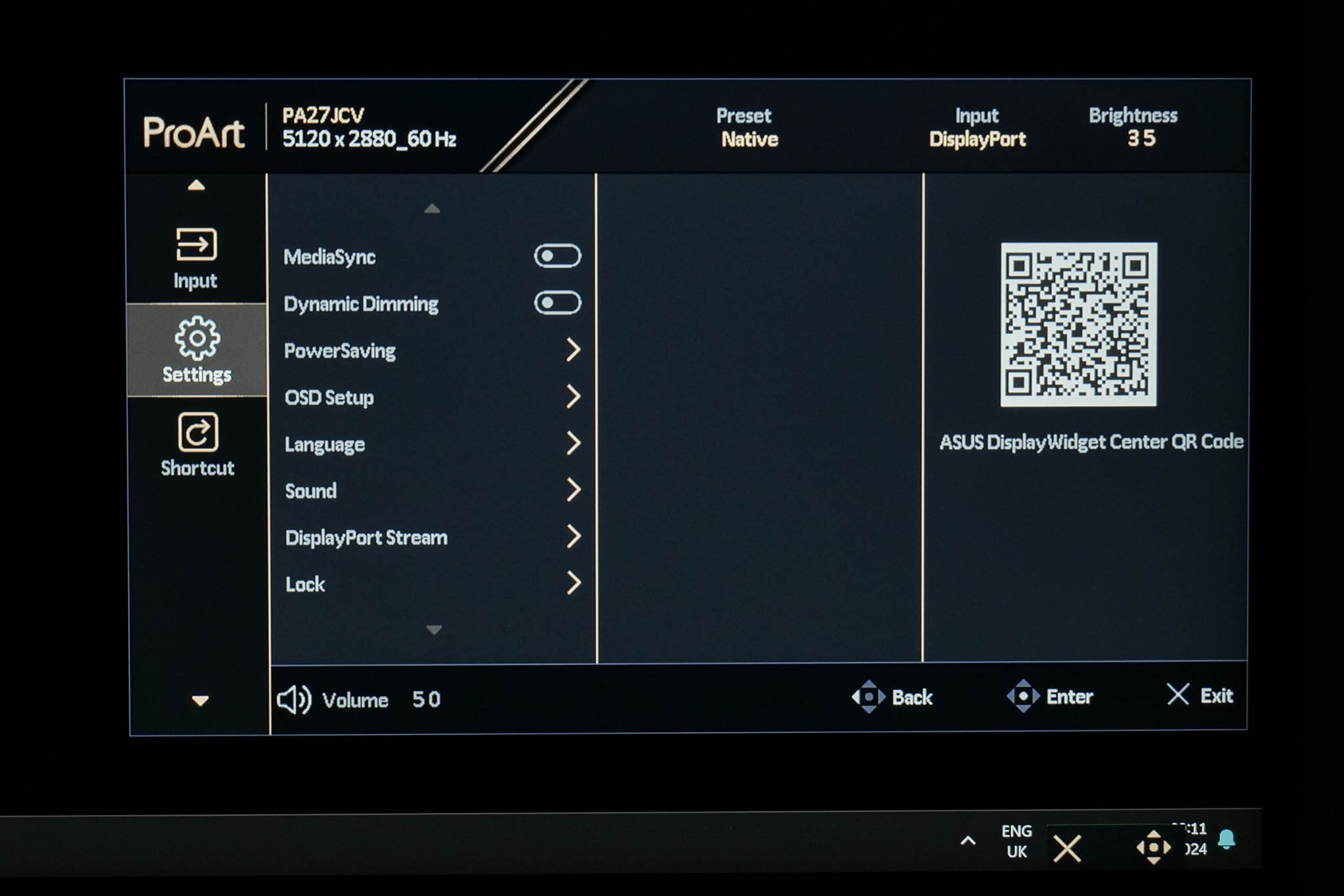
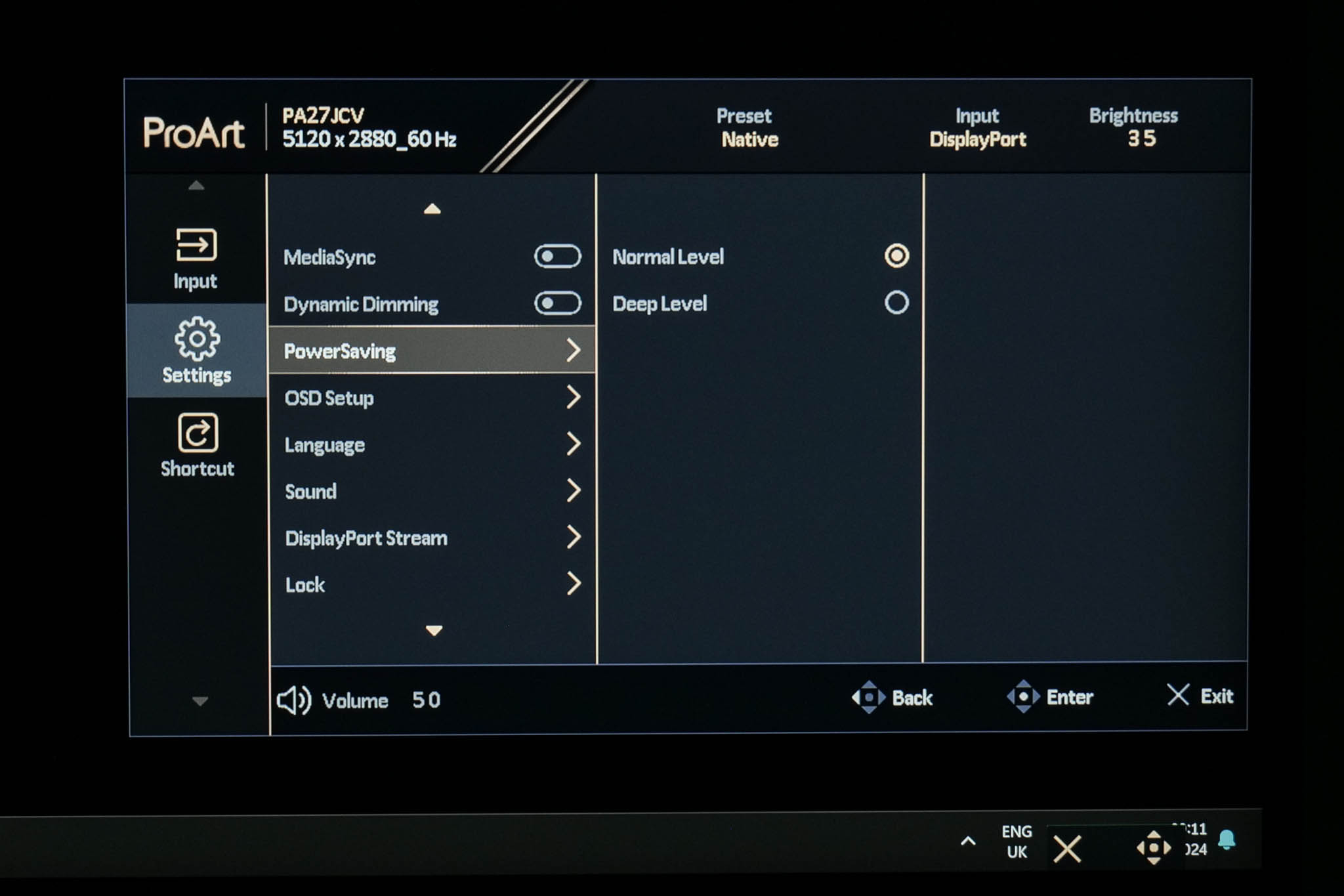
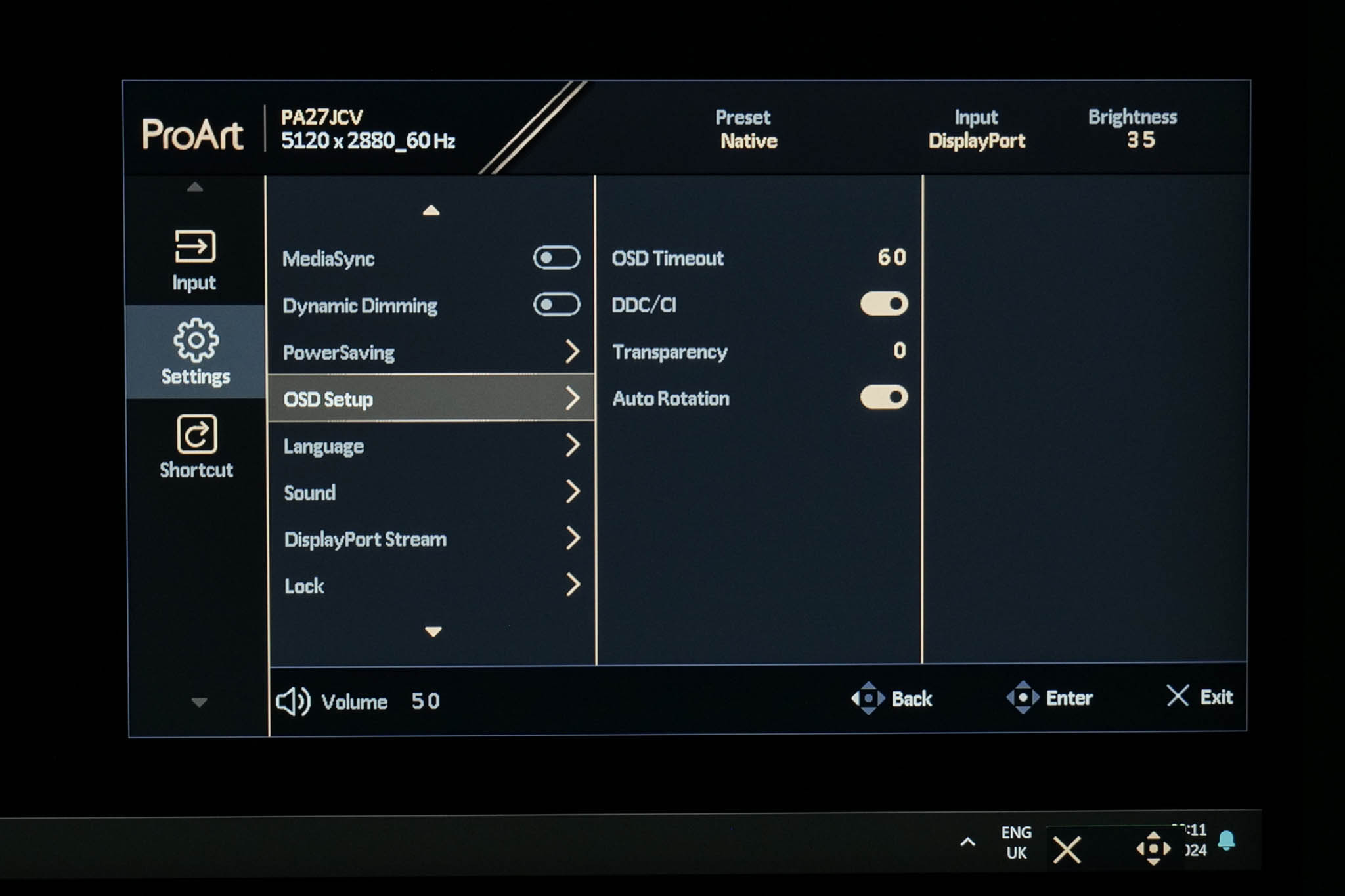
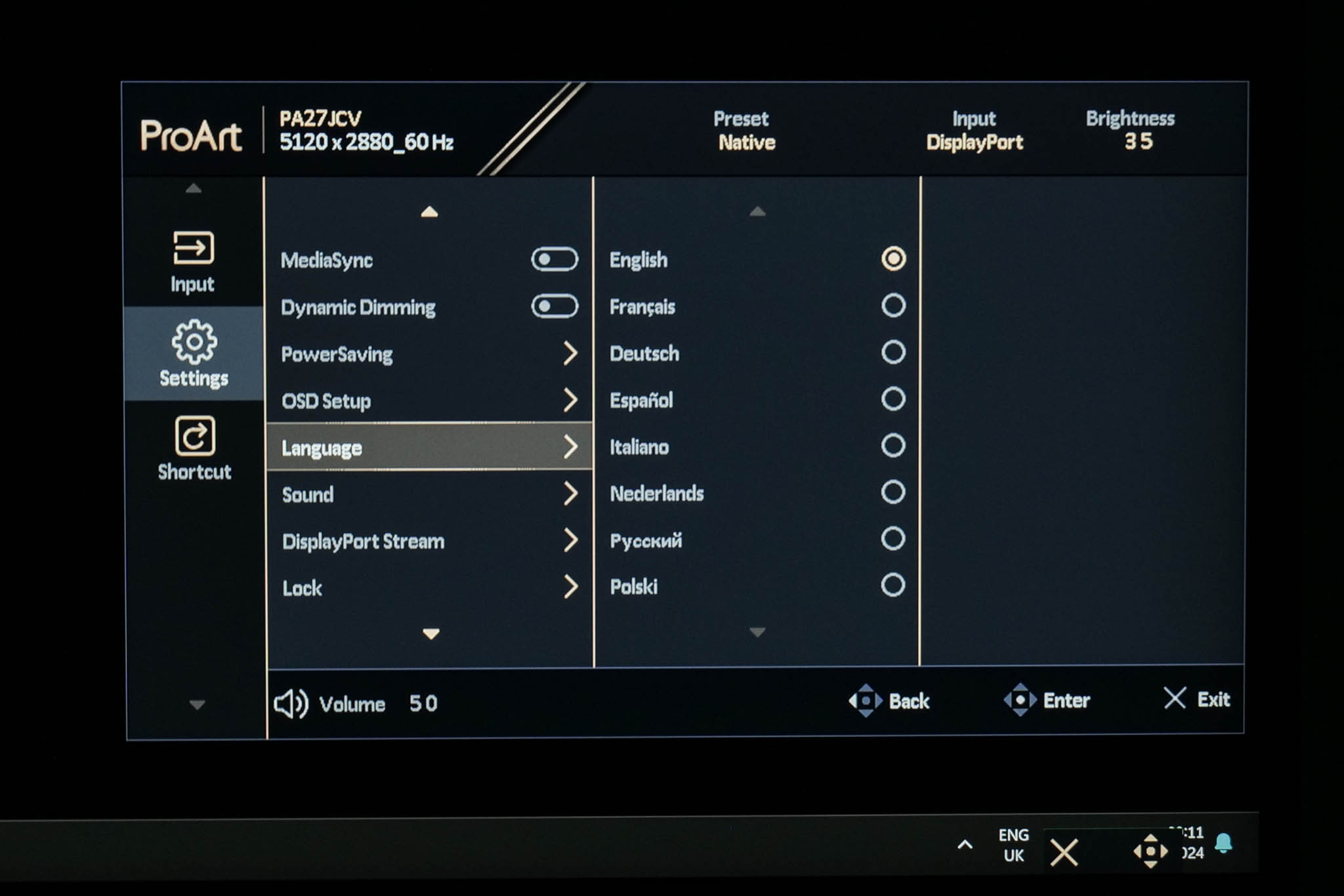
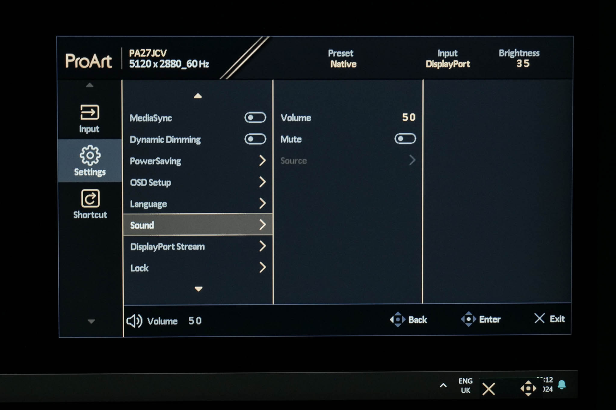
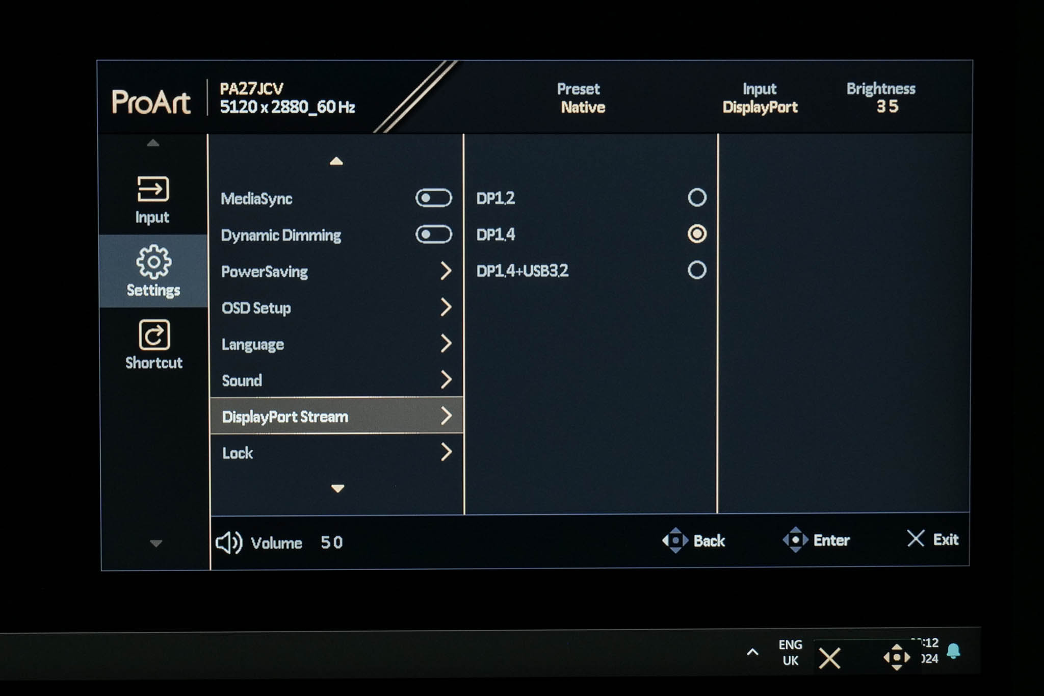
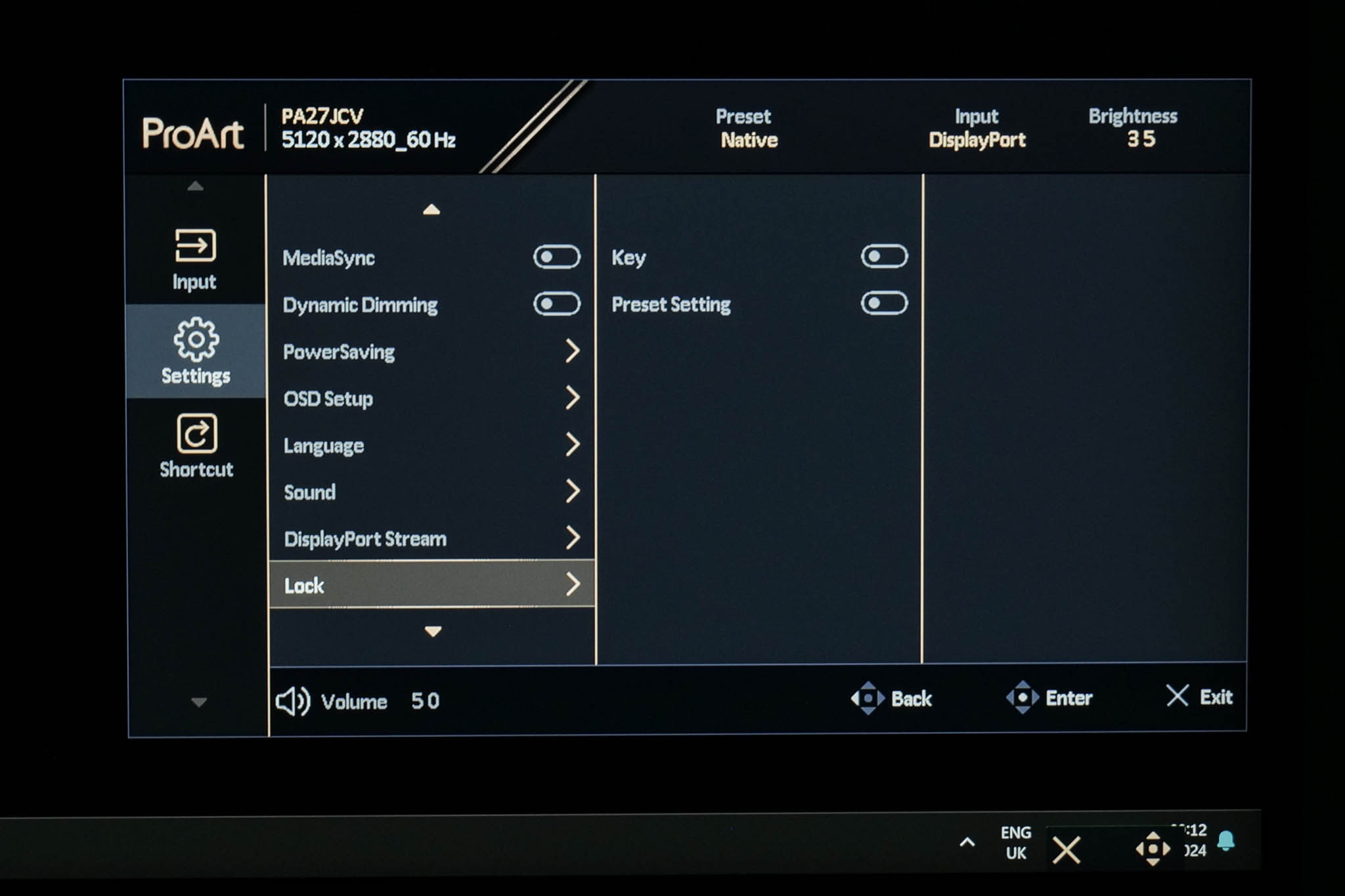
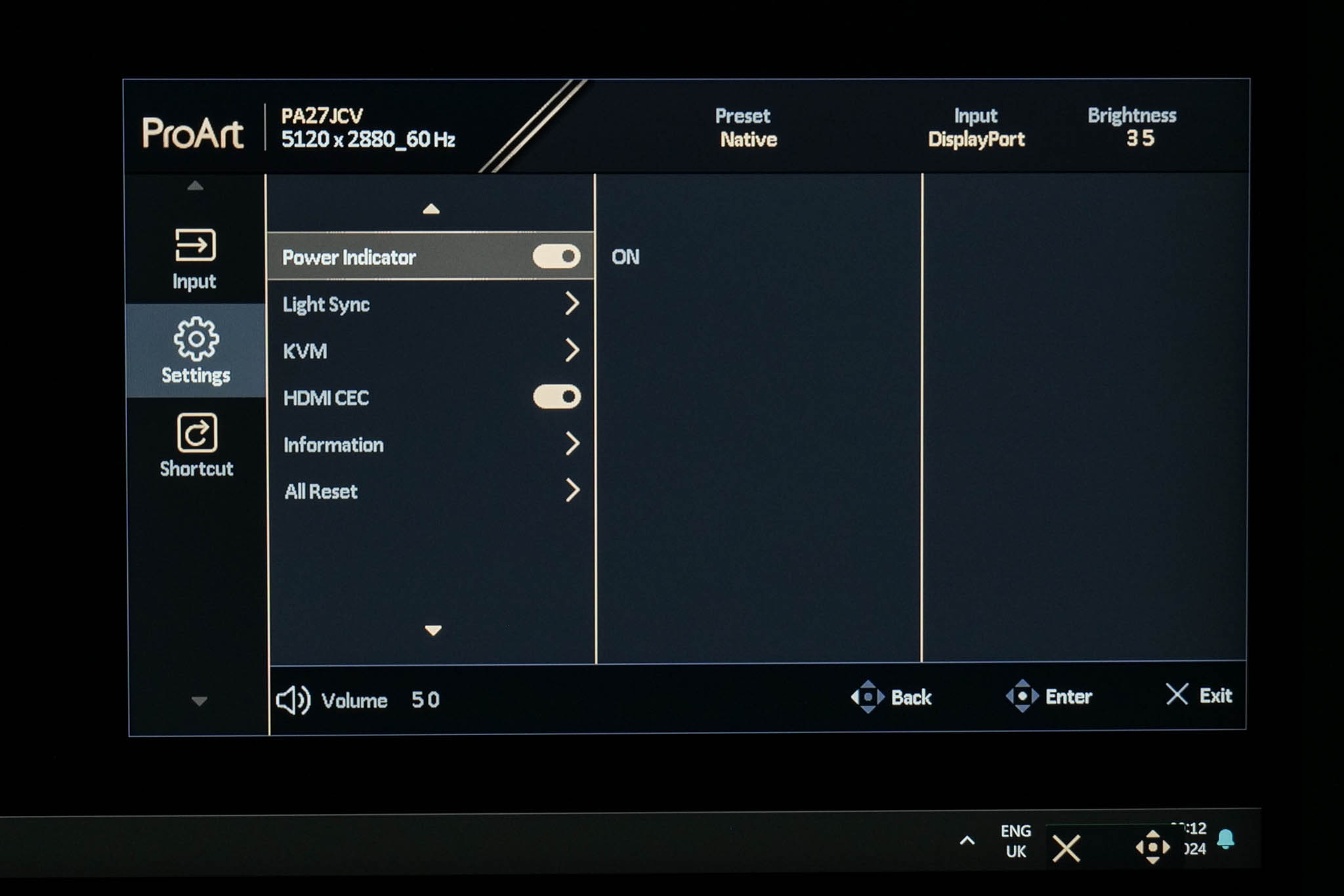
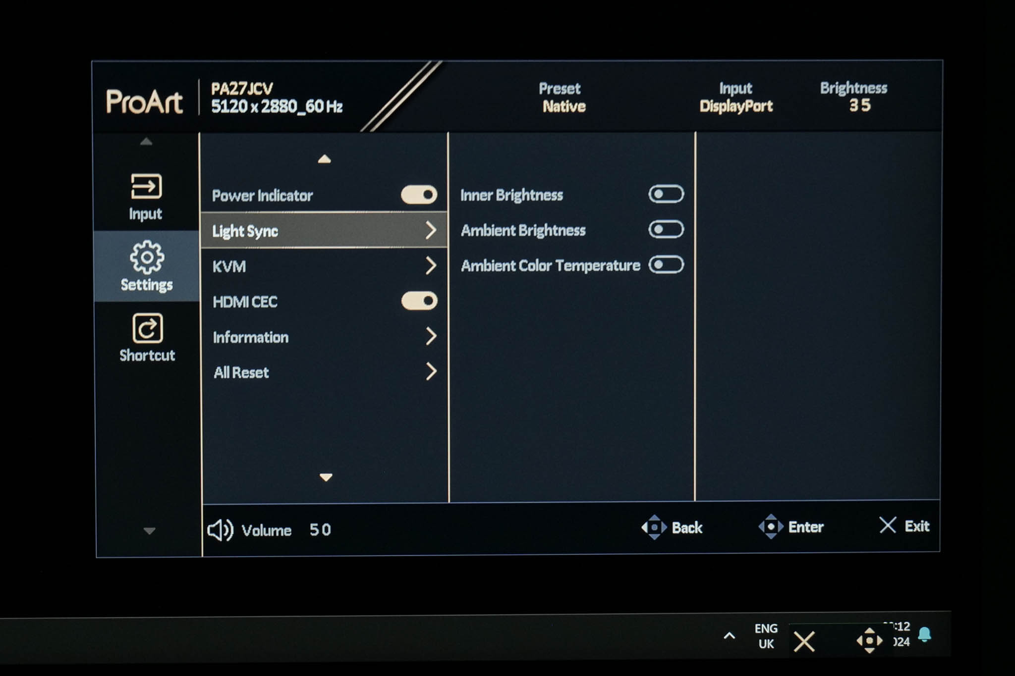
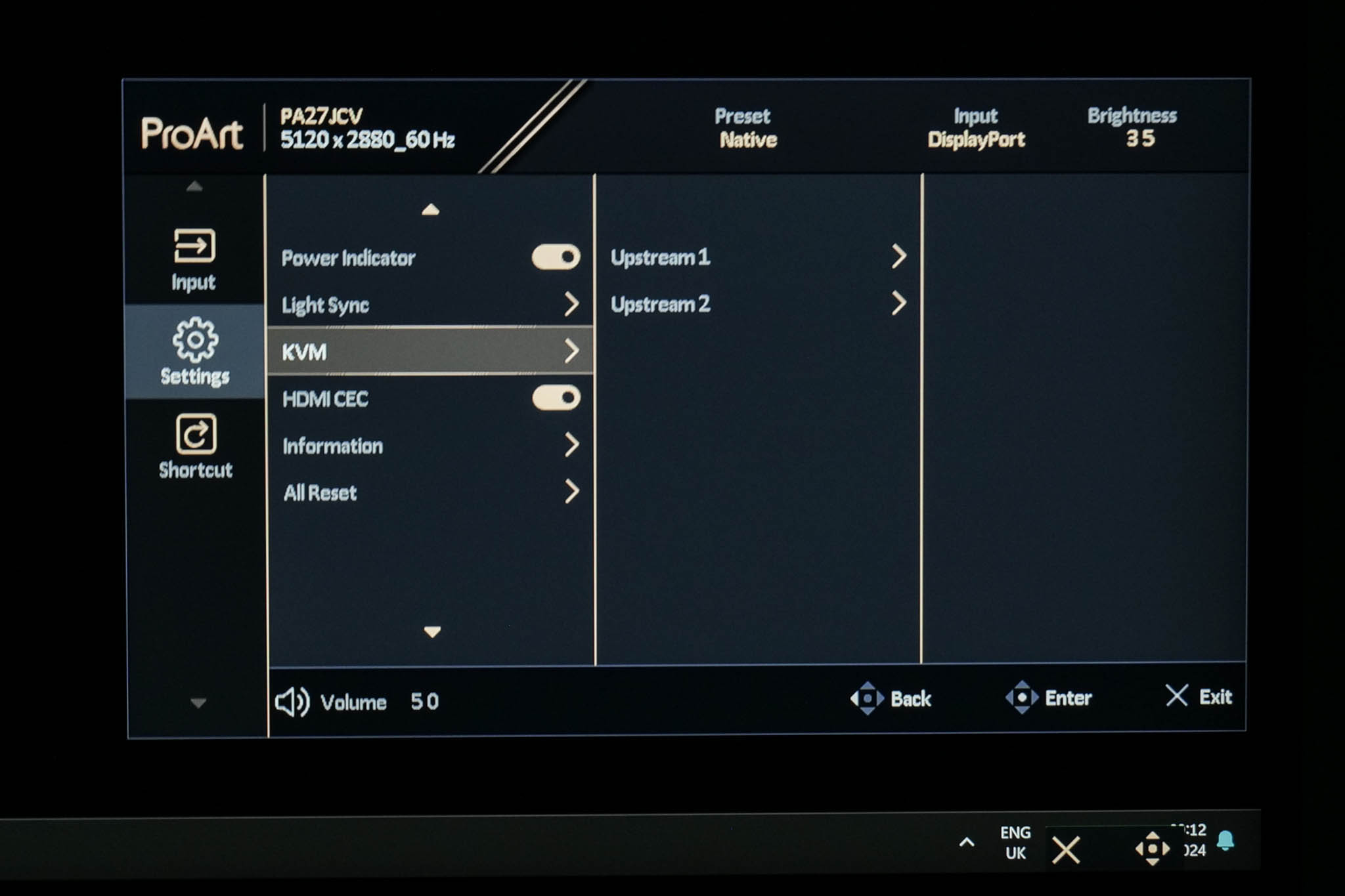
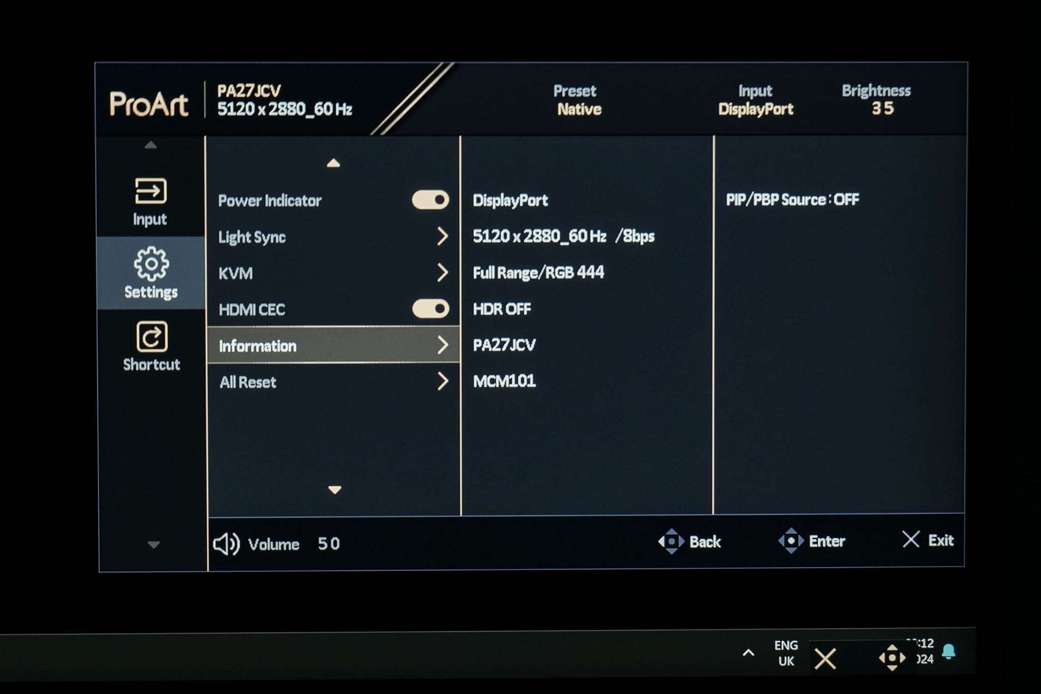
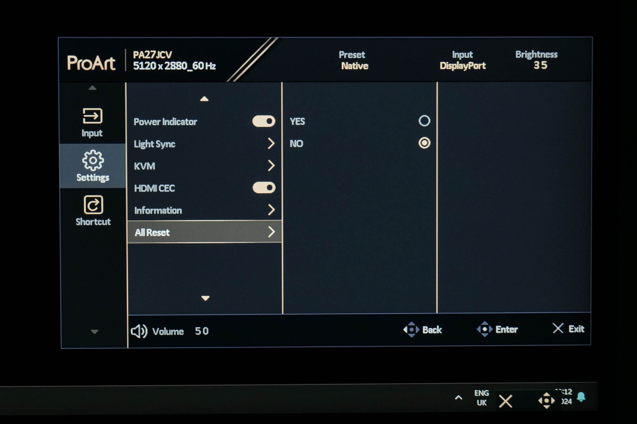
Settings has the most, erm, settings to adjust and it's quite a varied spread. There are basic things like OSD timeout options, but also more advanced features including KVM setup, DisplayPort configuration and ASUS Light Sync, the latter being an interesting feature which leverages ambient light and backlight sensors to automatically fine-tune gamut and white balance (if you want that). You can also get an overview of the monitor's information and firmware version, or reset everything to factory defaults.
Shortcut
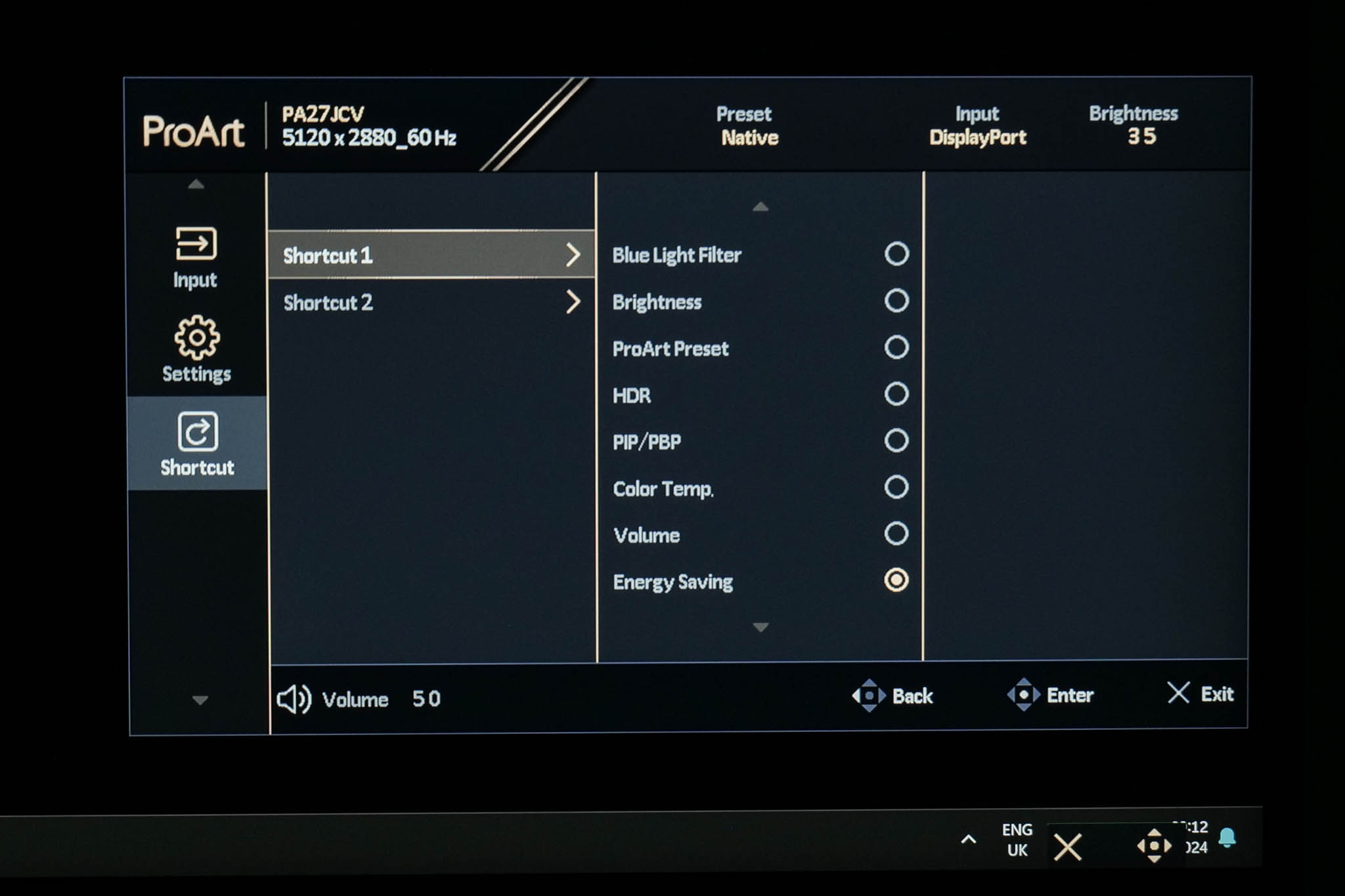
The final tab allows you to configure two shortcuts which can be accessed from the initial pop up menu (as shown as the top of this page).
ASUS DisplayWidget Center
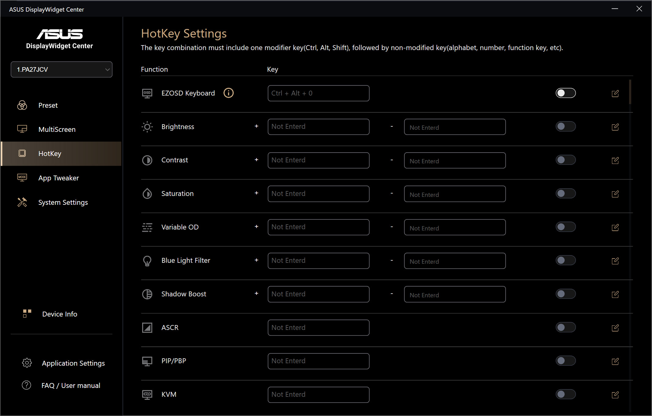
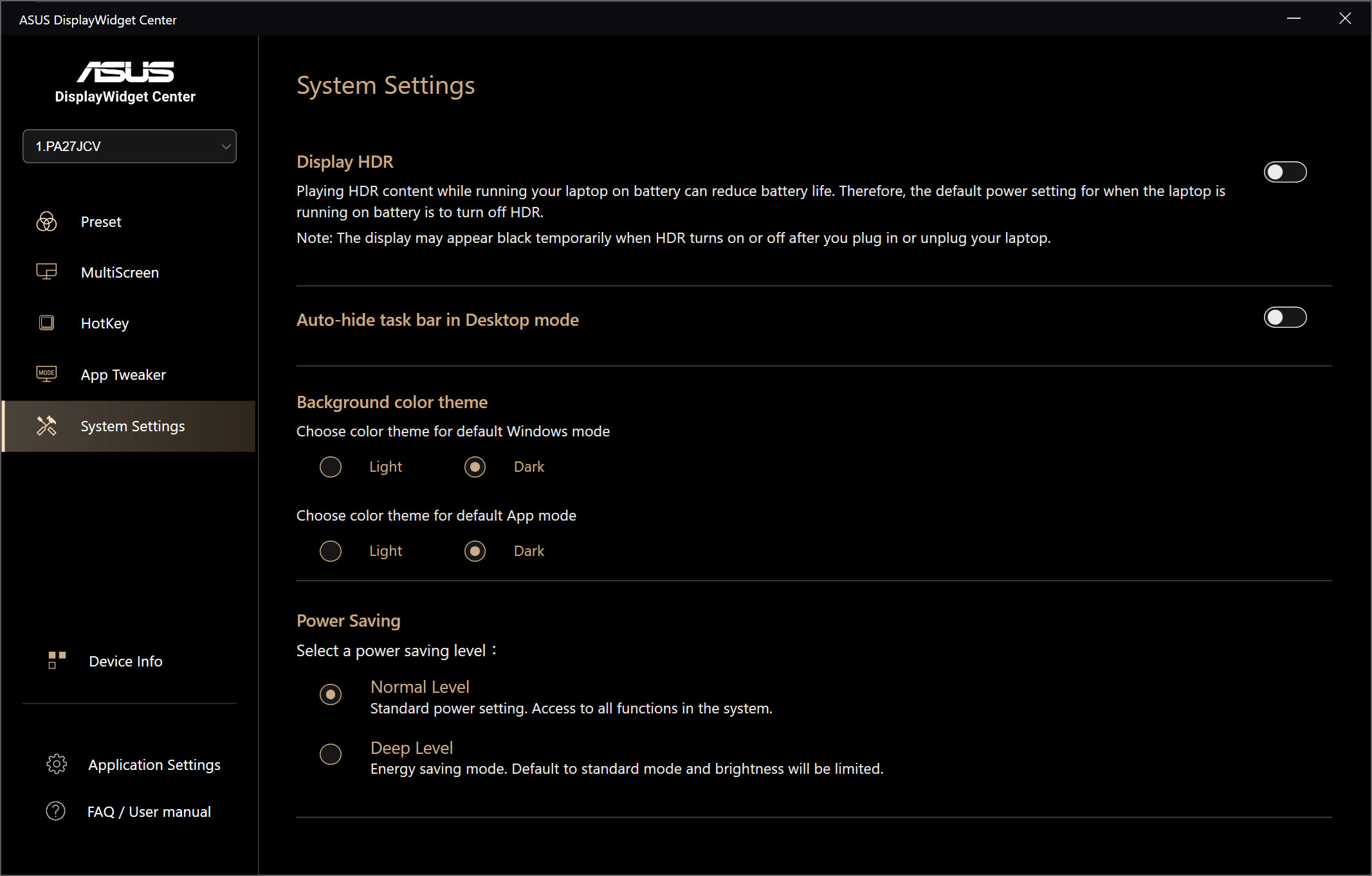
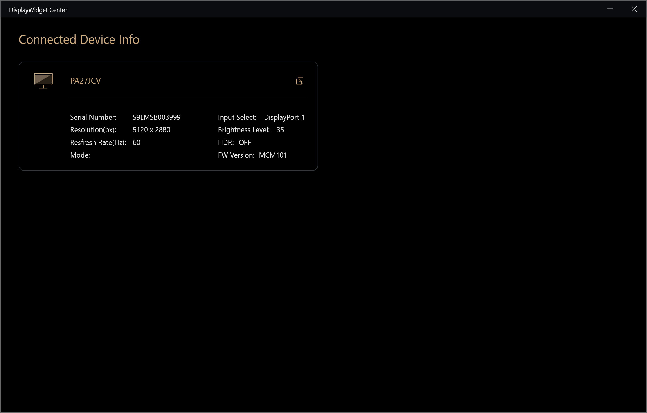
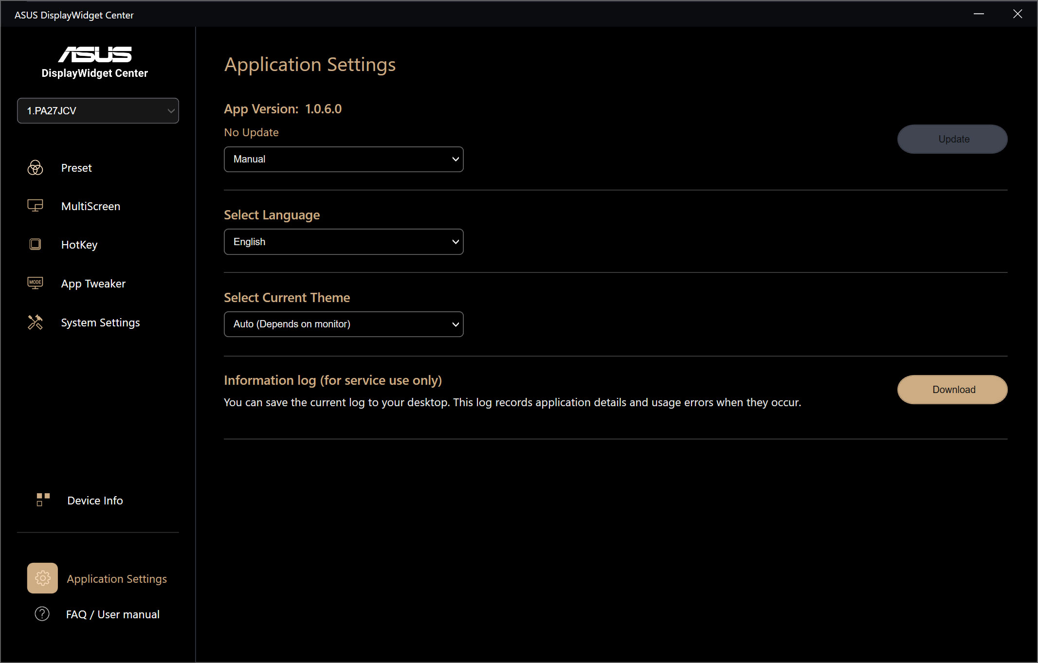
For those interested, ASUS also provides support for its DisplayWidget Center software. This gives you control over the key monitor settings from your PC, so you don't have to fiddle with the OSD to quickly adjust brightness or choose a different colour mode. This is currently only available for Windows, and not macOS.
Our main test involves using an X-Rite i1 Display Pro Plus colorimeter and utilising Portrait Display's Calman Ultimate software. The device sits on top of the screen while the software generates colour tones and patterns, which it compares against predetermined values to work out how accurate the screen is.
The results show:
- A monitor’s maximum brightness in candelas or cd/m2 at various levels set in the OSD.
- A monitor’s contrast ratio at various brightness levels in the OSD.
- Gamut coverage, primarily focusing on sRGB and DCI-P3 colour spaces.
- Greyscale accuracy, measured across 20 shades, with an average colour balance reported.
- The exact gamma levels, with a comparison against preset settings in the OSD.
- The colour accuracy, expressed as a Delta E ratio, with a result under 3 being fine for normal use, and under 2 being great for colour-accurate design work.
We first run these tests with the display in its out-of-the-box state, with all settings on default. If there is an sRGB emulation option or other useful mode then we may test that too. We then calibrate the screen using the Calman Ultimate software and run the tests again.
You can read more about our test methodology HERE.
Default settings
Brightness and Contrast (Full Screen)
| OSD Brightness | White Luminance (cd/m2) | Black Luminance (cd/m2) | Contrast Ratio |
| 0% | 22.7 | 0.015 | 1508:1 |
| 25% | 157.6 | 0.103 | 1529:1 |
| 50% | 293 | 0.192 | 1529:1 |
| 75% | 438.7 | 0.286 | 1532:1 |
| 100% | 584.6 | 0.382 | 1530:1 |
Starting off with our brightness and contrast testing, things are immediately looking positive for the PA27JCV. ASUS claims a brightness level of 400 nits for this panel, but that seems very conservative as we actually hit a peak of just under 585 nits! That's plenty bright for every day use, and it gets pleasantly dim at 22 nits minimum, too.
The black levels are impressively low for an IPS screen, resulting in contrast that's bang on ASUS' claimed 1500:1 ratio. That's indicative of a very high-quality panel, given most modern IPS monitors have a contrast ratio that's more like 1200 or 1300:1.
Gamut (CIE 1976)
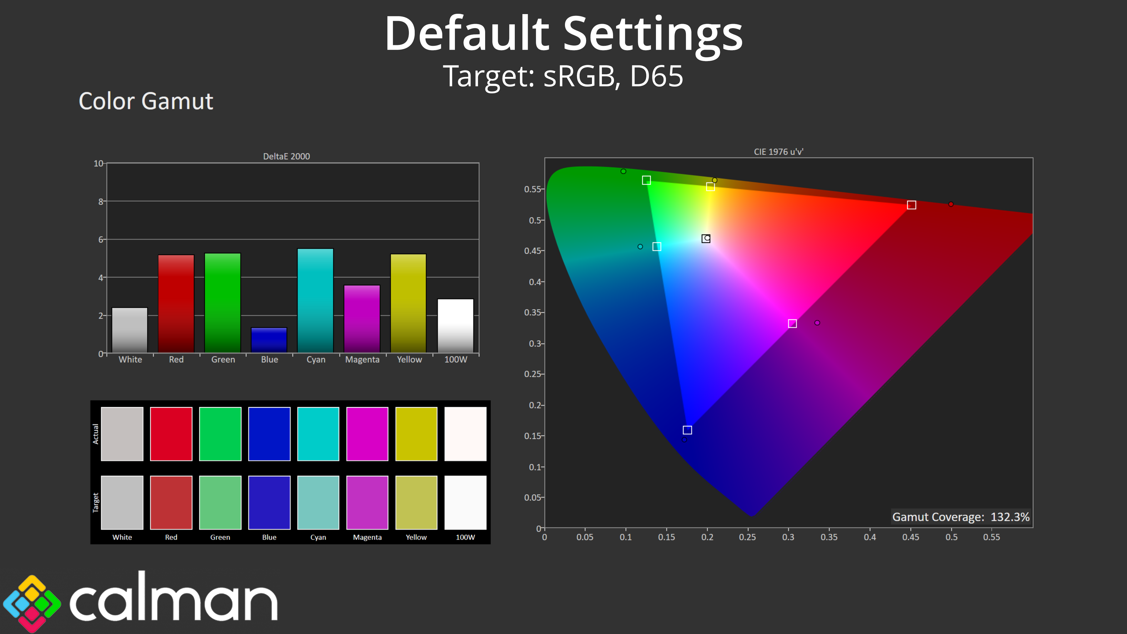
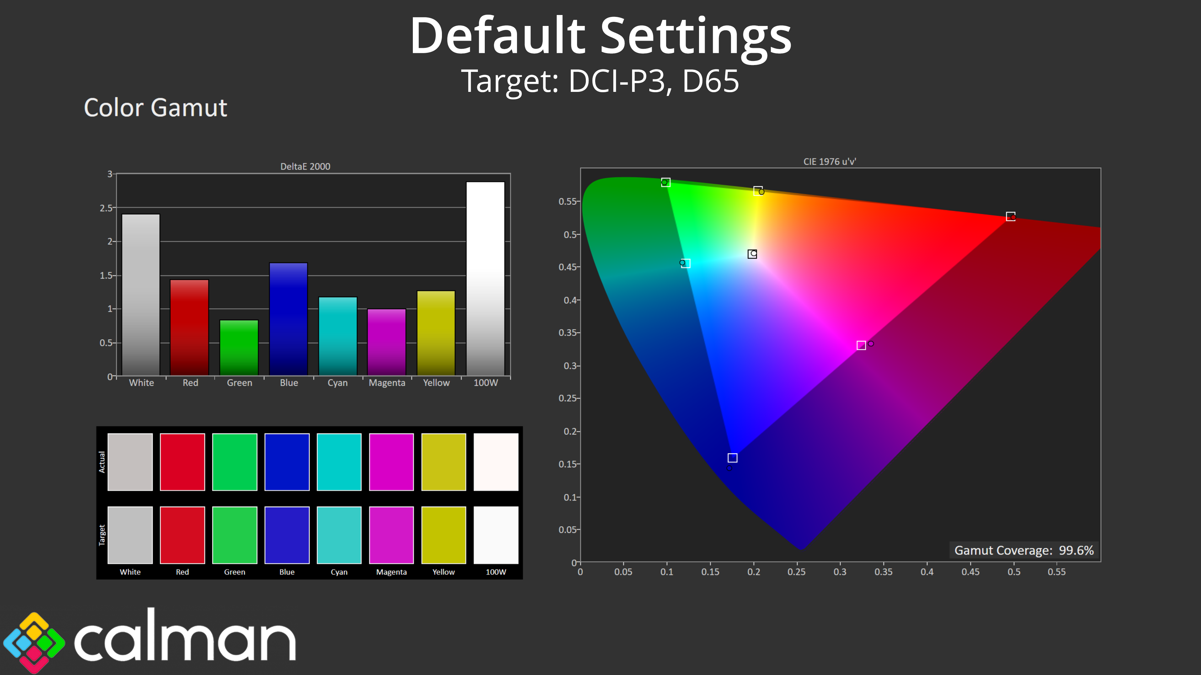
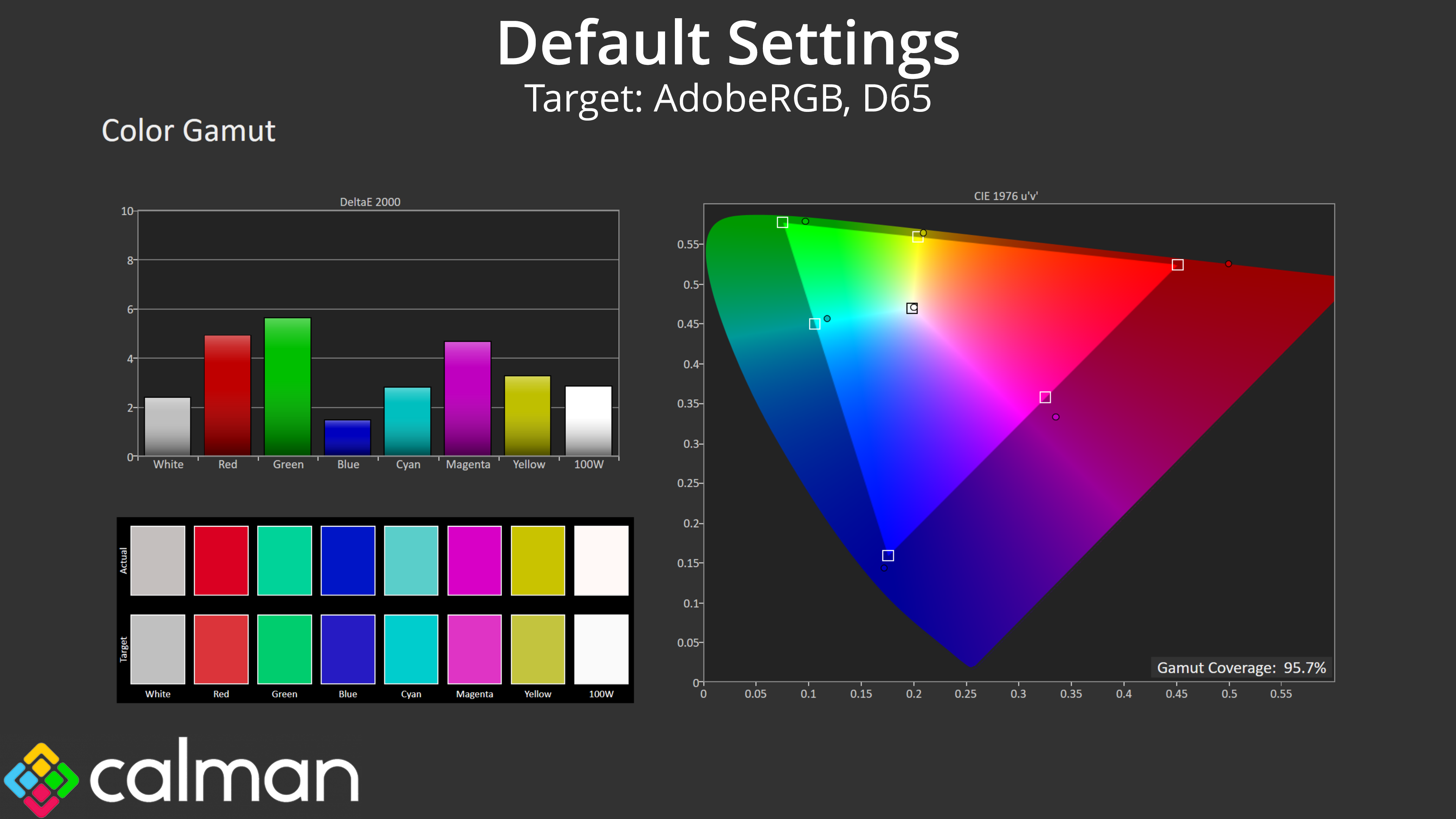
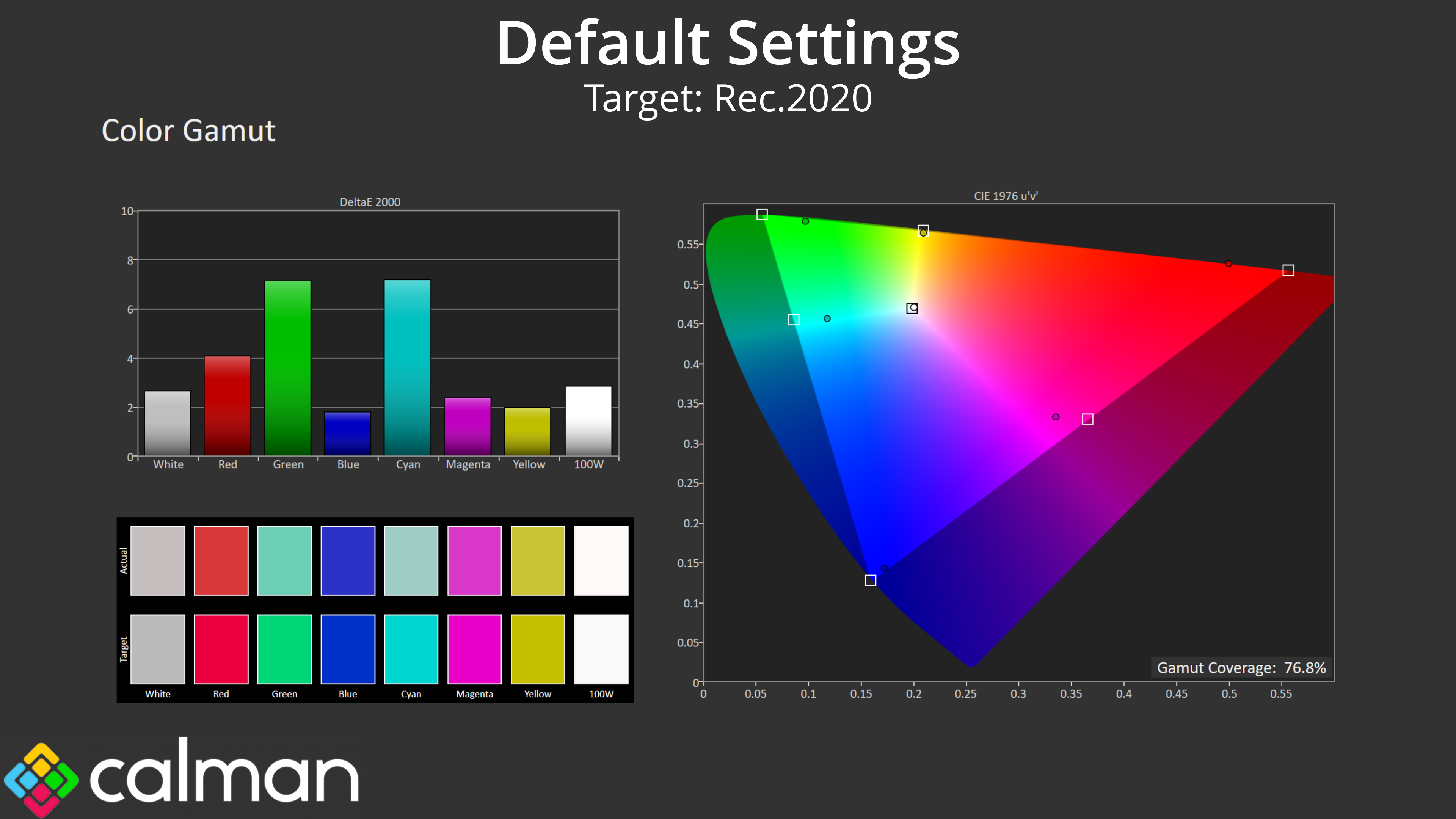
| Colour space | Coverage (%) |
| sRGB | 132.3 |
| DCI-P3 | 99.6 |
| Adobe RGB | 95.7 |
| Rec.2020 | 76.8 |
The PA27JCV is a very wide gamut monitor. We see 132.3% coverage of the sRGB space, and then 99.6% DCI-P3, 95.7% AdobeRGB and 76.8% Rec.2020 reporting. This is a very strong start for the display.
Greyscale
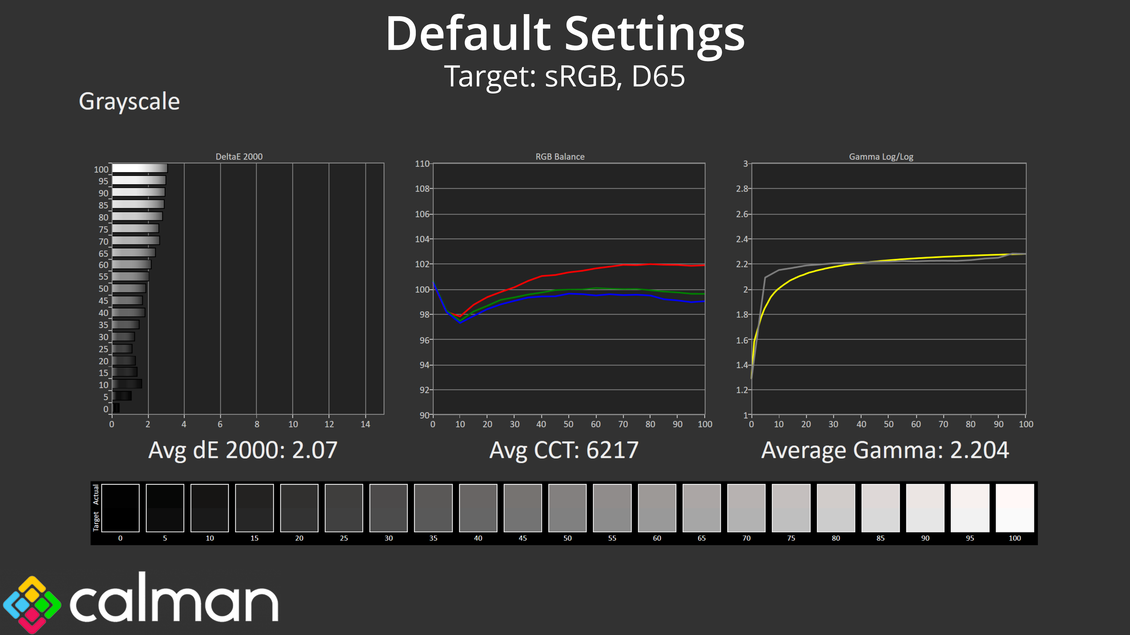
As for default greyscale performance, things are well-tuned out of the box. The colour temperature is fractionally warm, with the average CCT (Correlated Colour Temperature) hitting 6217K, but that's just a 4% deviation from the 6500K target. Gamma is also very accurate, only slightly high in the initial dark shades but then tracks the curve very well from there and averages 2.2 almost exactly. As a result, we get an average greyscale dE 2000 of just 2.07, which is very good.
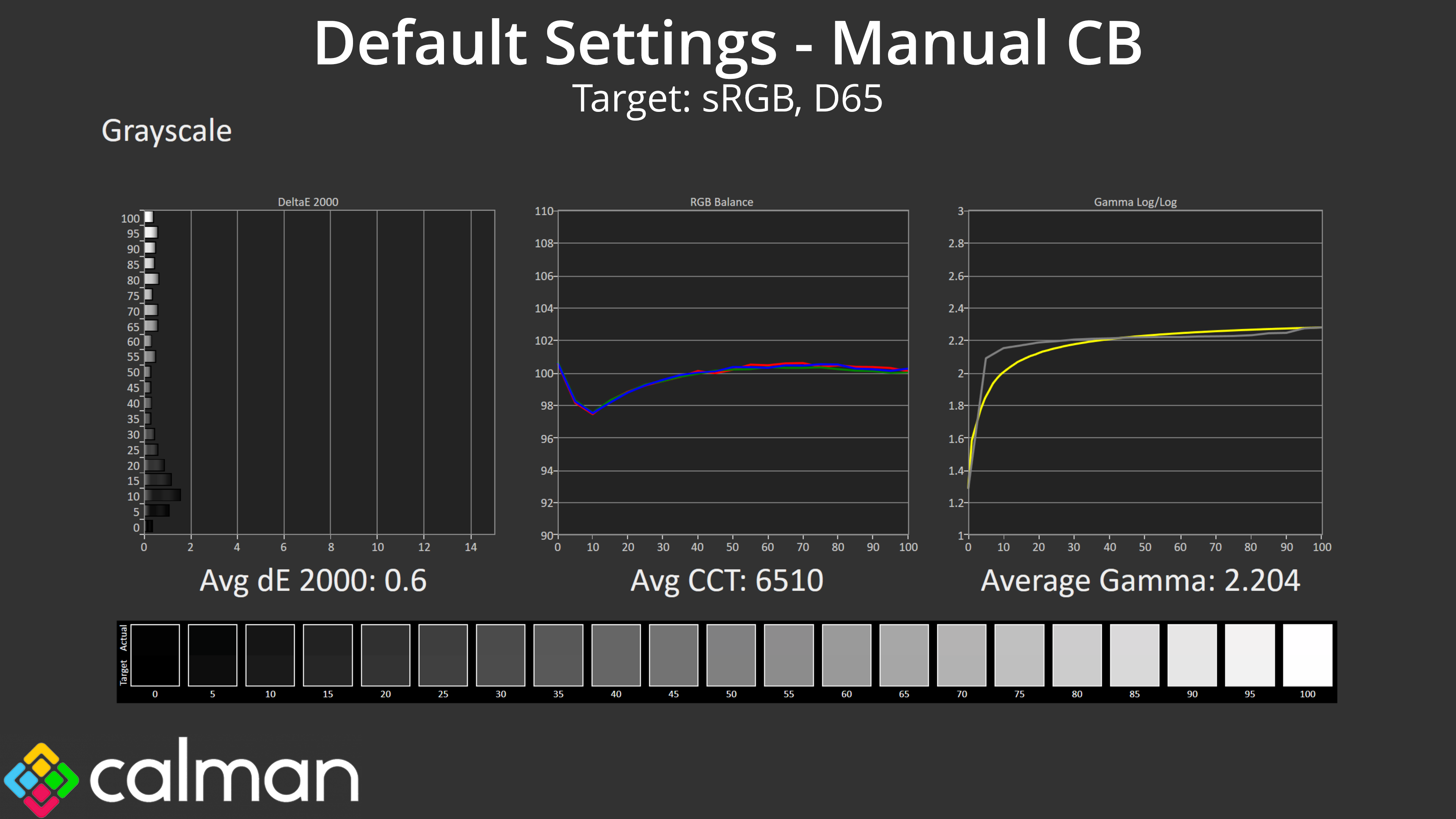
With just one small tweak, I was able to improve the stock results, simply by reducing the Red channel gain from 200 to 190. This improved the average CCT to a near-perfect 6510K, and as a result the average greyscale dE hit just 0.6, a phenomenally good result.
Saturation
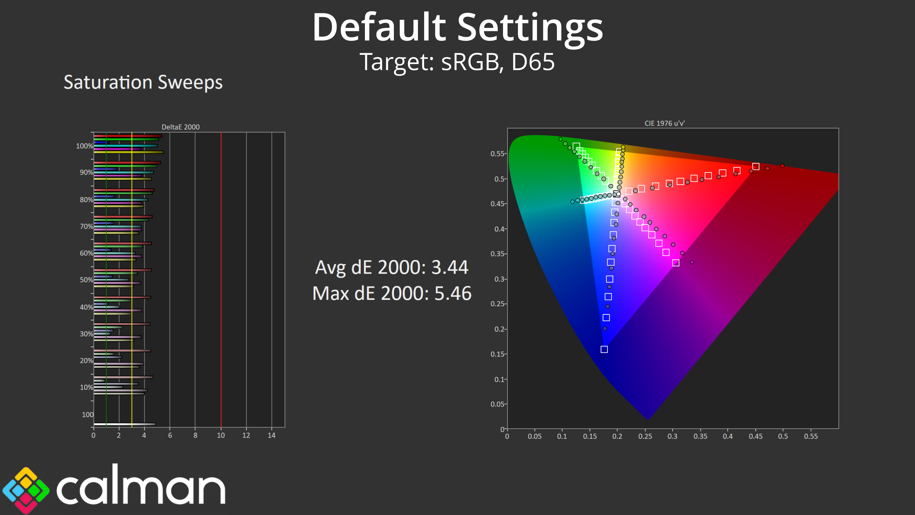
Given how wide the gamut is, it's understandable that our saturation sweeps show a good chunk of inaccuracy relative to the sRGB, with an average dE 2000 of 3.44.
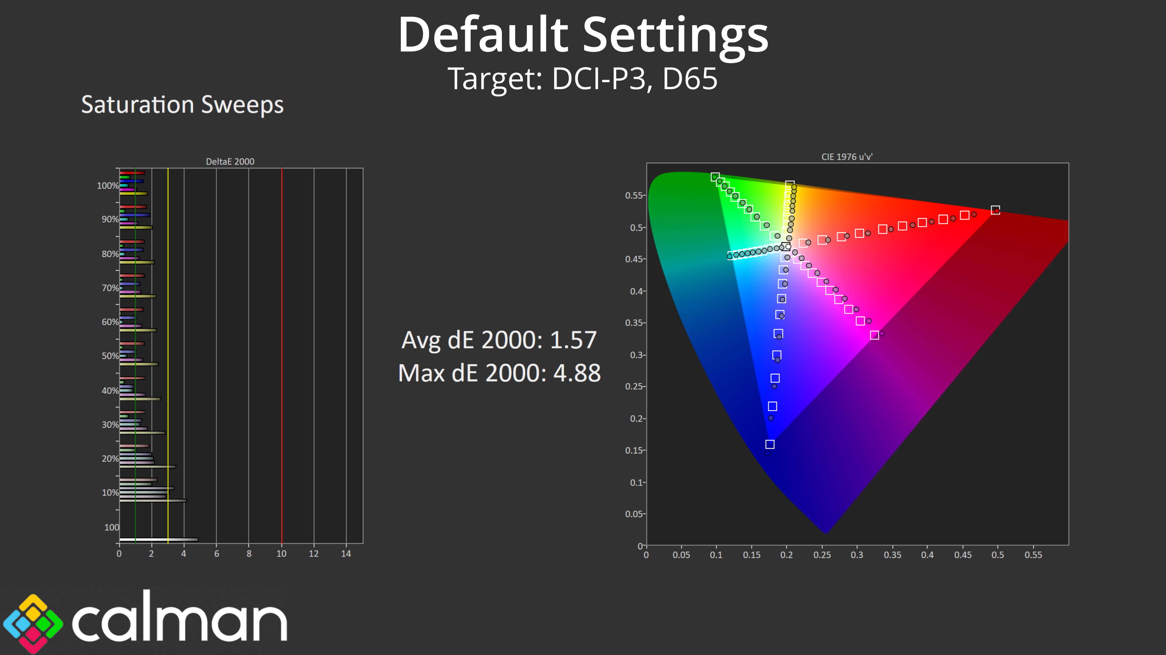
Relative to the DCI-P3 space however, things are more accurate with an average dE of 1.57.
Colour Accuracy
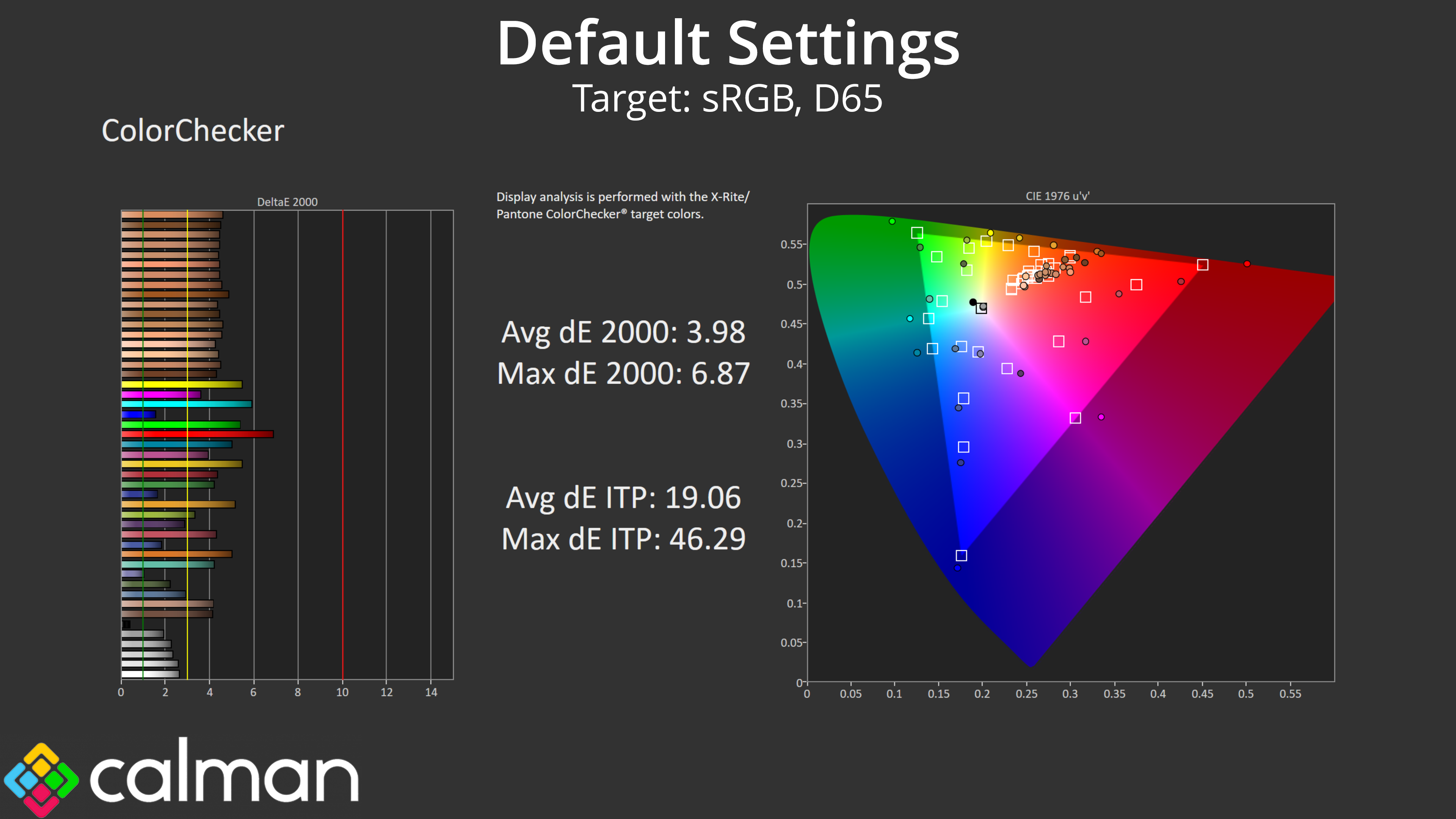
As suspected, high levels of over-saturation mean colour accuracy isn't great when tracking against the sRGB space. Remember, this is with out of the box settings using the native preset – we test again with the sRGB mode below.
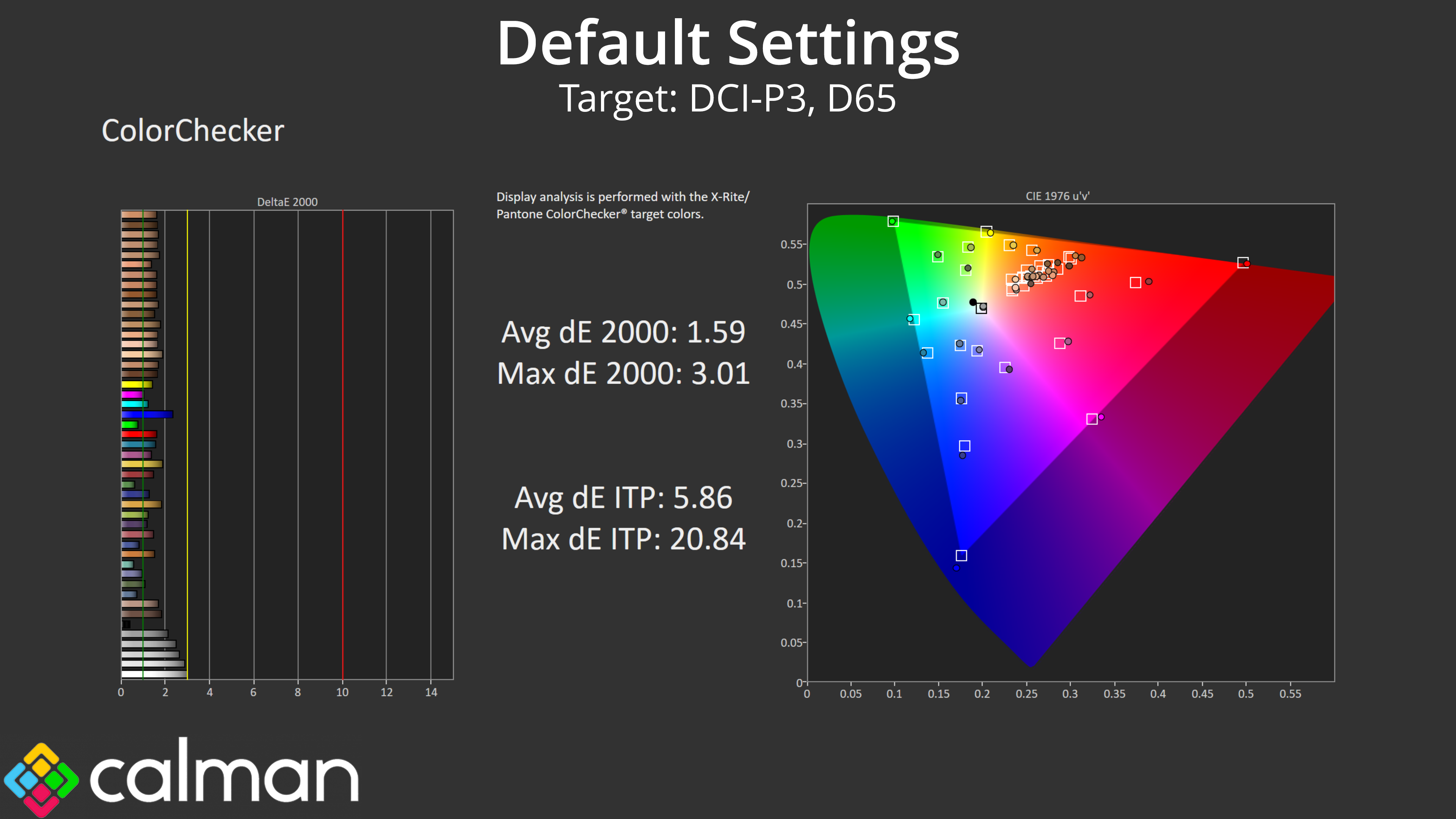
That said, colour accuracy is very good for the DCI-P3 space, even before we enable the DCI-P3 mode! We saw an average dE 2000 of just 1.59, and a maximum of 3.01.
sRGB Emulation Mode
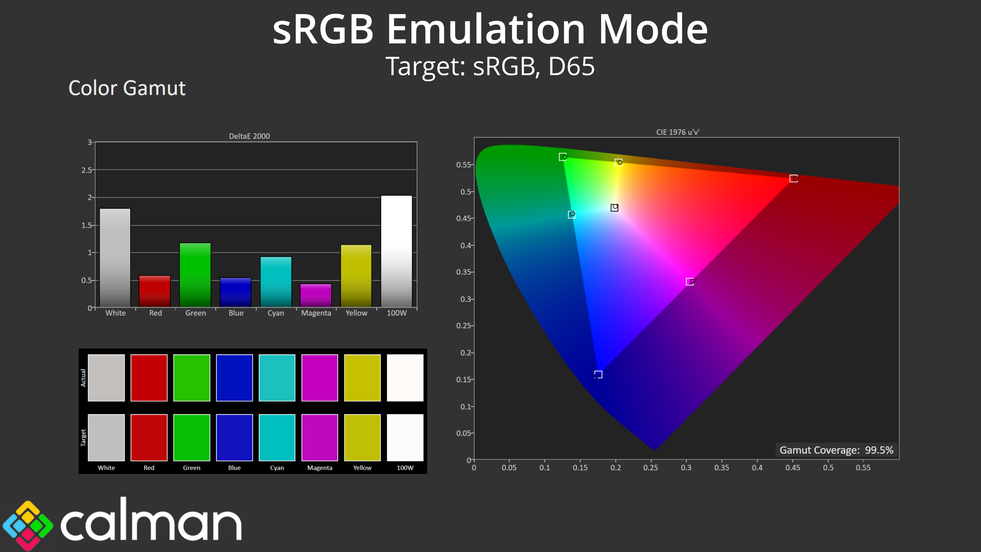
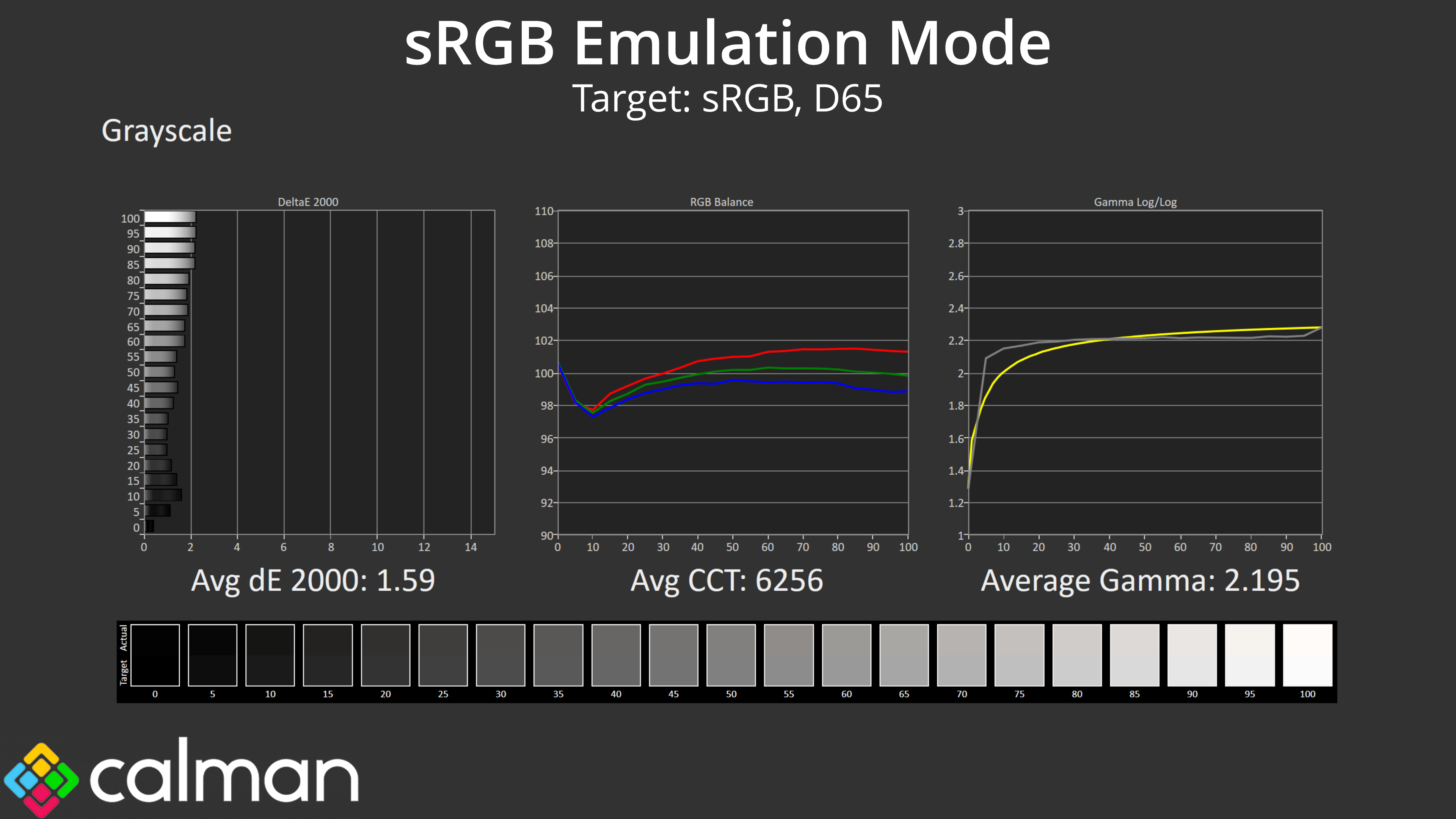
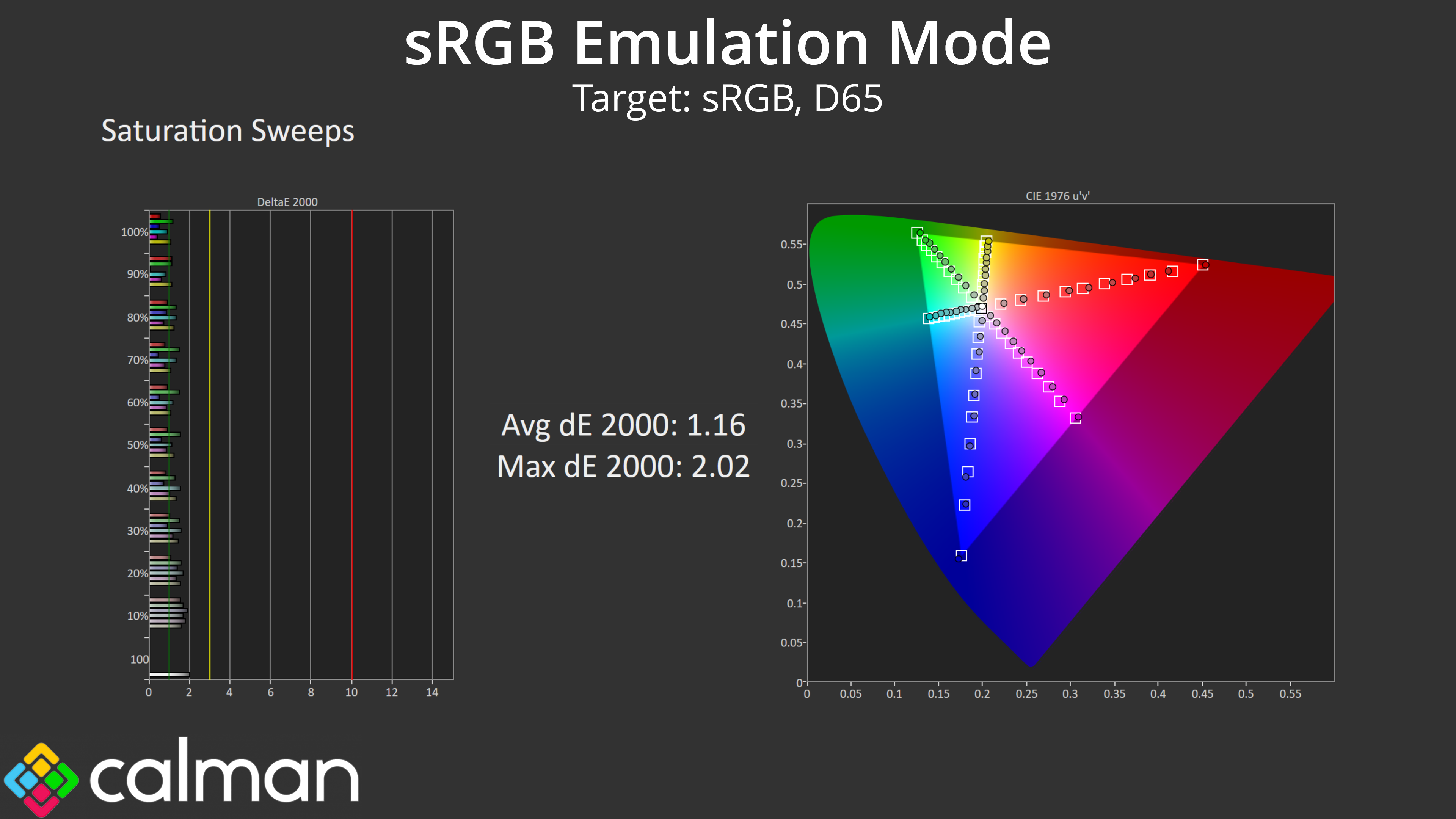
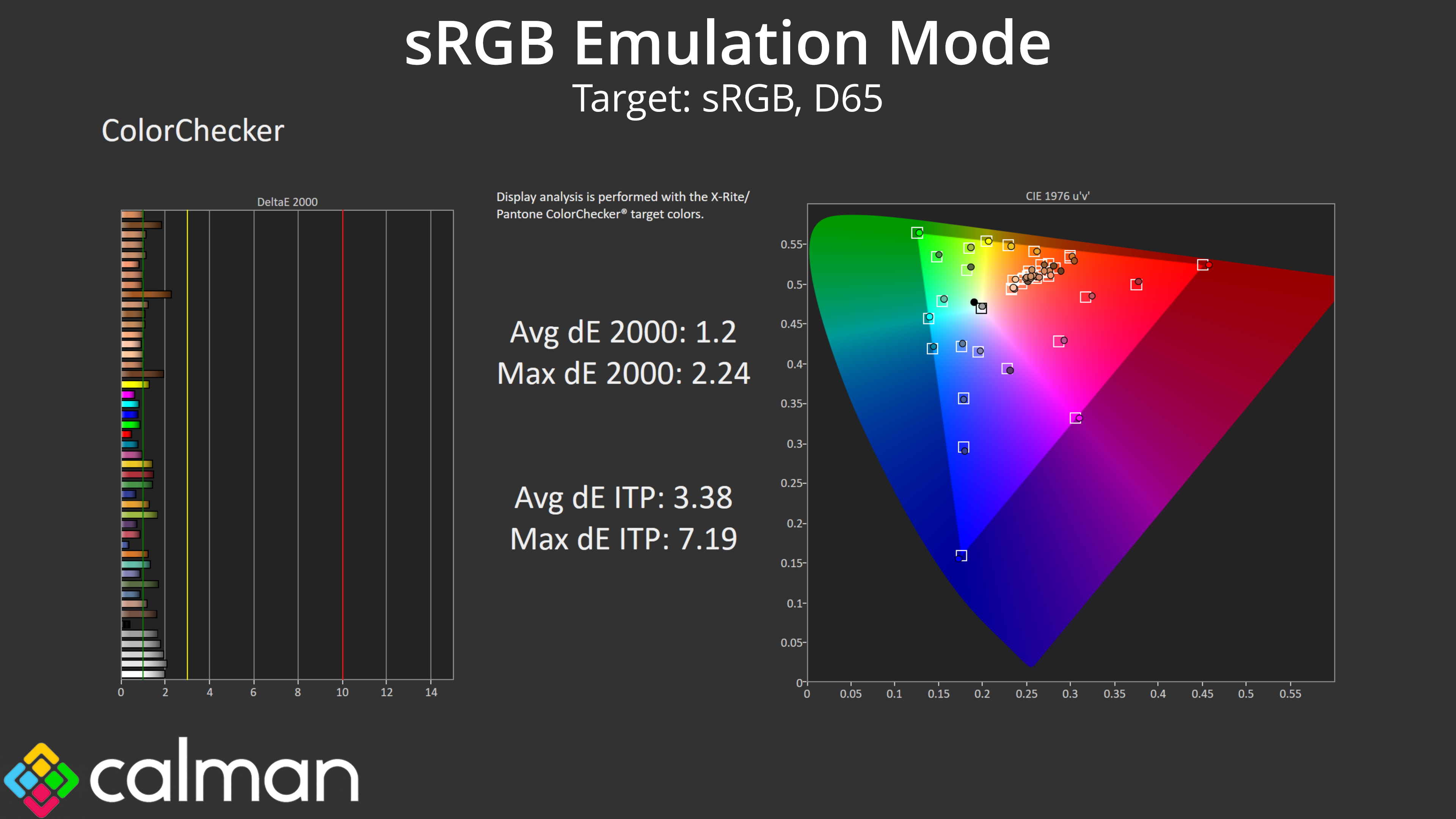
Next up we have the sRGB mode, enabled from within the OSD. This does a very good job at clamping the gamut to prevent over-saturation relative to the sRGB space. It also improves greyscale performance, with a new average dE 2000 of 1.59 – compared to 2.07 using the out of the box settings. It's the saturation and colour accuracy that have improved the most though, as both deliver average dEs of about 1.2 which are excellent results.
DCI-P3 Emulation Mode
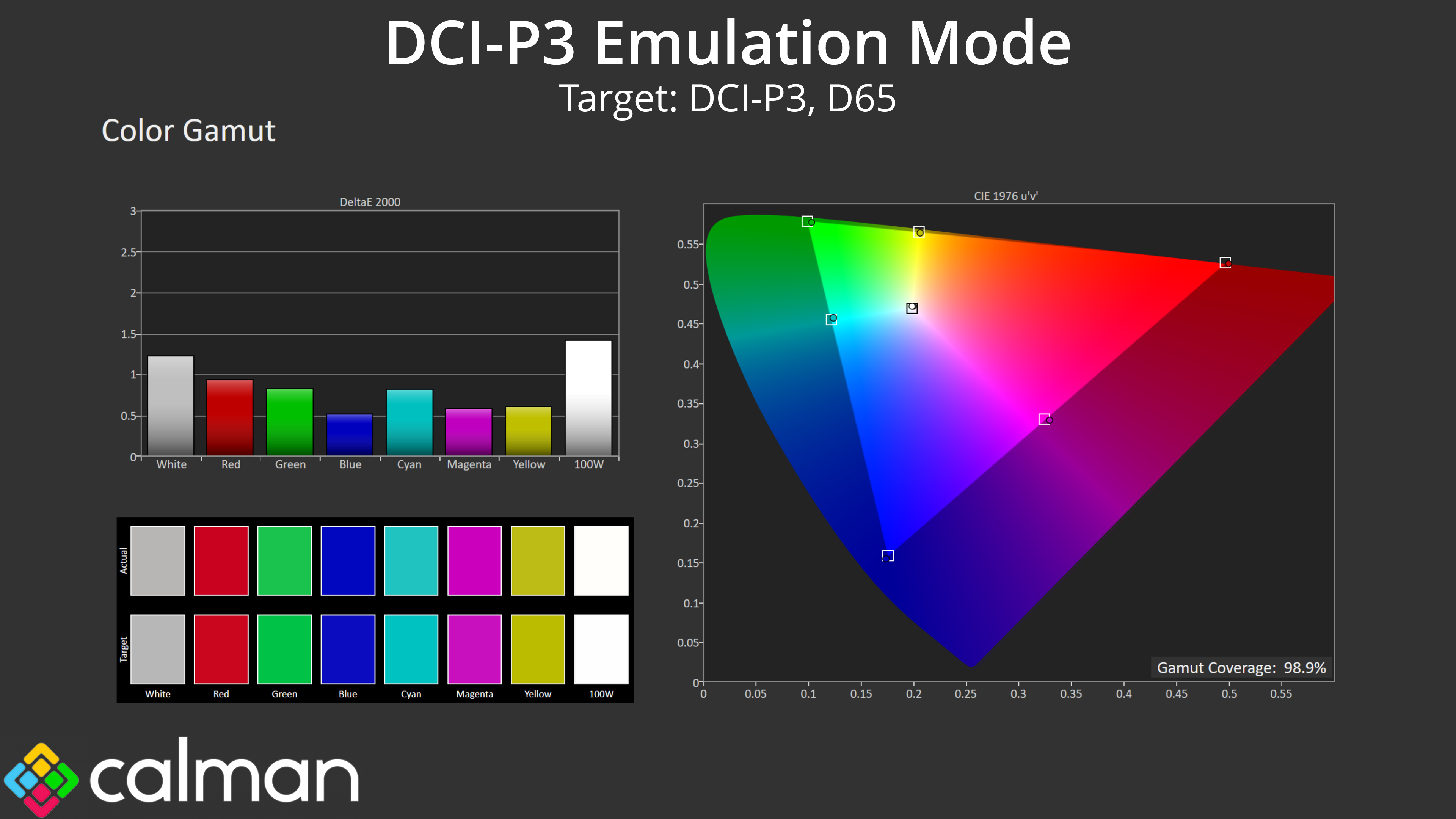
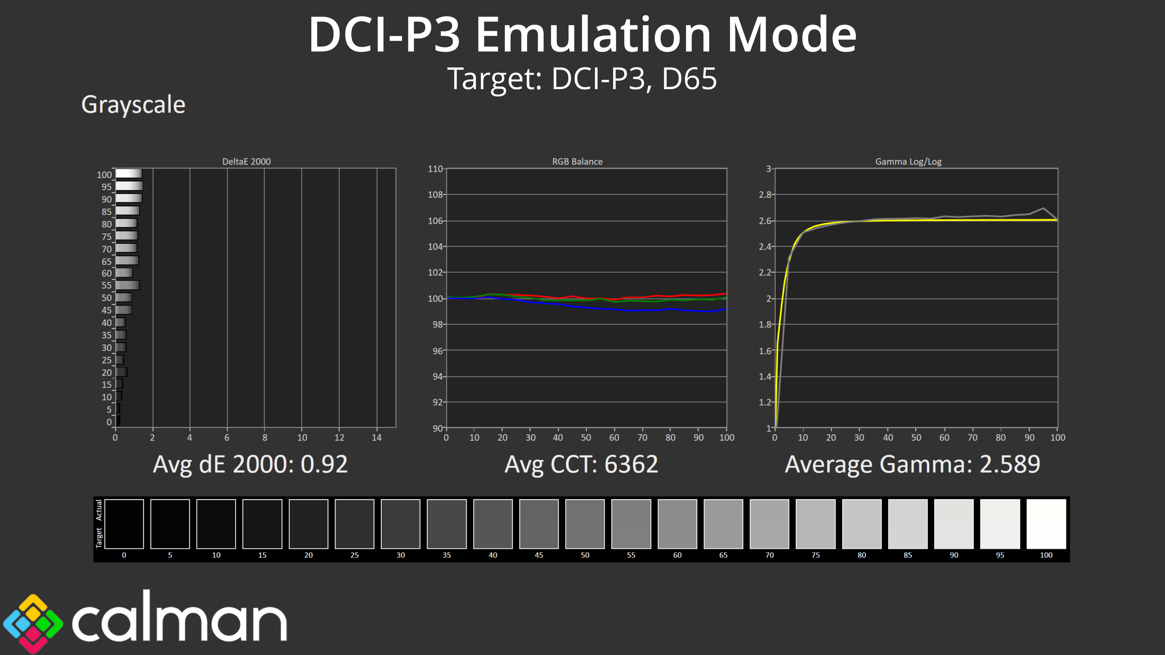

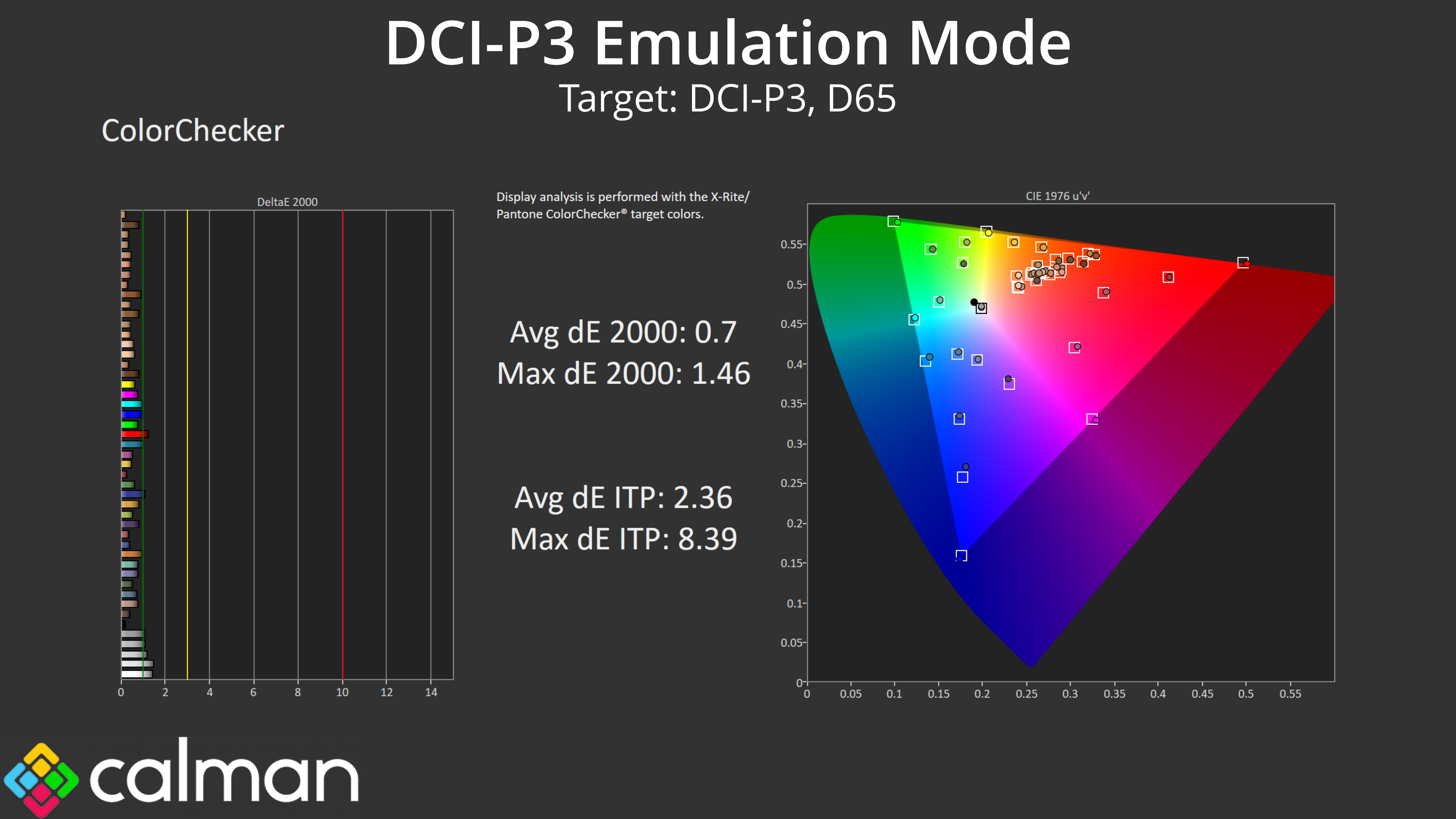
We also tried the DCI-P3 mode and this is even better! I did adjust the colour temperature from the default Theatre-P3 mode to the 6500K target, as that's what Calman tests against, and as you can see, the results are absolutely terrific. Greyscale performance is superb, with excellent gamma tracking and an even better colour balance, resulting in an greyscale average dE 2000 of just 0.92. On top of that, saturation accuracy is silly good, as is colour accuracy – both hit average dEs of about 0.7.
According to Portrait Displays, ‘any error that is smaller than a DeltaE of 1 is generally invisible. It is usually not recommended or useful to continue tweaking settings once all measures are smaller than a DeltaE of 1.' That means the DCI-P3 mode is ready to go for even the most demanding professionals, no tweaking required, and that is highly impressive.
AdobeRGB Emulation Mode
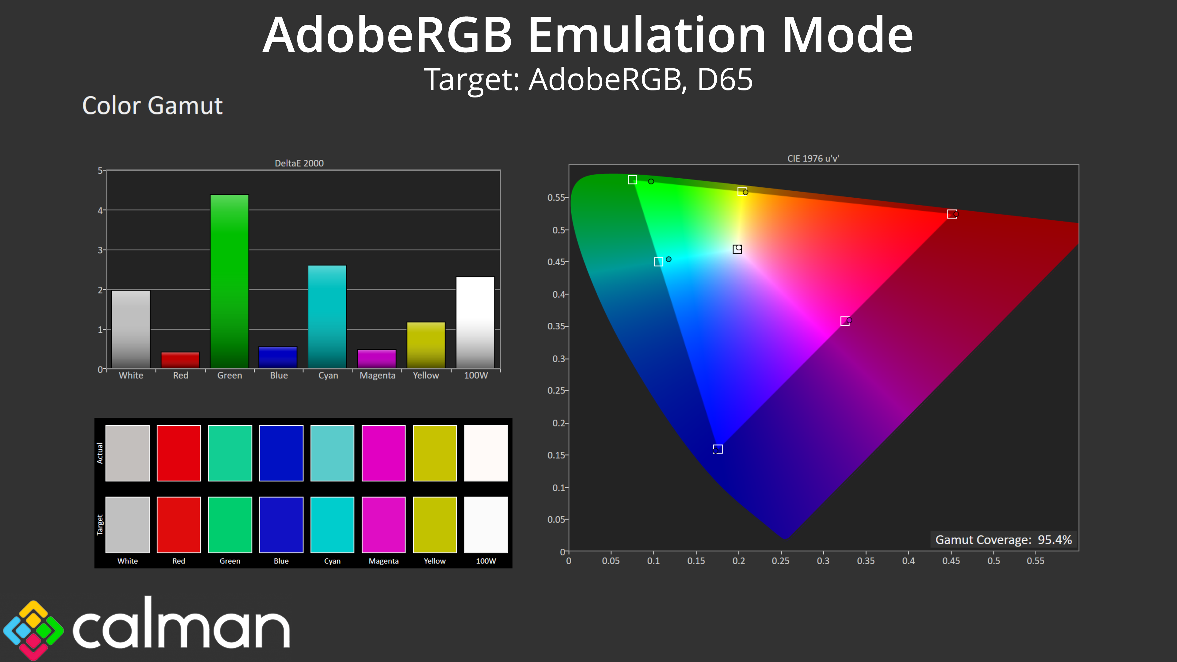
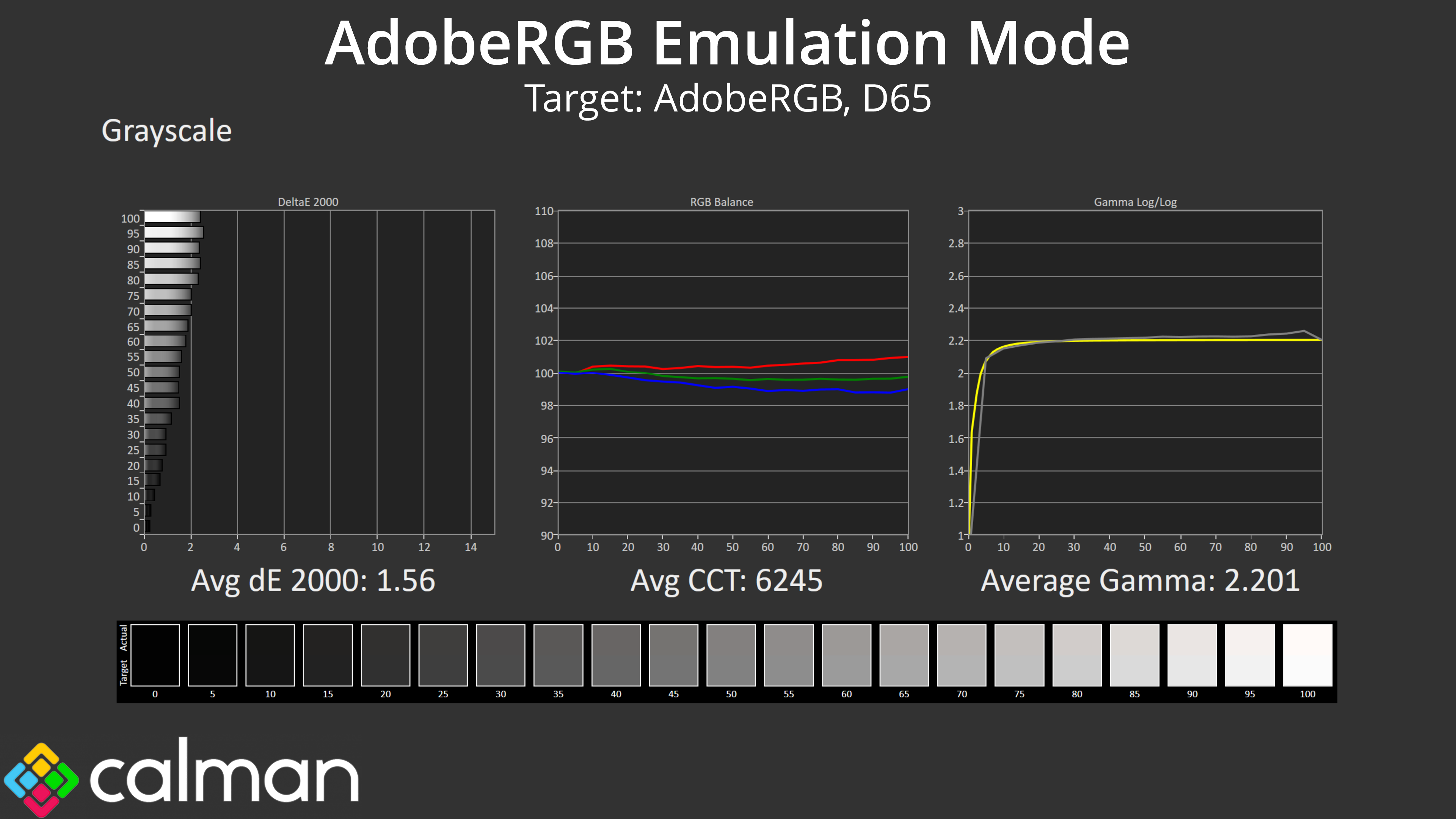
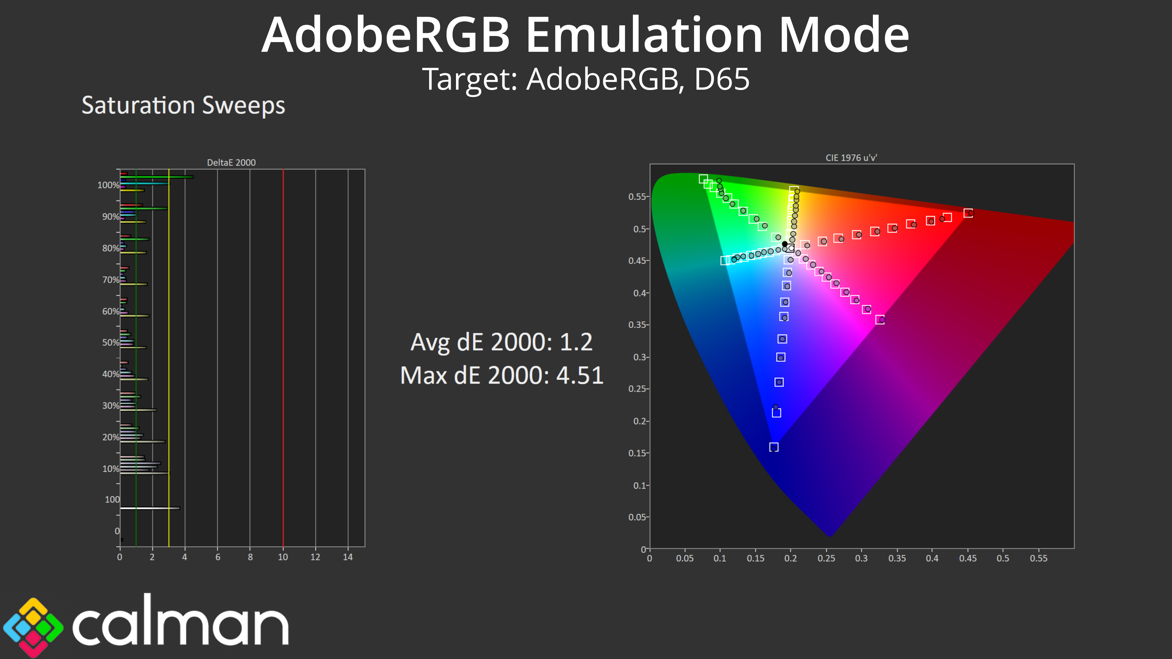

Lastly, I also tested the AdobeRGB mode and this is still very good overall. The PA27JCV can't quite cover the whole AdobeRGB colour space, so a couple of the results – particularly the green and cyan channels – have higher deltaEs. Even then, overall accuracy is still nothing to be sniffed at, with an average ColorChecker dE 2000 of just 1.11.
Calibrated Results
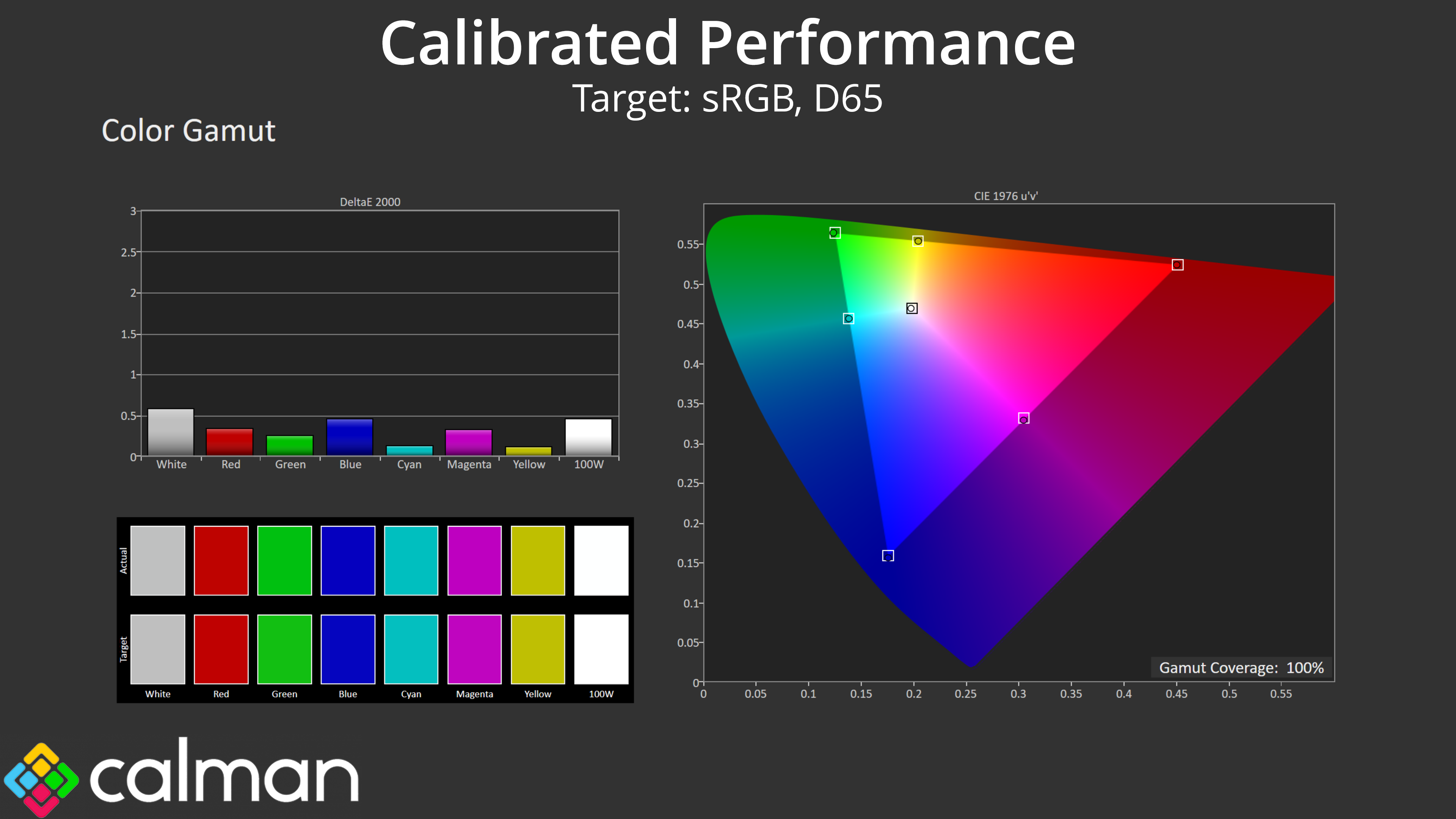
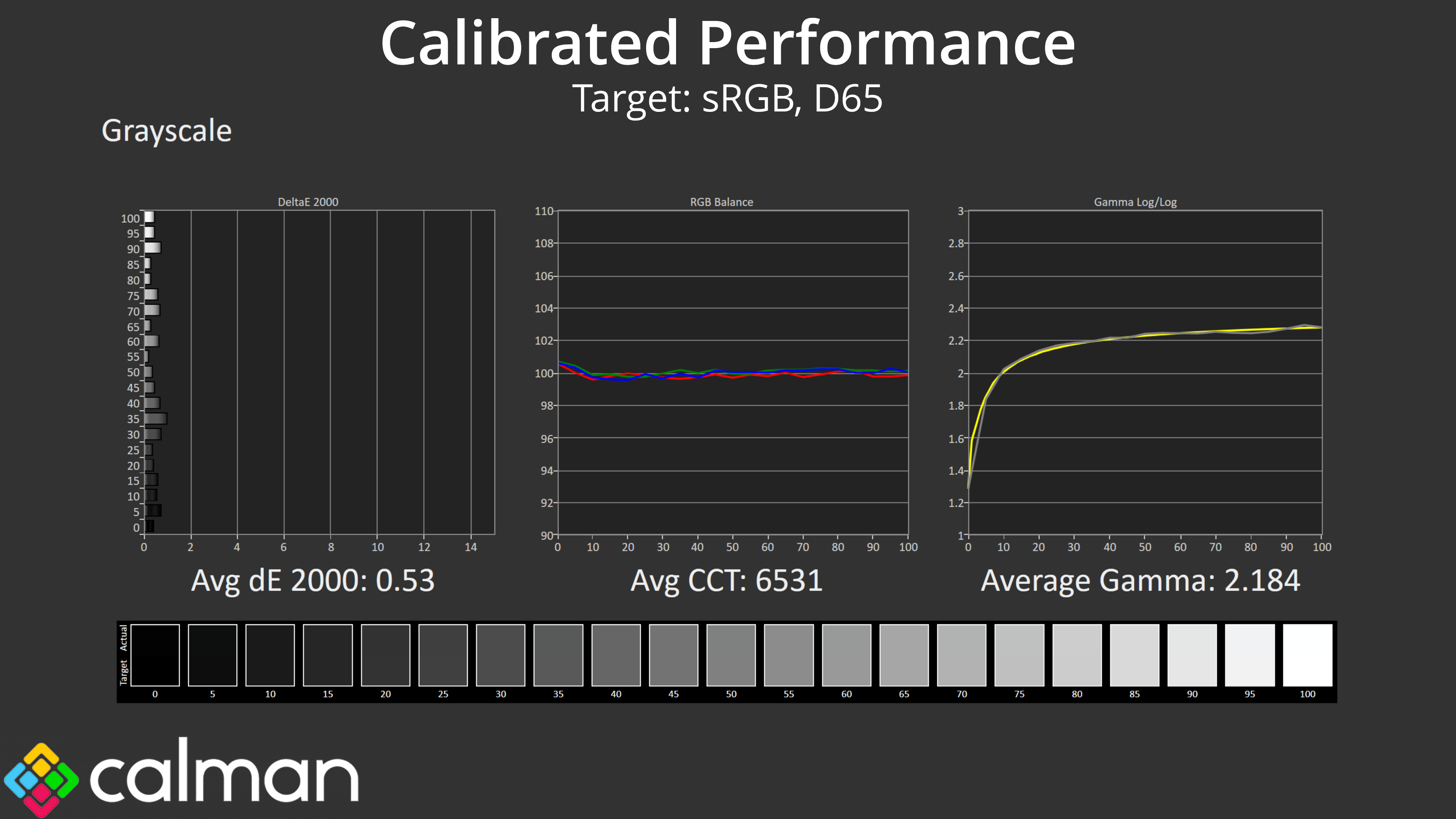

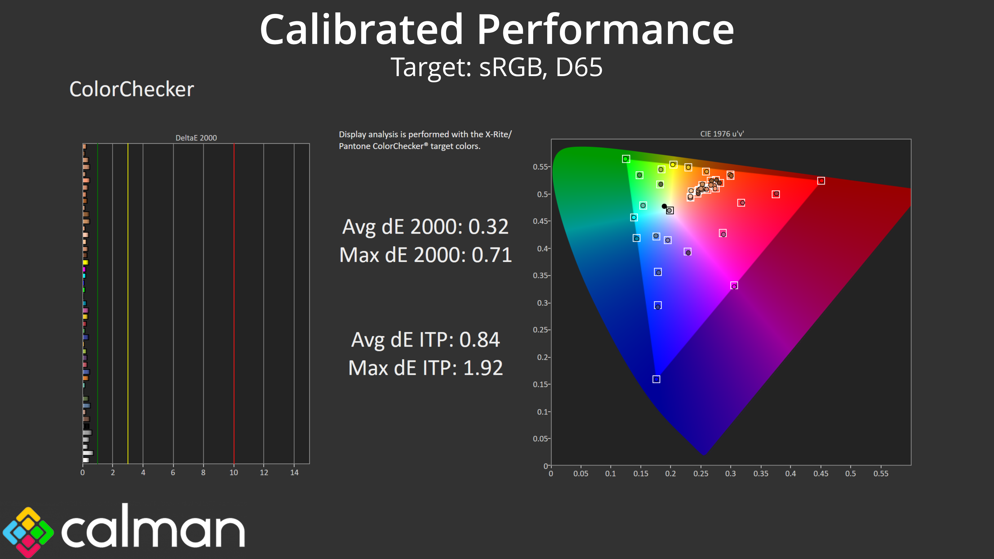
Lastly, I calibrated the display using Calman Ultimate. This delivered the single best set of results I have ever seen from a monitor, with an average greyscale deltaE 2000 of just 0.53, while saturation and ColorChecker results averaged 0.27 and 0.32, respectively.
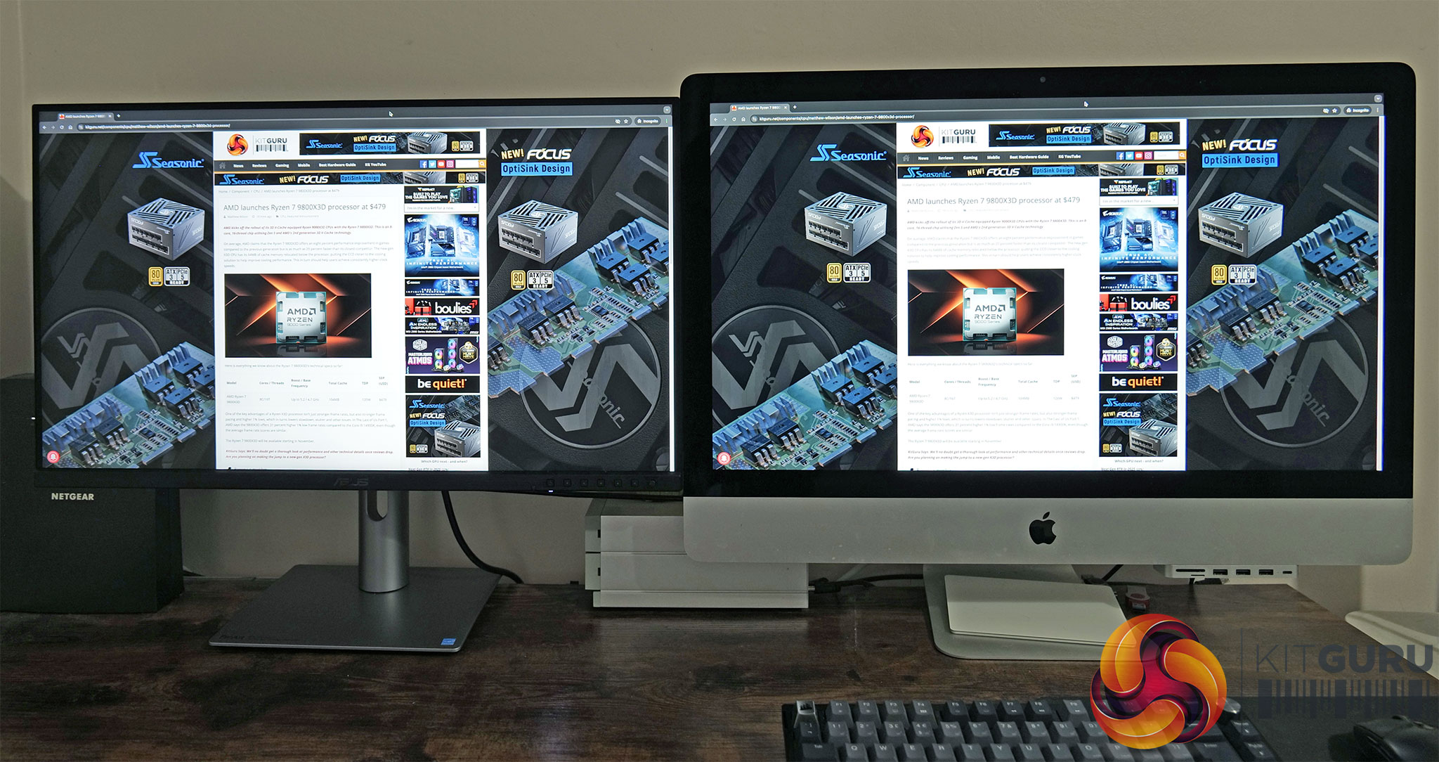
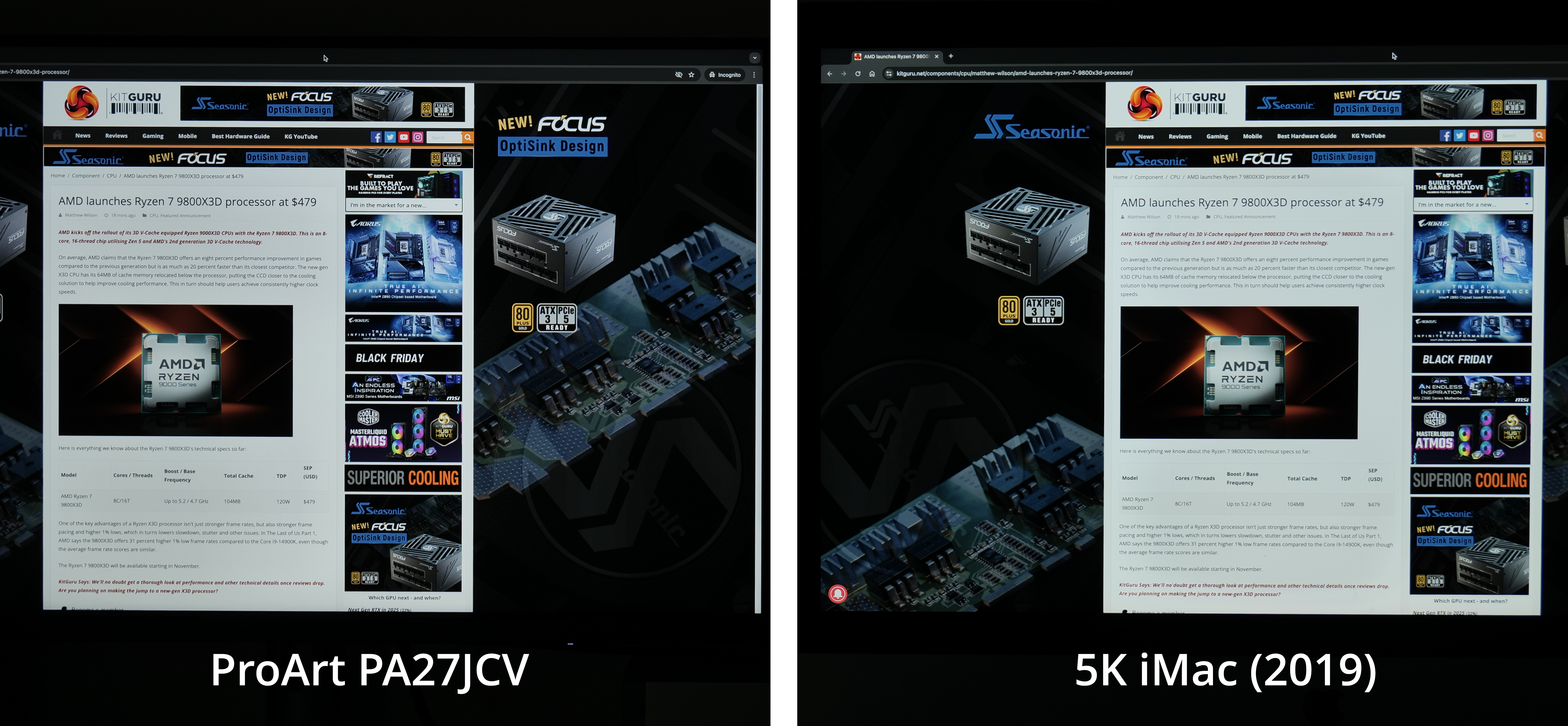
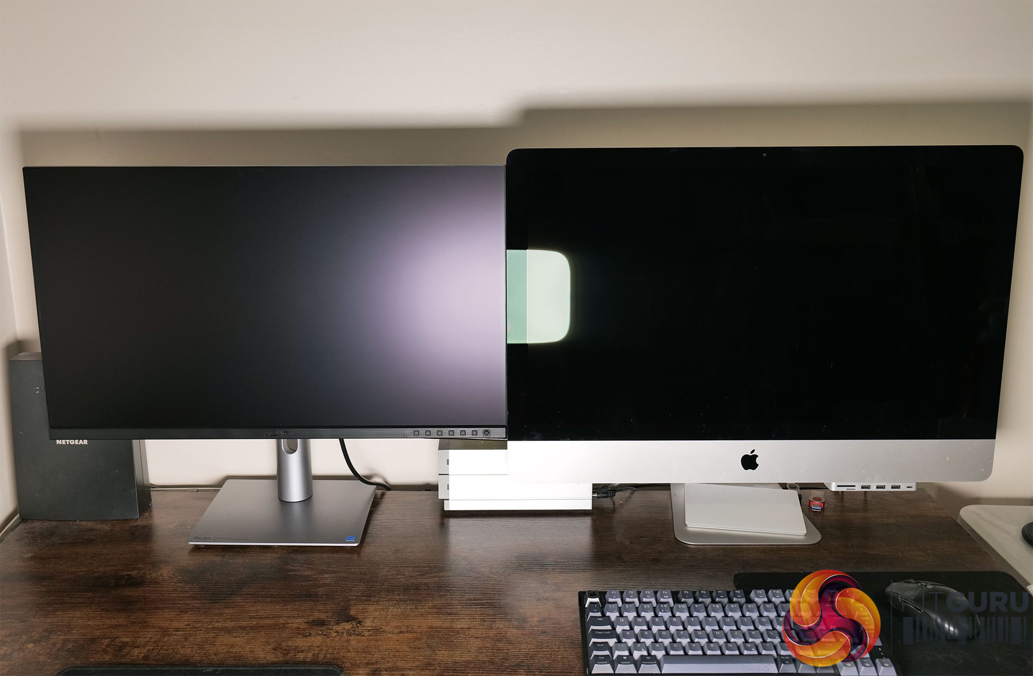
Given a key feature of the ProArt's display is the ‘LuxPixel AGLR (Anti-Glare, Low Reflection)' coating, I thought it was worth taking a closer look. This is quite a hard thing to test objectively, but fortunately I happen to use a 2019 iMac for most of my photo and video work here at KitGuru. This is also a 27in 5K IPS screen, but crucially it has a glossy finish, so I thought it'd make for a good comparison.
I set the two screens up side by side and connected the ProArt to the iMac via USB-C, so the ProArt was mirroring my iMac display. This means we're not dealing with how different operating systems may handle text or image scaling – it's as close to an apples-to-apples comparison as we could get. I also adjusted both monitors to output at 200 nits – to be specific, the closest I could match them was with the PA27JCV at 203 nits and the iMac at 206.4 nits. Both are running factory settings and colour balance was locked on my camera – the difference in white balance you can see below is just down to the factory calibration.
Click to enlarge. Please note: the above images are large files and may take a moment or two to open.
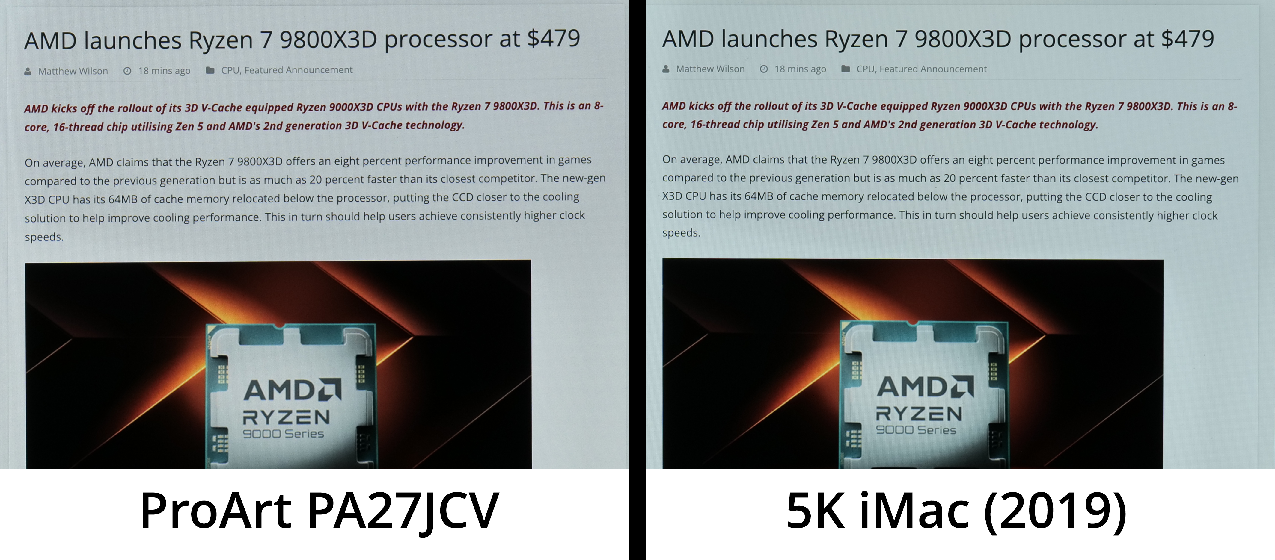
In essence, I took a photo of our website open on both screens and have compared them here. I have not processed the images in any way, except in the second one where I have cropped in and placed each photo side by side.
The differences may not be immediately apparent, especially from the first image which has not been cropped in at all. However, I believe in the second image you can get a slightly better look at the difference in coating. To my eye, the iMac looks slightly sharper, and lacks the slight coating grain that I believe is visible on the ProArt. Of course, the differences are not large, but we were asked to take a look at the coating and see how it affects the image, so it's well worth including.
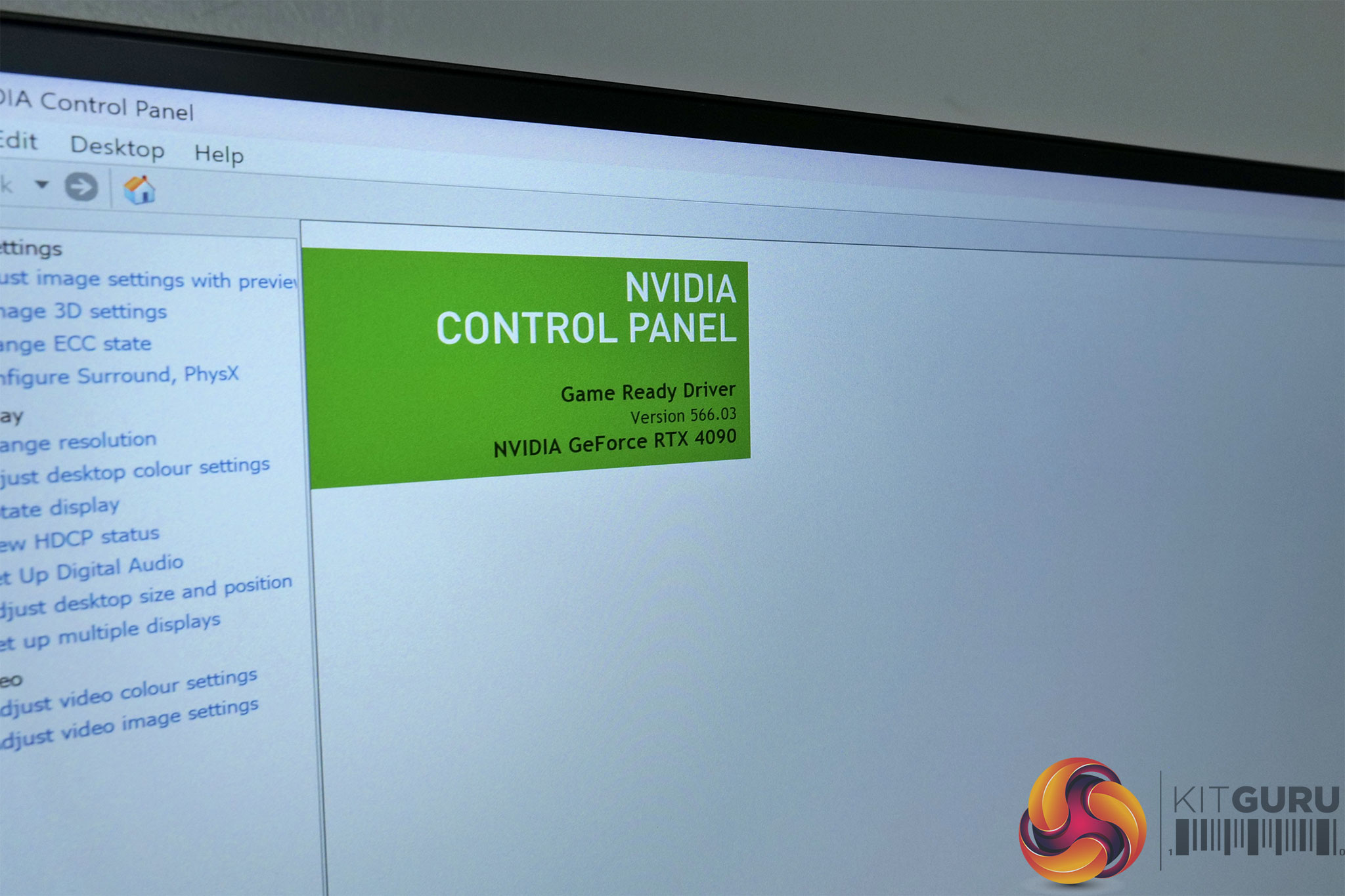
Above you can see another photo of the ProArt PA27JCV with the Nvidia Control Panel open. This gives us another look at the coating grain that is visible. To be clear, I really don't think it is particularly bad or overly distracting, especially if you sit at a normal viewing distance. It may just depend how close you are to the screen, and how sensitive you are to this sort of thing, as to how much this is a factor for you with your potential buying decision.
Obviously, the benefit of the matte coating is that is significantly reduces harsh, mirror-like reflections. For the image above, I positioned an Elgato Key Light right in the middle of both monitors and set it to 50% brightness. You can see a perfect outline of the LED panel on the iMac, but it's very diffuse on the ProArt.
Here's another example, this time of just the ProArt. These photos was taken with the monitor facing a large window, catching a lot of natural light. The photo on the left is with the display turned off, and the photo on the right is with the screen turned on and just sitting on the desktop. Both were taken from the same position in the same conditions.
The photo above is with the monitor in the exact same place and in the same conditions, but I just shifted the camera's position so it acts as a reference point.
Monitor response time testing is a new addition to our reviews, where we use the Open Source Response Time Tool (OSRTT), developed by TechTeamGB. This measures grey-to-grey response times and presents the results in a series of heatmaps, the style of which you may be familiar with from other reviews.
Initial Response Time is the time taken for the panel to transition from one colour to another, where lower values are better. We present the initial response time, so overshoot is not taken into account and is measured separately. We use a fixed RGB 5 tolerance for each transition.
Overshoot is the term given for when a monitor's transition exceeds or goes beyond its target value. So if a monitor was meant to transition from RGB 0 to RGB 55, but it hits RGB 60 before settling back down at RGB 55, that is overshoot. This is presented as RGB values in the heatmaps – i.e. how many RGB values past the intended target were measured.
Visual Response Rating is a metric designed to ‘score' a panel's visual performance, incorporating both response times and overdrive. Fast response times with little to no overshoot will score well, while slow response times or those with significant overshoot will score poorly.
We test the PA27JCV at 60Hz. ASUS calls overdrive ‘Trace Free' and offers settings of 0, 20, 40, 60, 80, and 100. We tested settings 40, 60, and 80.
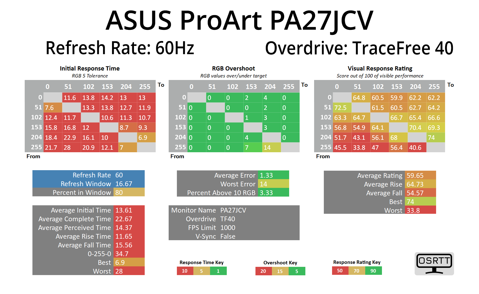
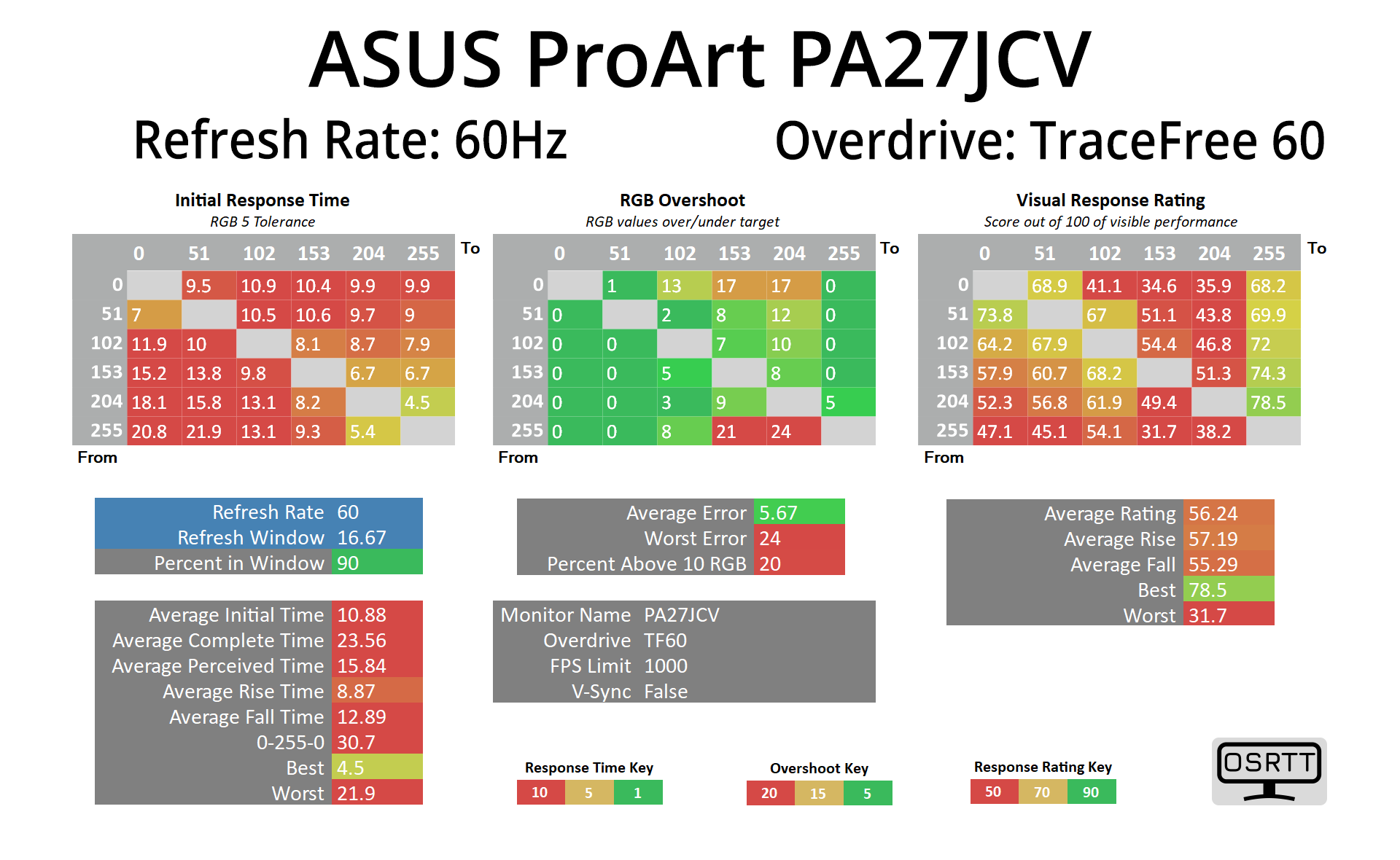
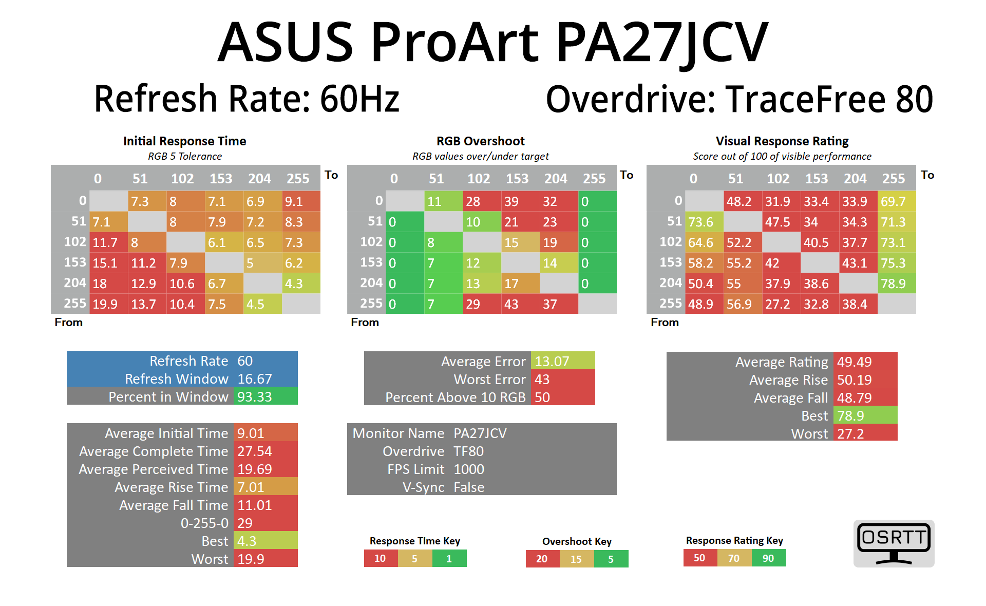
Clearly, the PA27JCV is a professional monitor and not something aimed at gamers. However, I still thought it would be interesting to measure response times. Out of the box, the screen defaults to the Trace Free 60 setting, and I'd say that is the best one to use. It's not particularly fast, with an average response time of 10.88ms, but that's still well inside the 16.67ms window needed for 60Hz compliance, and it has minimal overshoot. The Trace Free 80 setting is only slightly faster, averaging 9.01ms, but the overshoot becomes noticeable at this setting.
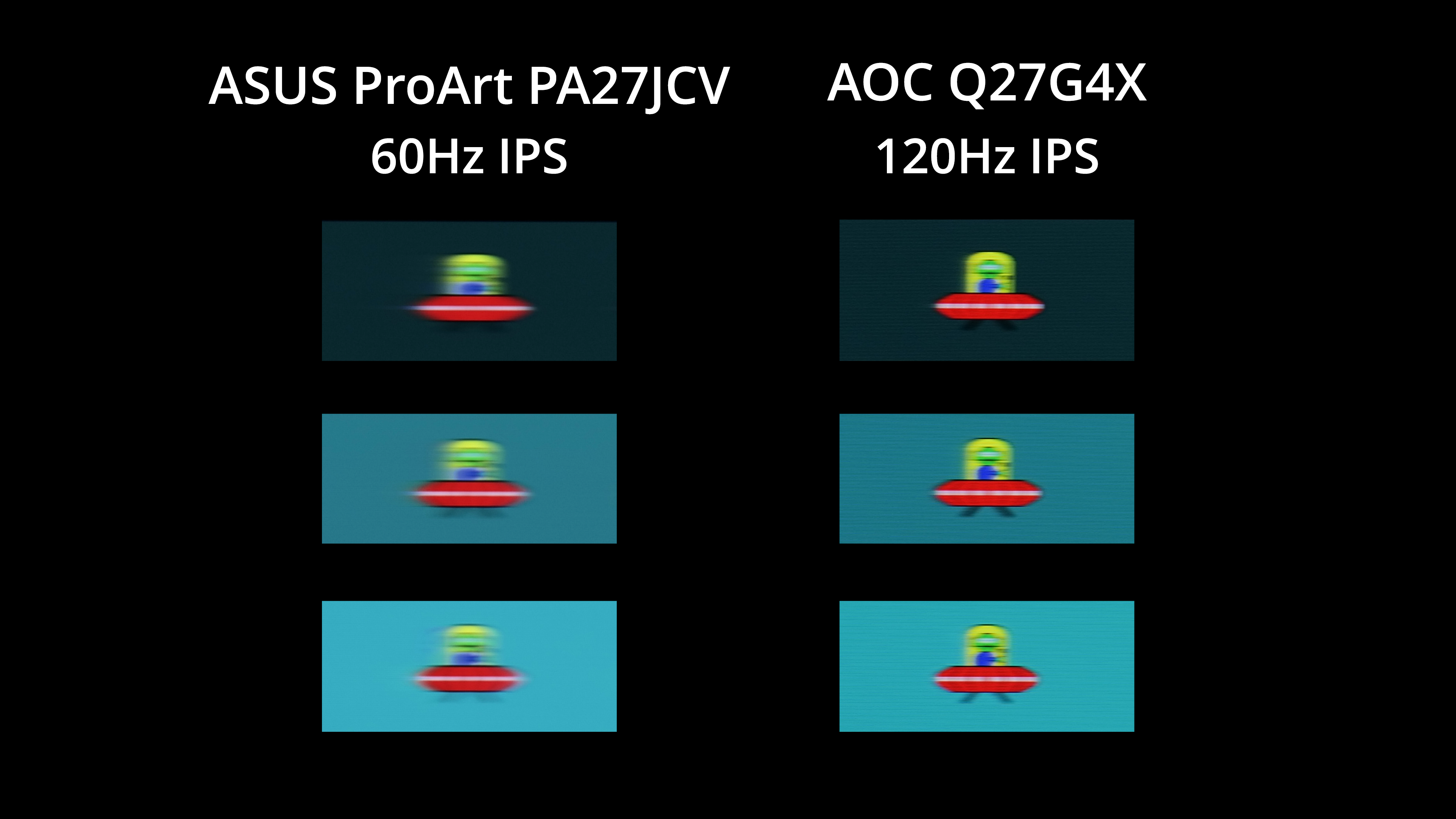
We did get a request to include an example of motion clarity, given the PA27JCV is only a 60Hz refresh. Some professional monitors are now making the switch to 120Hz, and while I haven't reviewed any of those, I did run a quick test on the AOC Q27G4X, a budget 1440p 180Hz IPS screen (though I ran it at 120Hz for the purposes of this test).
As you can see, there is a fair amount of motion blur visible from the PA27JCV, as we'd expect. The Q27G4X looks substantially clearer. Of course, you can argue as to whether or not a professional screen like the ProArt needs a refresh above 60Hz, and it may not be a factor for many considering this type of screen, but we thought it was worth including the comparison so you can make your own decision.
We again use the Open Source Response Time Tool (OSRTT), developed by TechTeamGB, to report monitor input latency.
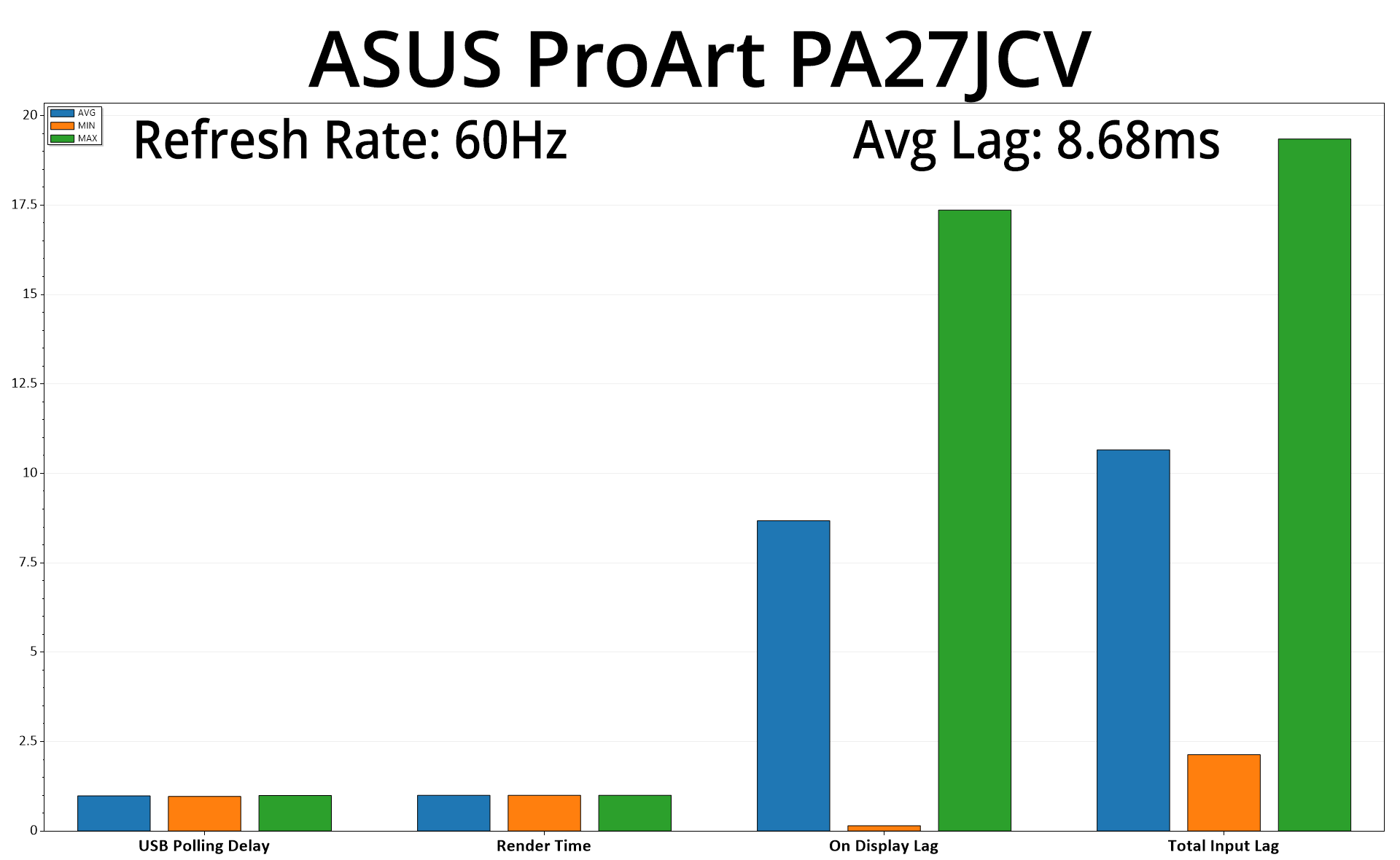
As expected from a 60Hz panel, there's more input latency than we'd typically see from the high refresh-rate monitors I usually review. Even then, the average lag of 8.68ms barely equates to half a frame at 60Hz, so it's nothing to worry about.
It's been fascinating to test the ASUS ProArt PA27JCV for the last week, given its target market is a world away from the gaming screens I am used to reviewing. This is clearly designed for professional use, and discerning professional users at that, and I have to say ASUS has done a great job overall.
That's not to say the PA27JCV is perfect, and I'll get my biggest criticism out the way first – the build quality is a let down. Considering this is a $799 monitor, I'd expect a premium metal stand, not the mostly plastic construction that we have instead. I get that the panel itself is the main attraction here, and while the overall design is clean and modern, I just don't think it makes the best first impression given how much plastic is used throughout the build.
The other niggle is perhaps more subjective, but it's worth pointing out the PA27JCV uses what ASUS calls ‘LuxPixel AGLR (Anti-Glare, Low Reflection)'. In other words, it's a fairly strong matte coating, and while ASUS claims ‘the user only sees accurate colors and sharp details' thanks to the LuxPixel tech, some coating grain is still visible. Compared against a 5K Apple iMac (2019), I did find myself preferring the appearance of text on the Apple display, but everyone has their own preference when it comes to gloss vs matte.
However, if you're not too fussed about either of those points and just want a good-looking, easy-to-use professional monitor that has strong colour accuracy and plenty of features… well, the PA27JCV delivers in spades. I made a point of showing every single page and setting within the OSD menu as ASUS has done a really good job at catering to the needs of professional and creative types with just how feature-rich the OSD is, not to mention the built-in KVM support and 96W PD on offer from a rear USB-C port.
On top of that, this has to go down as the most colour accurate display I have ever tested. Out of the box results are good in their own right, with contrast hitting 1500:1 being a particular highlight for the IPS panel. However, ASUS' colour space modes are supremely well configured, to the point where anyone using the sRGB or DCI-P3 modes wouldn't even need to bother with calibration – they are that good.
The DCI-P3 mode is a particular highlight, delivering average deltaE results below 1 for greyscale performance, saturation and colour accuracy, alongside near-perfect gamma tracking. Anyone working in that colour space is in for a treat with the PA27JCV. The only downside to that is the PA27JCV won't be a viable option for those looking for real HDR support, given it's only DisplayHDR 500 certified. I don't see that as a big issue, though, as it's all relative to price and real pro-grade HDR monitors are considerably more expensive, but it is worth pointing out.
Overall, if you are in the market for a pro-grade screen, the ASUS ProArt PA27JCV is well worth picking up. It retails for $799 in the US, so hopefully the conversion rate will be kind to those of us on the other side of the Atlantic!
Discuss on our Facebook page HERE.
Pros
- Tremendously well-configured colour modes (sRGB, DCI-P3, AdobeRGB).
- Even the out of the box performance is very good before any settings are tweaked.
- Very high contrast for an IPS panel.
- Feature-rich OSD.
- Auto-KVM feature works well, with one Type-C port offering 96W PD.
- One HDMI 2.1 input alongside plentiful USB ports.
- 5K resolution at the 27in screen size is pin-sharp.
- Matte coating prevents harsh reflections.
- Looks smart and sleek.
Cons
- I'd expect a metal stand and generally better build quality at this price.
- Matte coating has some grain and won't be for everyone.
- Lacks real HDR support given the DisplayHDR 500 certification.
KitGuru says: With an all-metal stand, this would be a near-perfect monitor. It's still bloomin' good, though, thanks to its incredible colour accuracy and extensive featureset.