

Our main test involves using an X-Rite i1 Display Pro Plus colorimeter and utilising Portrait Displays' Calman Ultimate software. The device sits on top of the screen while the software generates colour tones and patterns, which it compares against predetermined values to work out how accurate the screen is.
The results show:
- A monitor’s maximum brightness in candelas or cd/m2 at various levels set in the OSD.
- A monitor’s contrast ratio at various brightness levels in the OSD.
- Gamut coverage, primarily focusing on sRGB and DCI-P3 colour spaces.
- Greyscale accuracy, measured across 20 shades, with an average colour balance reported.
- The exact gamma levels, with a comparison against preset settings in the OSD.
- The colour accuracy, expressed as a Delta E ratio, with a result under 3 being fine for normal use, and under 2 being great for colour-accurate design work.
We first run these tests with the display in its out-of-the-box state, with all settings on default. If there is an sRGB emulation option or other useful mode then we may test that too. We then calibrate the screen using the Calman Ultimate software and run the tests again.
You can read more about our test methodology HERE.
Default settings
Brightness and Contrast (Full Screen)
| OSD Brightness | White Luminance (cd/m2) | Black Luminance (cd/m2) | Contrast Ratio |
| 0% | 42 | 0.019 | 2225:1 |
| 25% | 108.2 | 0.048 | 2272:1 |
| 50% | 173 | 0.076 | 2275:1 |
| 75% | 265.4 | 0.116 | 2283:1 |
| 100% | 462.9 | 0.203 | 2284:1 |
Starting our testing with brightness and contrast, brightness range is good – iiyama claims 450 nits and we hit just over 460, while the minimum of just 42 nits is also nice and comfortable for darker/nighttime environments.
Contrast is slightly more nuanced. On the one hand, a ratio of almost 2300:1 is incredibly good by typical IPS standards and is noticeably better than something with, say, a 1200:1 ratio. However, IPS Black 2.0 claims a 3000:1 ratio, which our unit falls some way short of.
Screen Uniformity
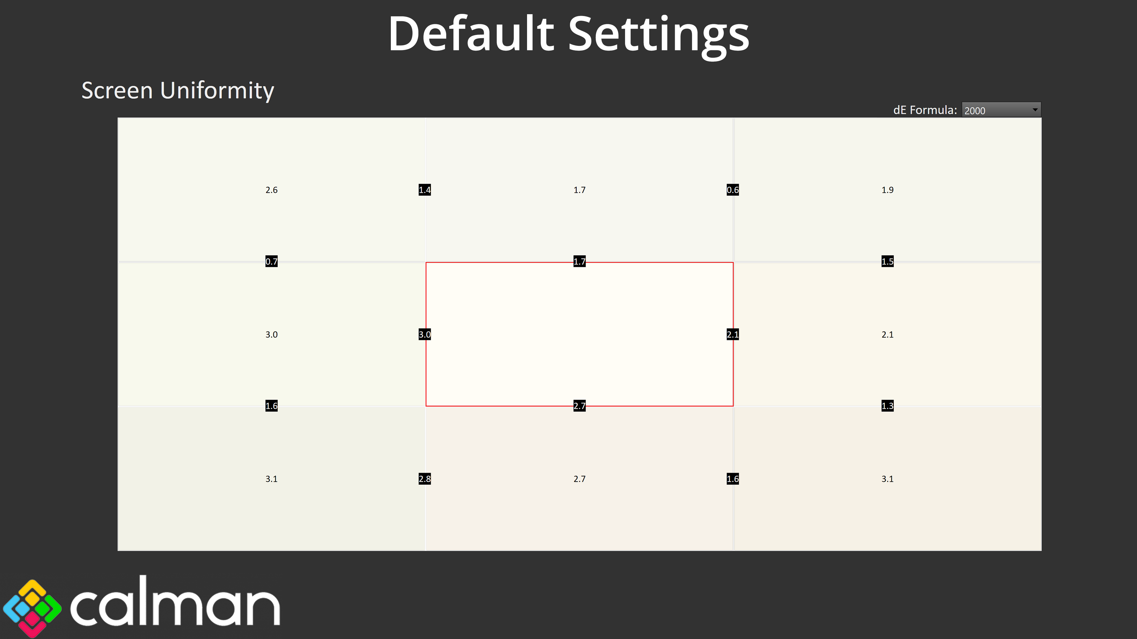
Uniformity also leaves a little to be desired. Deviation is never too significant, with the worst error being a deltaE 2000 of 3.1, but there are a few sections that come close to that level of aberration, when we'd hope for more from a pro-grade screen.
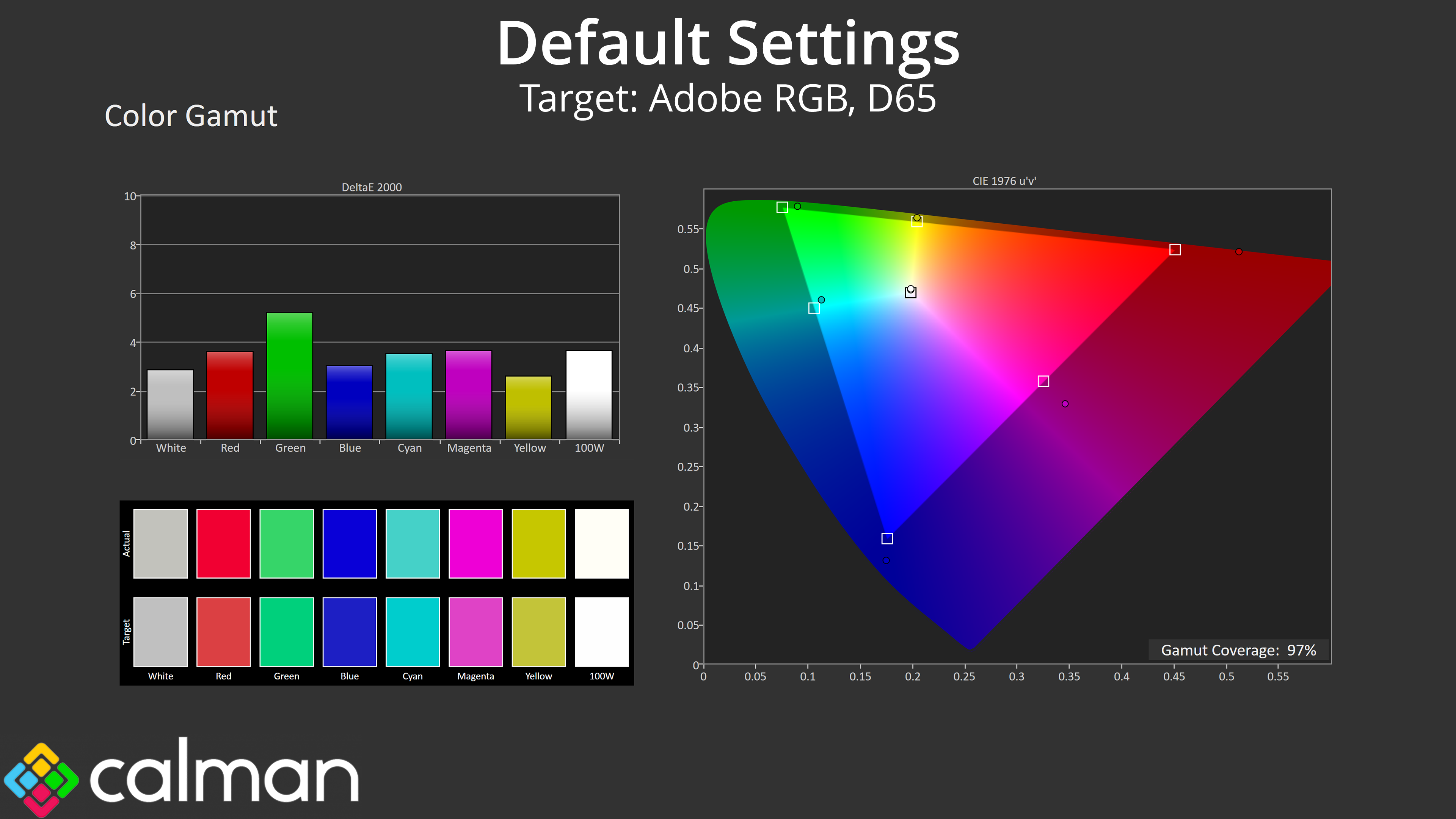
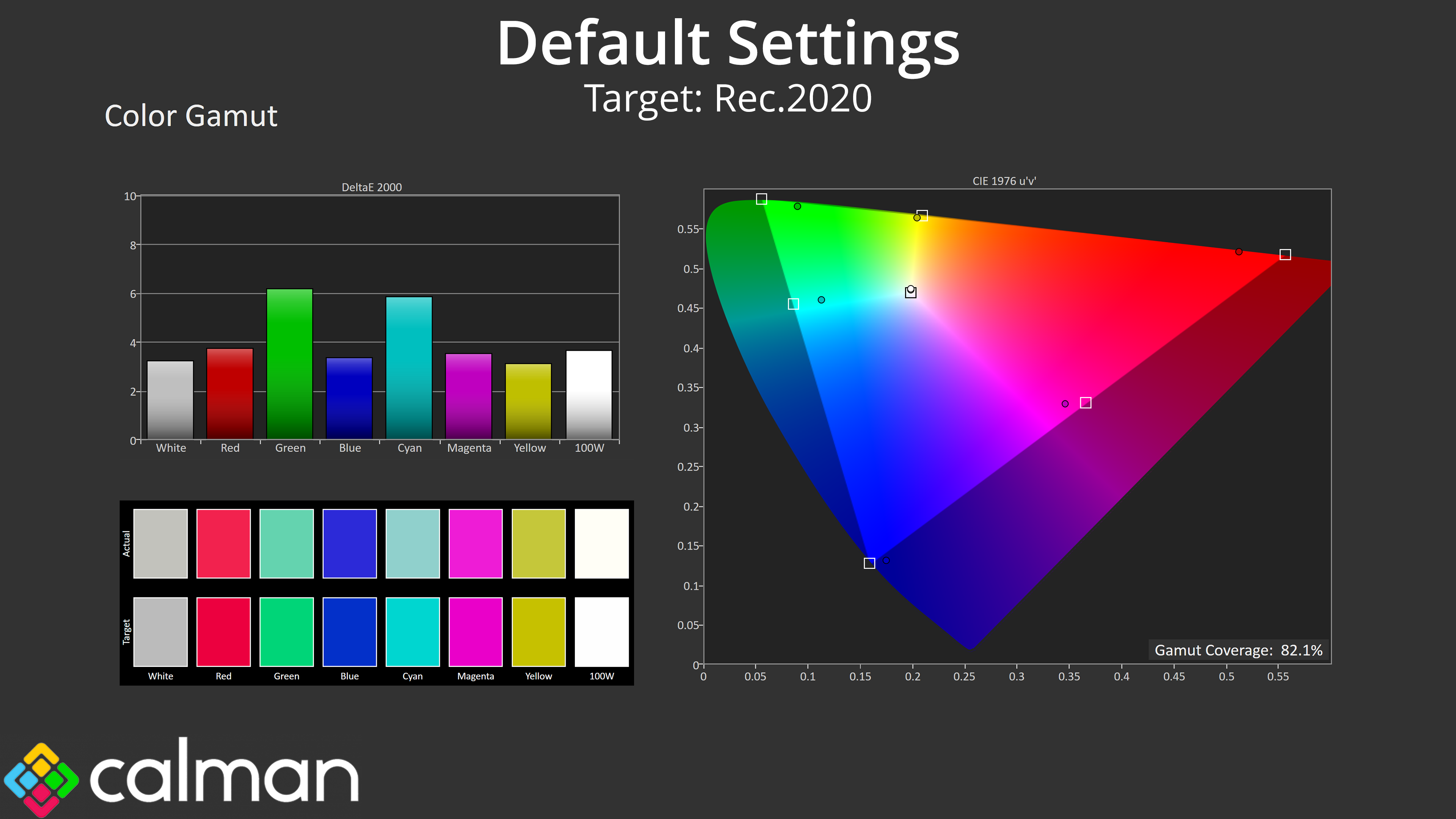
Gamut (CIE 1976)
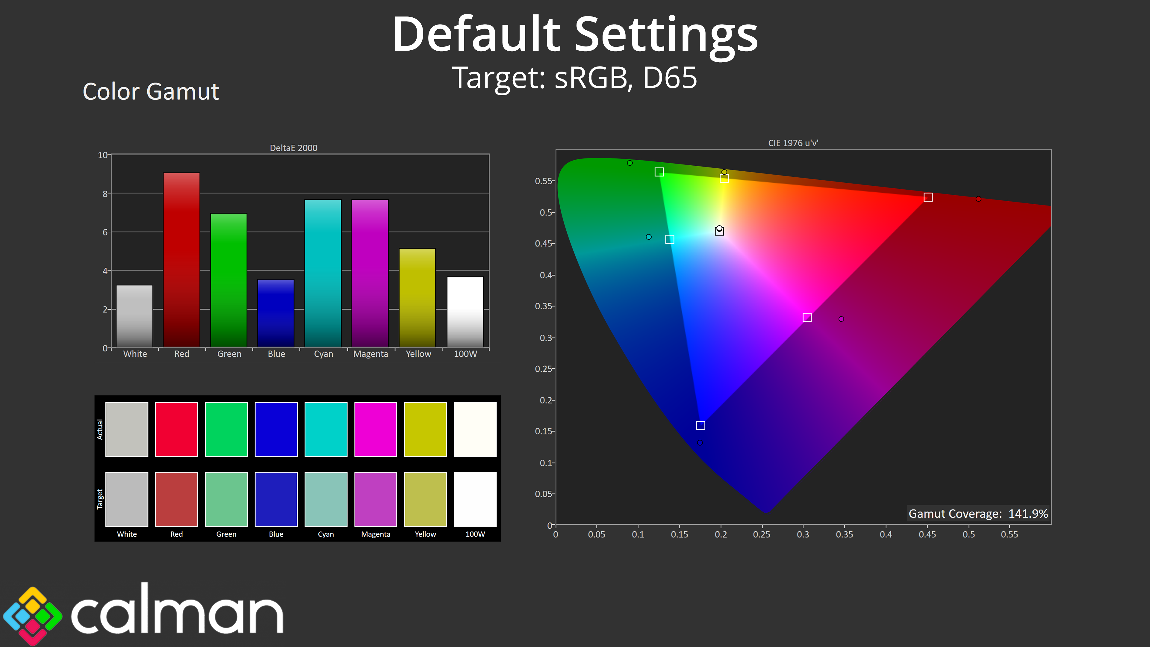
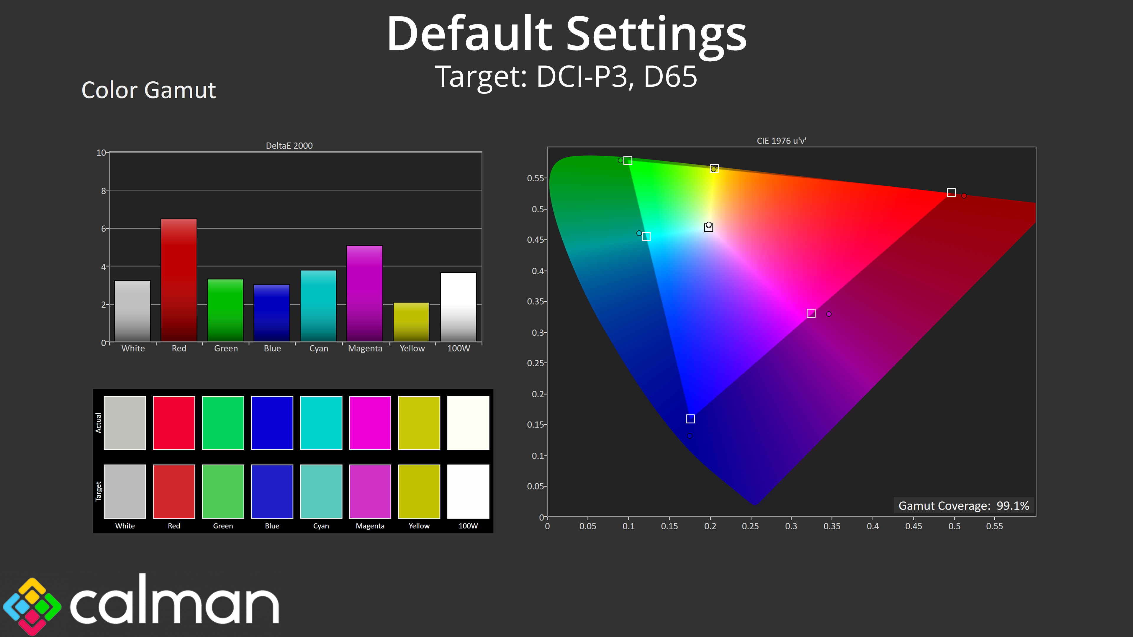
| Colour space | Coverage (%) |
| sRGB | 141.9 |
| DCI-P3 | 99.1 |
| Adobe RGB | 97 |
| Rec.2020 | 82.1 |
Gamut is very wide, however, far exceeding the sRGB space and delivering on iiyama's claim of 99% DCI-P3 coverage – we measured 99.1%. We also saw 97% Adobe RGB and 82.1% Rec.2020. These are very impressive figures and go to show what IPS Black 2.0 can do in regards to gamut.
Greyscale
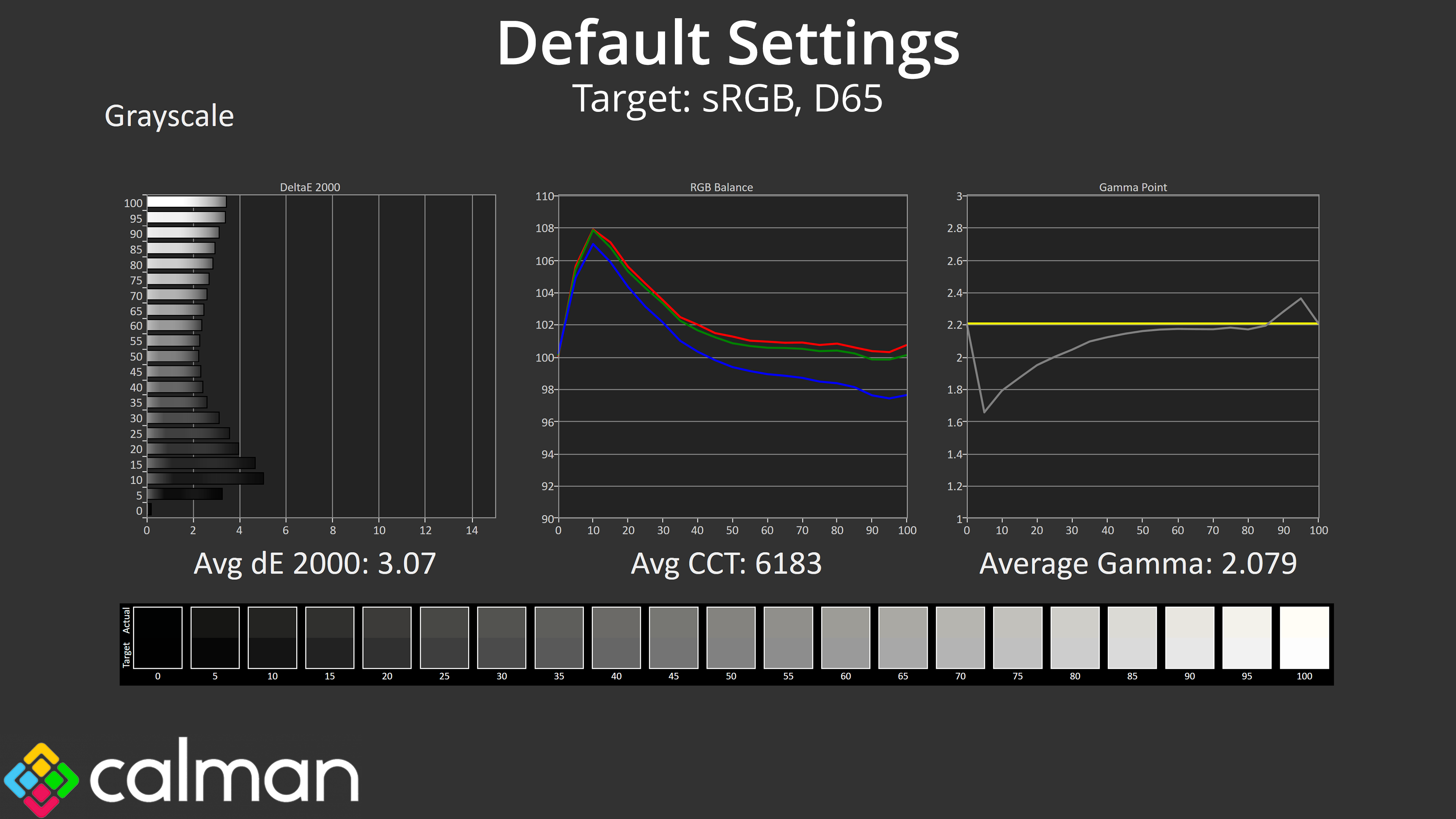
Factory greyscale performance does leave a bit to be desired, to put it mildly. Colour balance isn't terrible – there is a slight imbalance, resulting in an average CCT of 6183K, but that's only a 5% deviation from the 6500K target and can be easily remedied via a manual colour balance.
Gamma is a much bigger issue though, as it is far too low across the darker and mid-to-dark shades of grey, resulting in a washed out appearance for those shades.
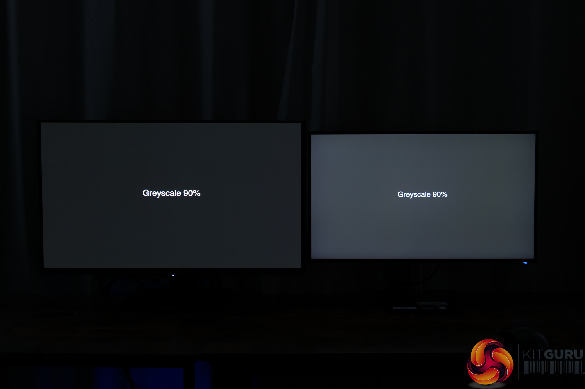
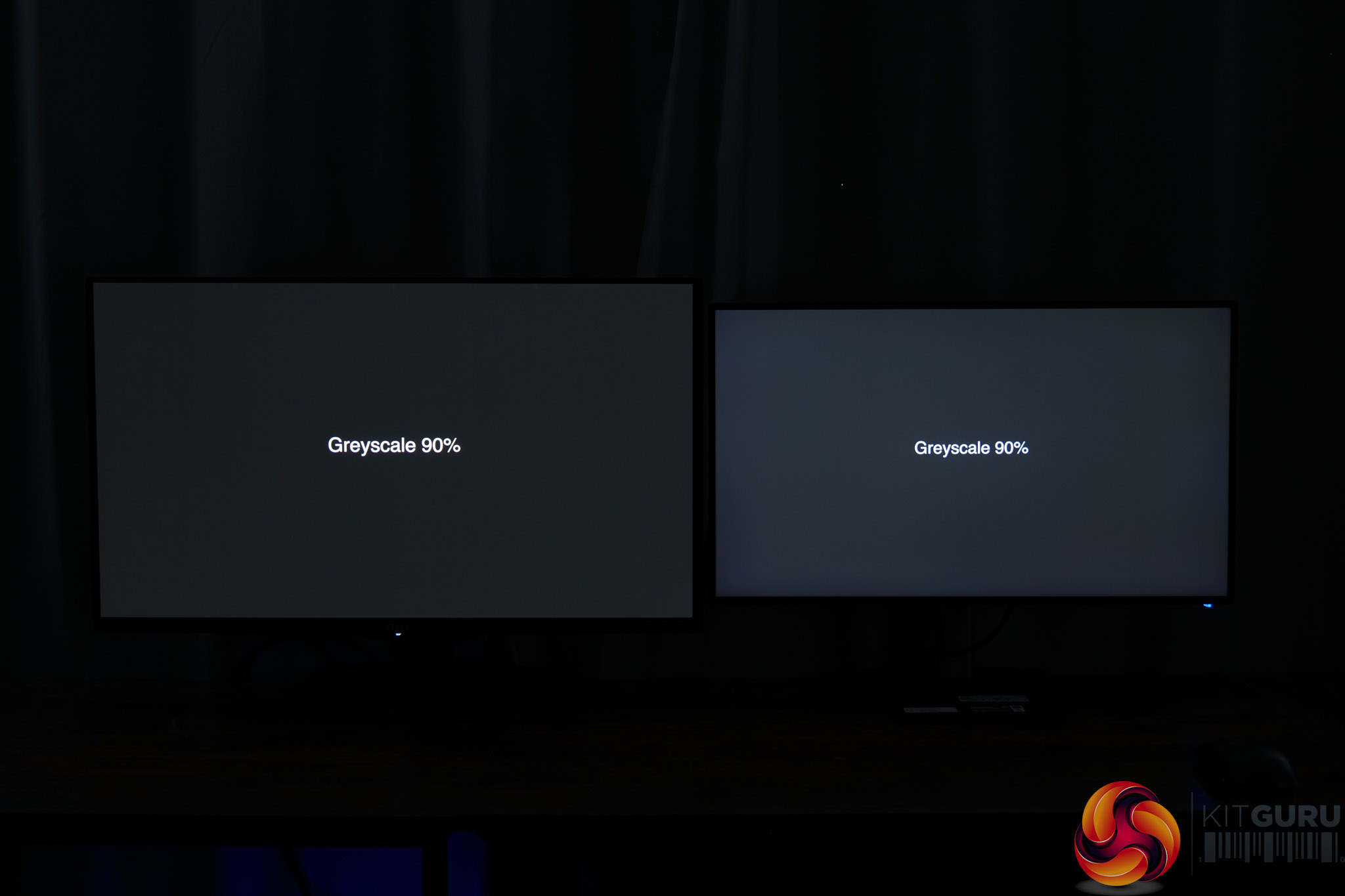
To illustrate this, I took two photos with the HB2701UHSNP side-by-side with a quality QD-OLED monitor. Out of the box, the iiyama monitor looks significantly brighter than it should when showing a 90% greyscale. Once we calibrated the HB2701UHSNP (and more on that below), the difference becomes much less apparent and the image is much darker.
Saturation
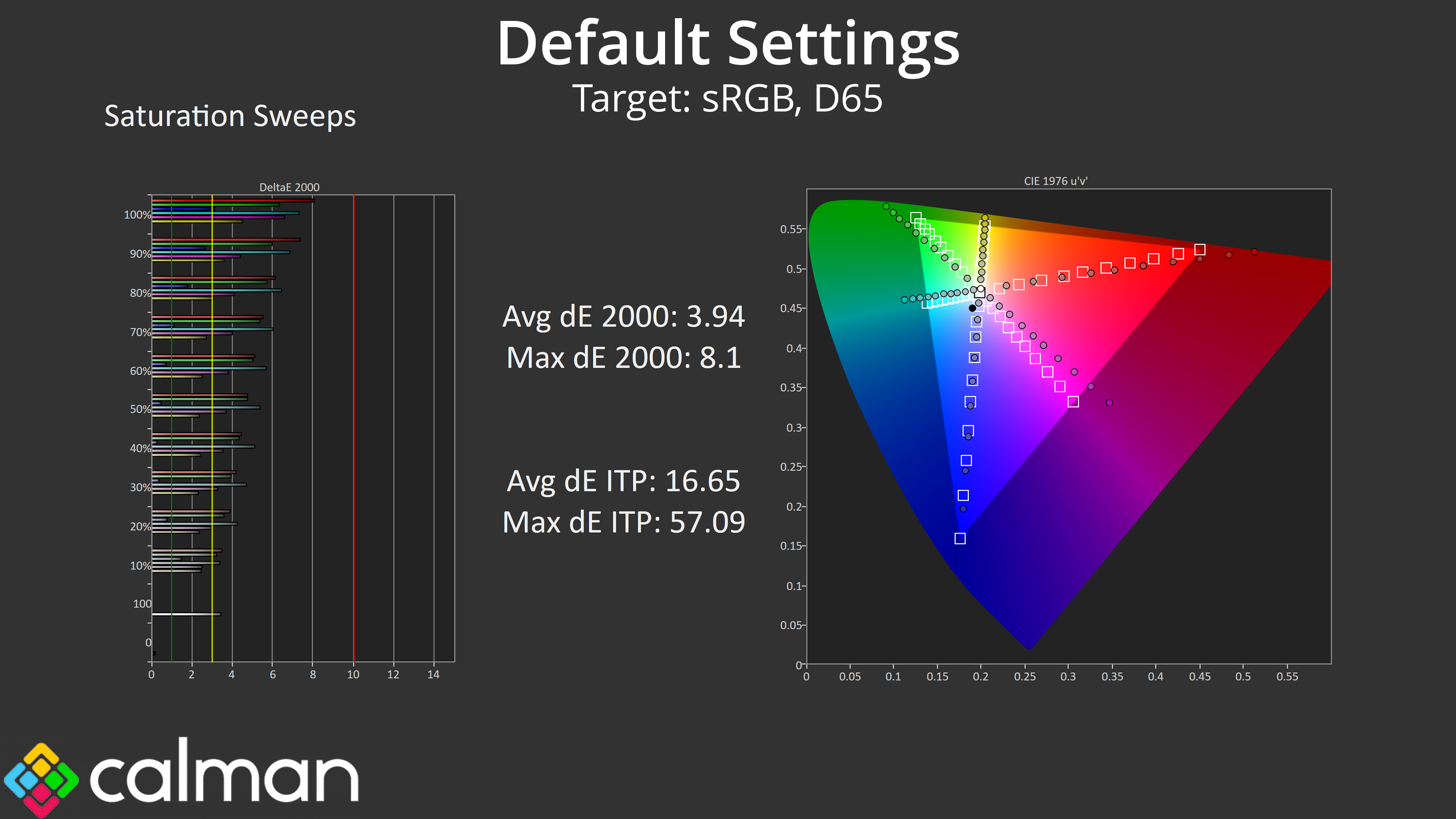
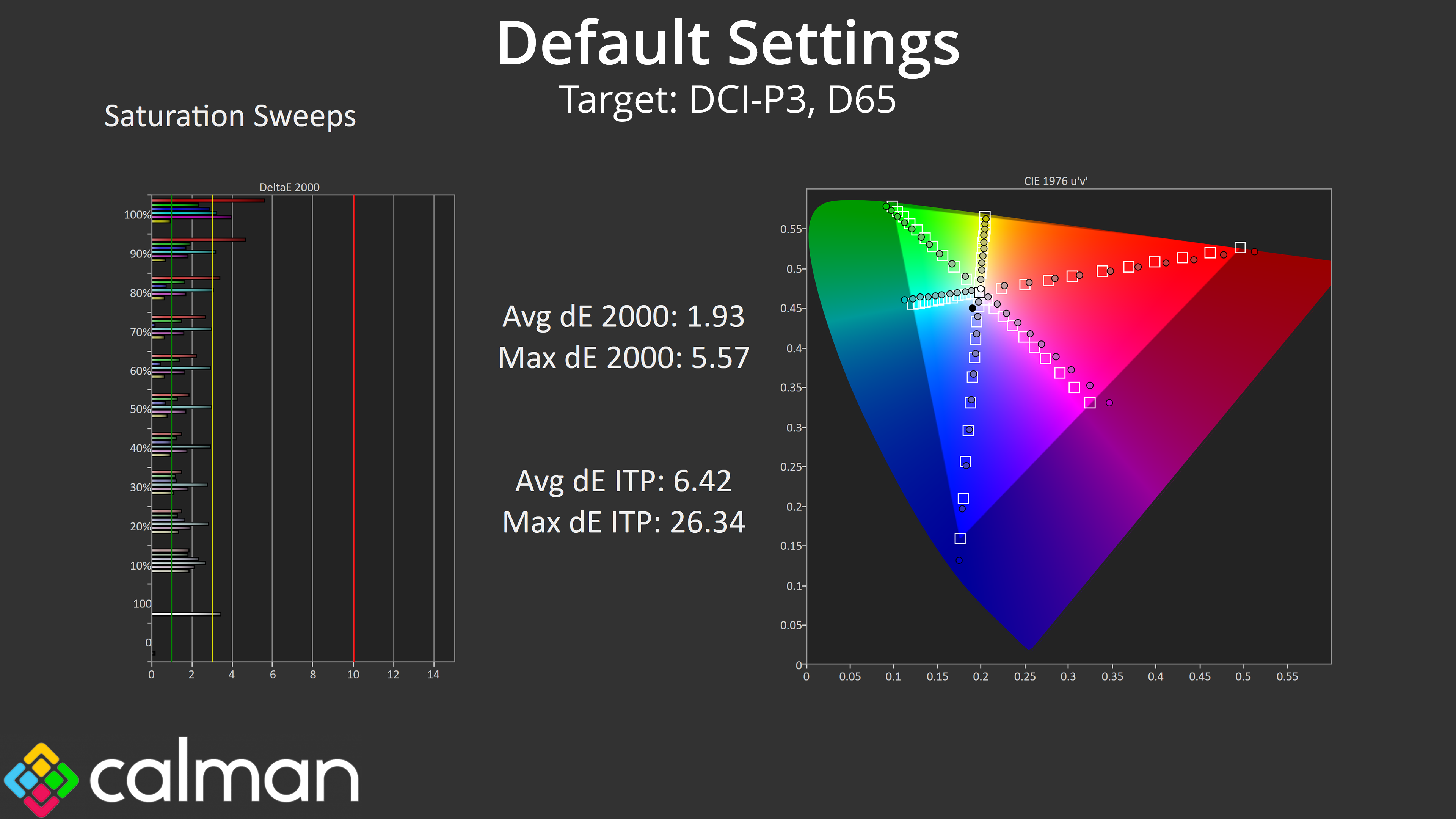
Saturation sweeps indicate performance that's about as expected – the very wide gamut means a lot of oversaturation relative to sRGB, though this improves significantly when compared against the DCI-P3 space.
Colour Accuracy
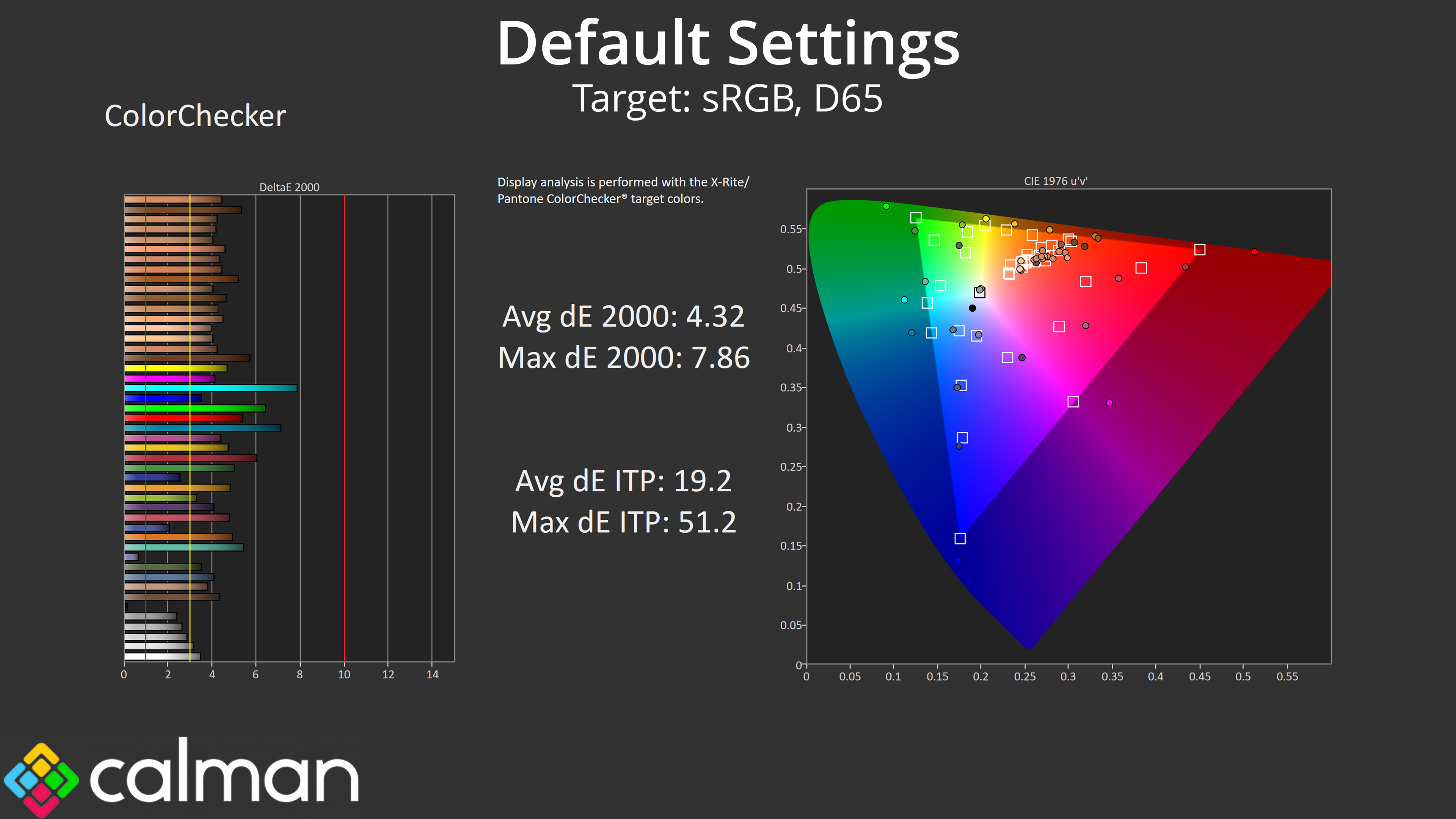

The same goes for colour accuracy, with an average dE2000 of 4.32 relative to the sRGB space, though this improves to an average deltaE of 2.02 when looking at the DCI-P3 results.
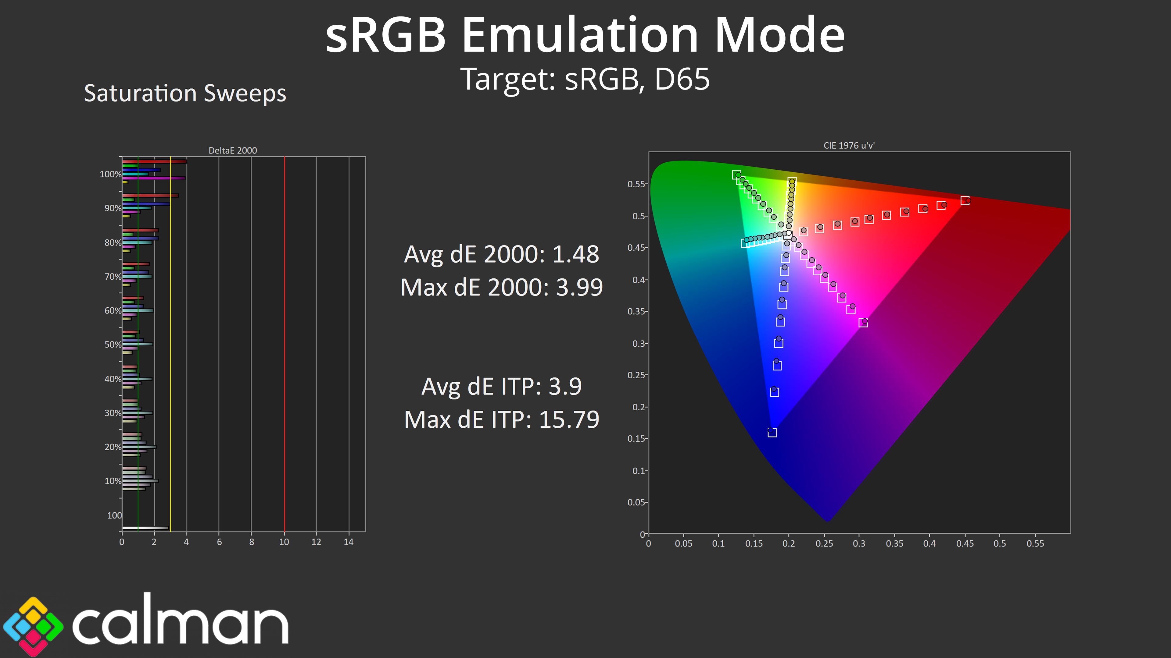
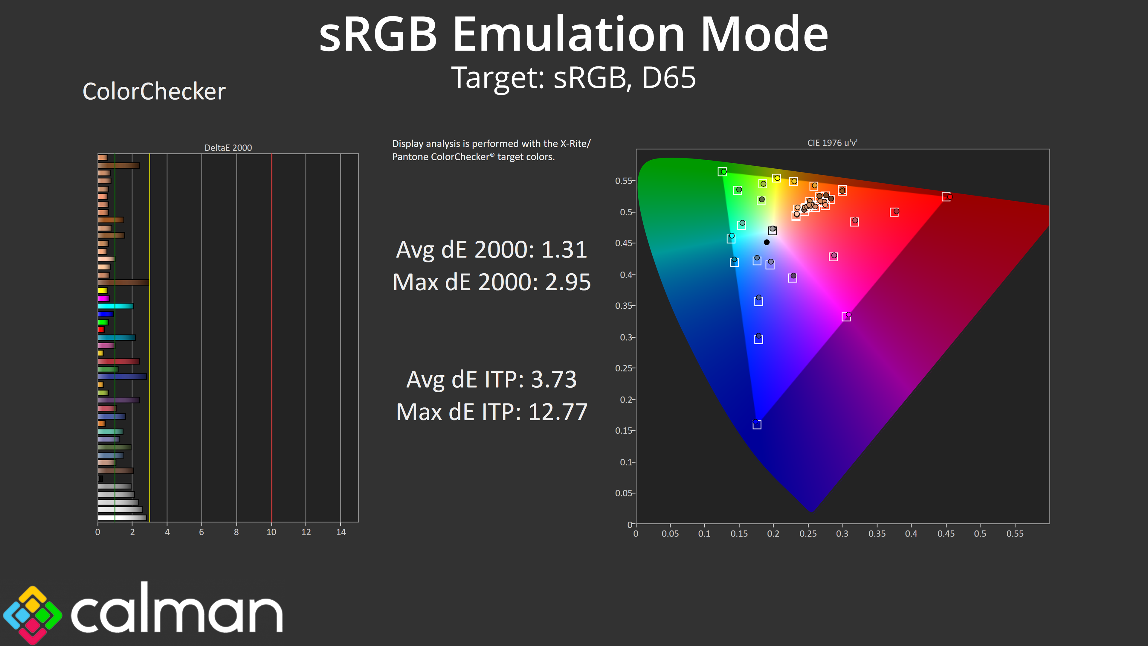
sRGB Emulation Mode
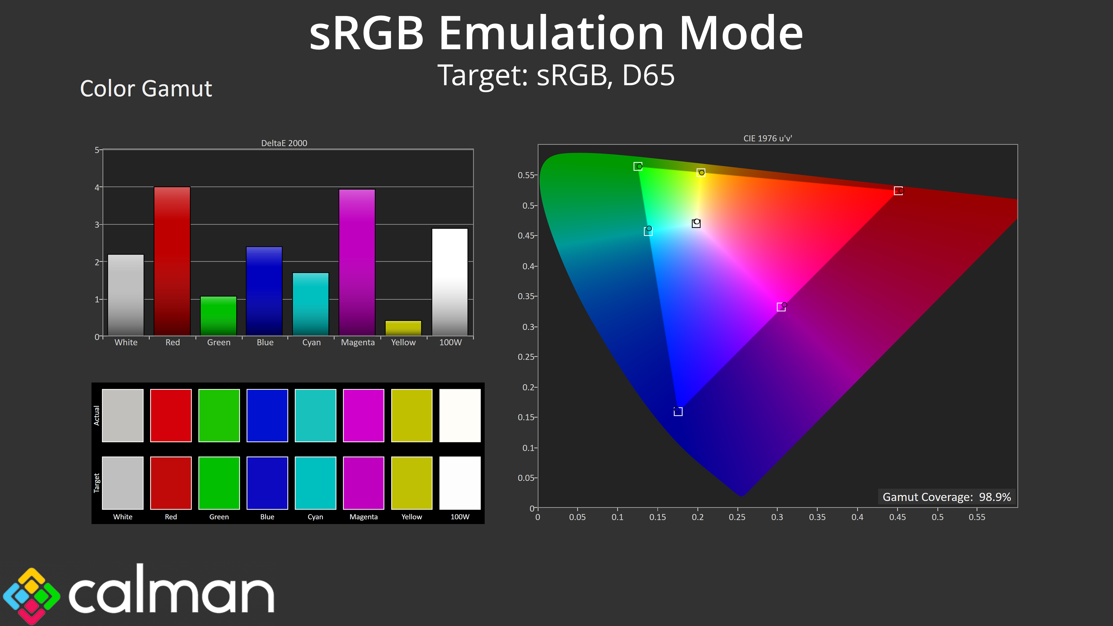
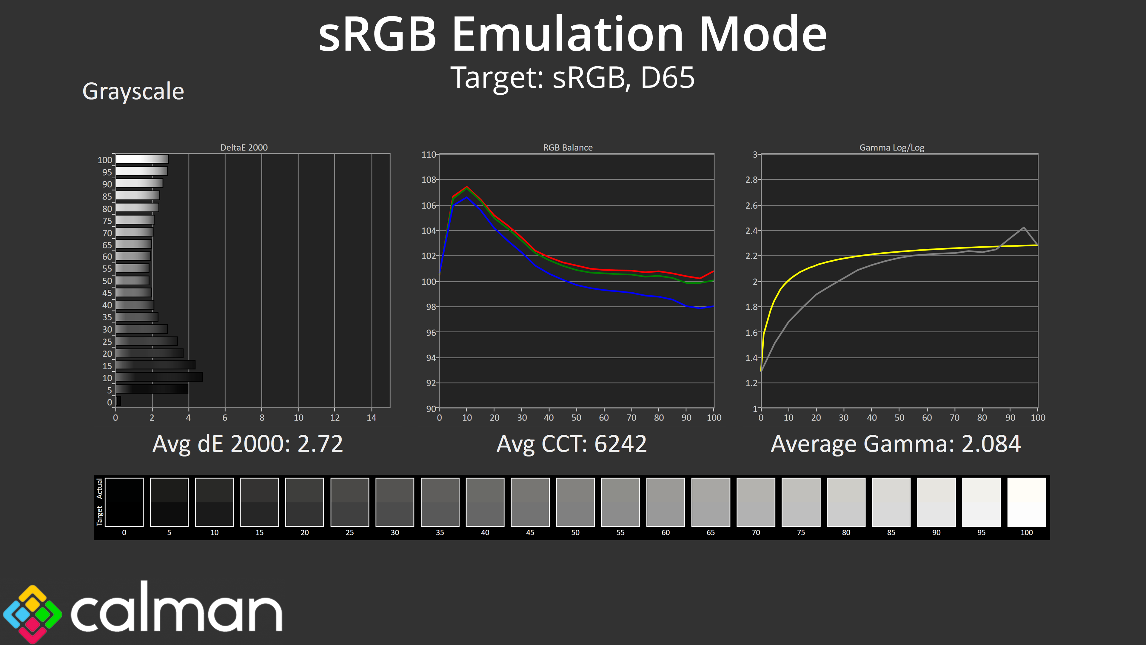
iiyama includes a range of colour space modes which we will assess here, starting with the sRGB mode. This does a good job at clamping the gamut to prevent oversaturation, and colour balance is slightly improved over the factory default. However, gamma is still too low across the first half of the curve, and it averages just 2.084.
Still, an effective gamut clamp means saturation accuracy is much improved, with an average dE 2000 of 1.48, while colour accuracy also improves to 1.31 average. These are very good results, if not absolutely top tier.
Display P3 Emulation Mode
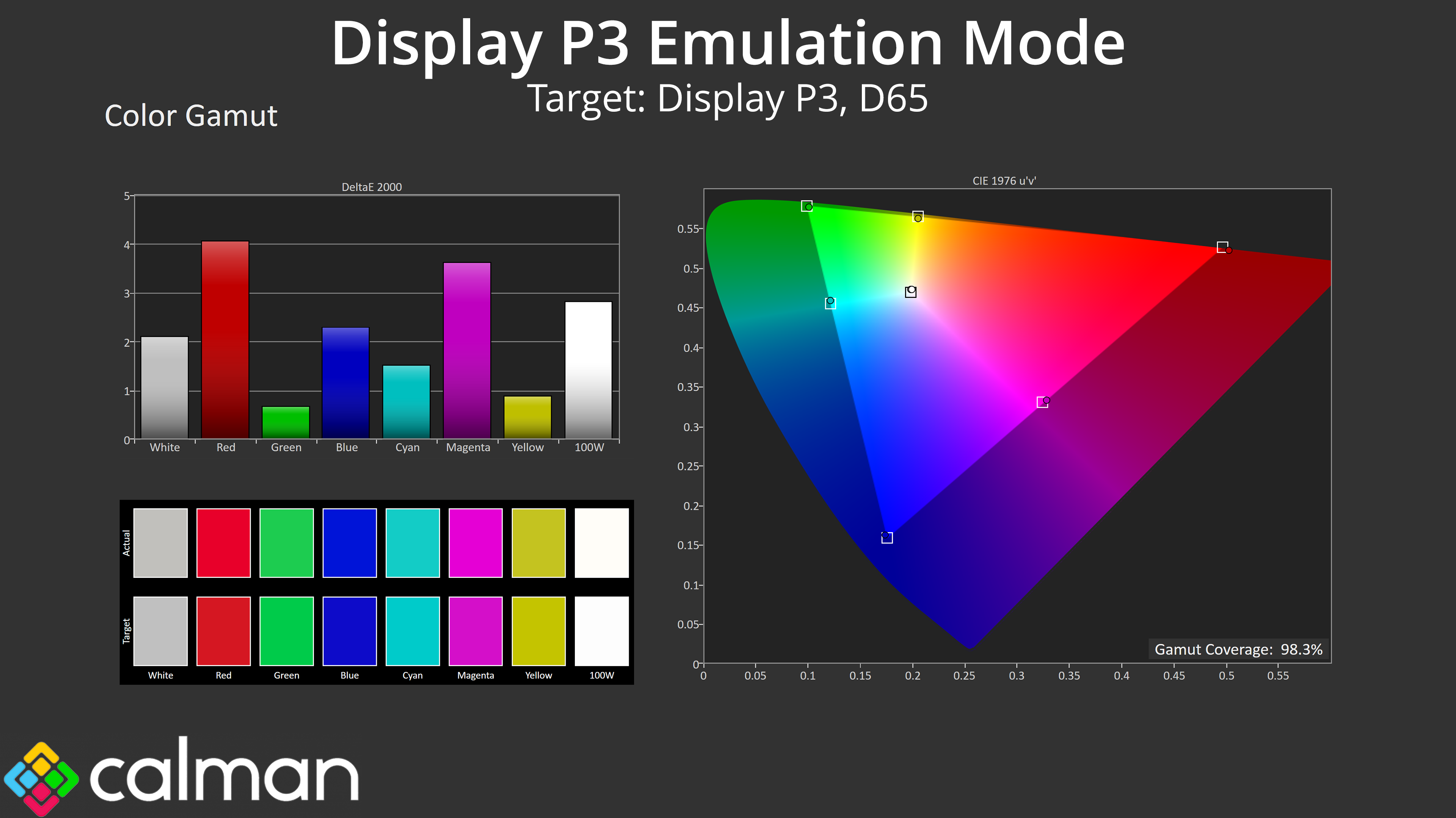
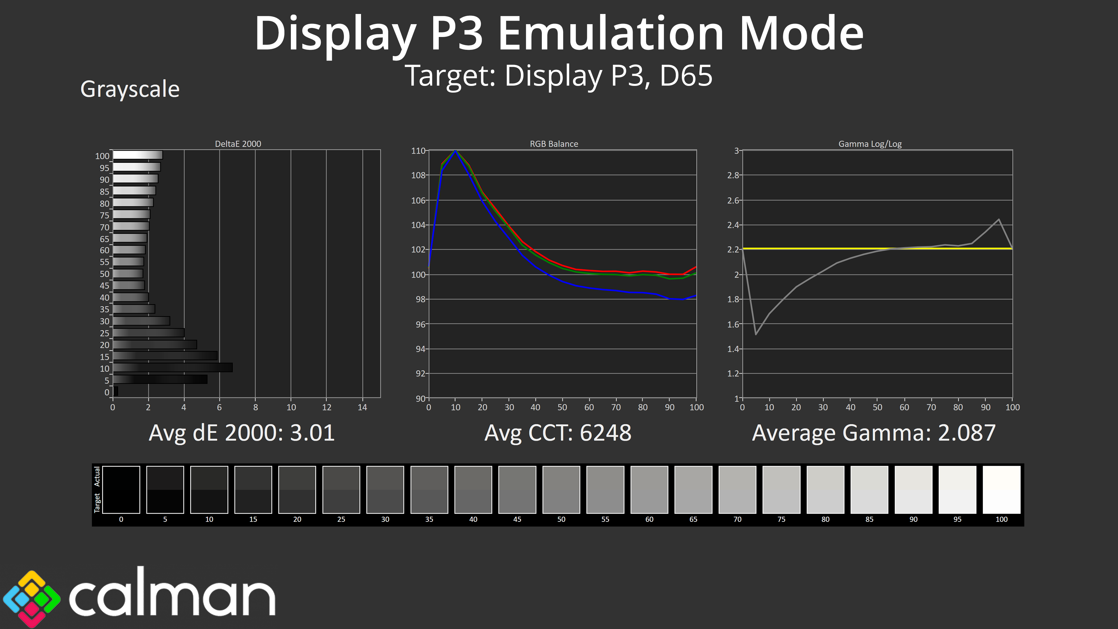
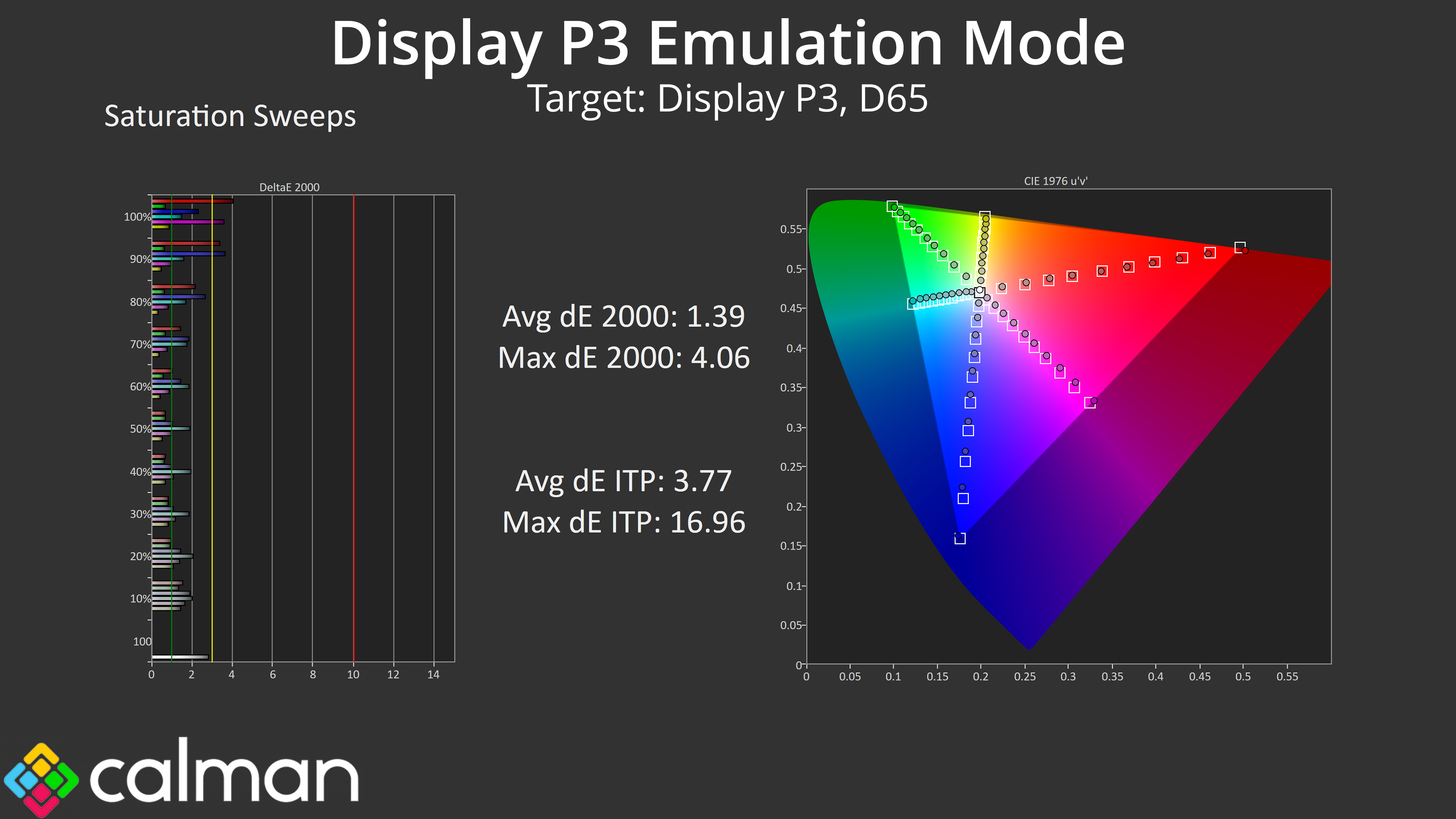

Next we tried the Display P3 mode and found more of the same. The gamut looks good, colour balance is just under 6300K, but gamma is just too low to meaningfully improve the greyscale accuracy. We still see much improved saturation and colour accuracy results, but the gamma is the real issue here.
Adobe RGB Emulation Mode
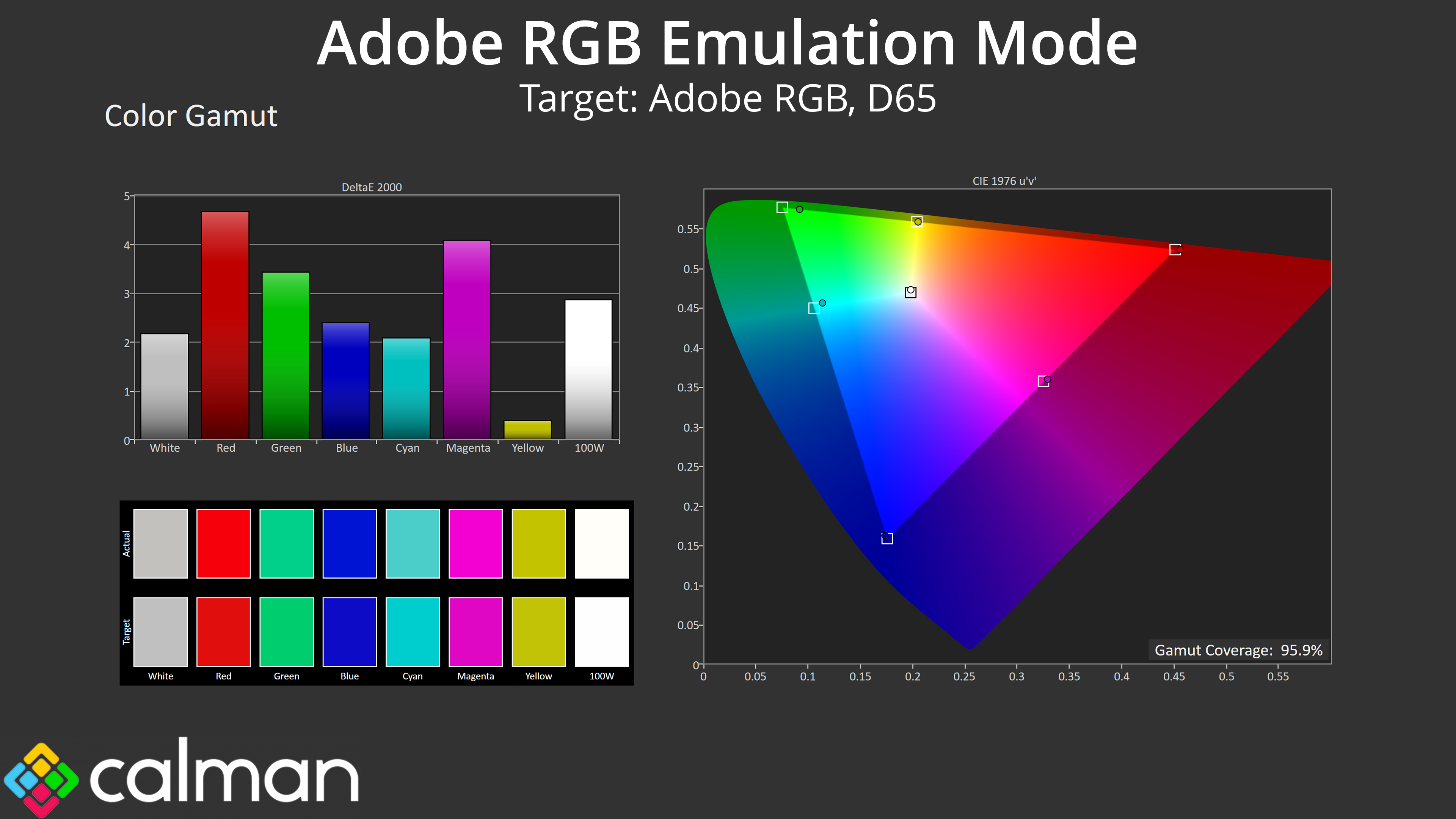
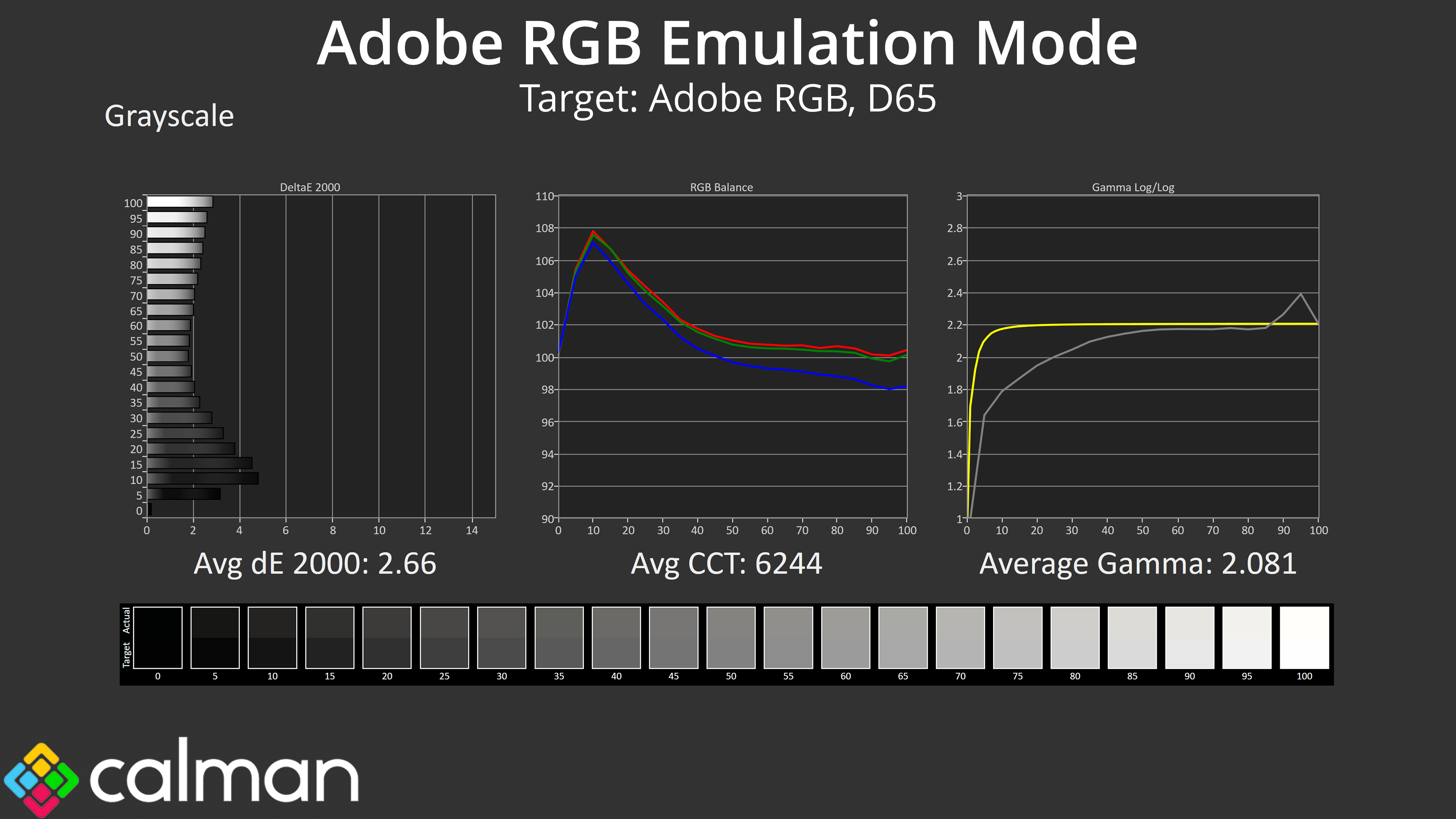
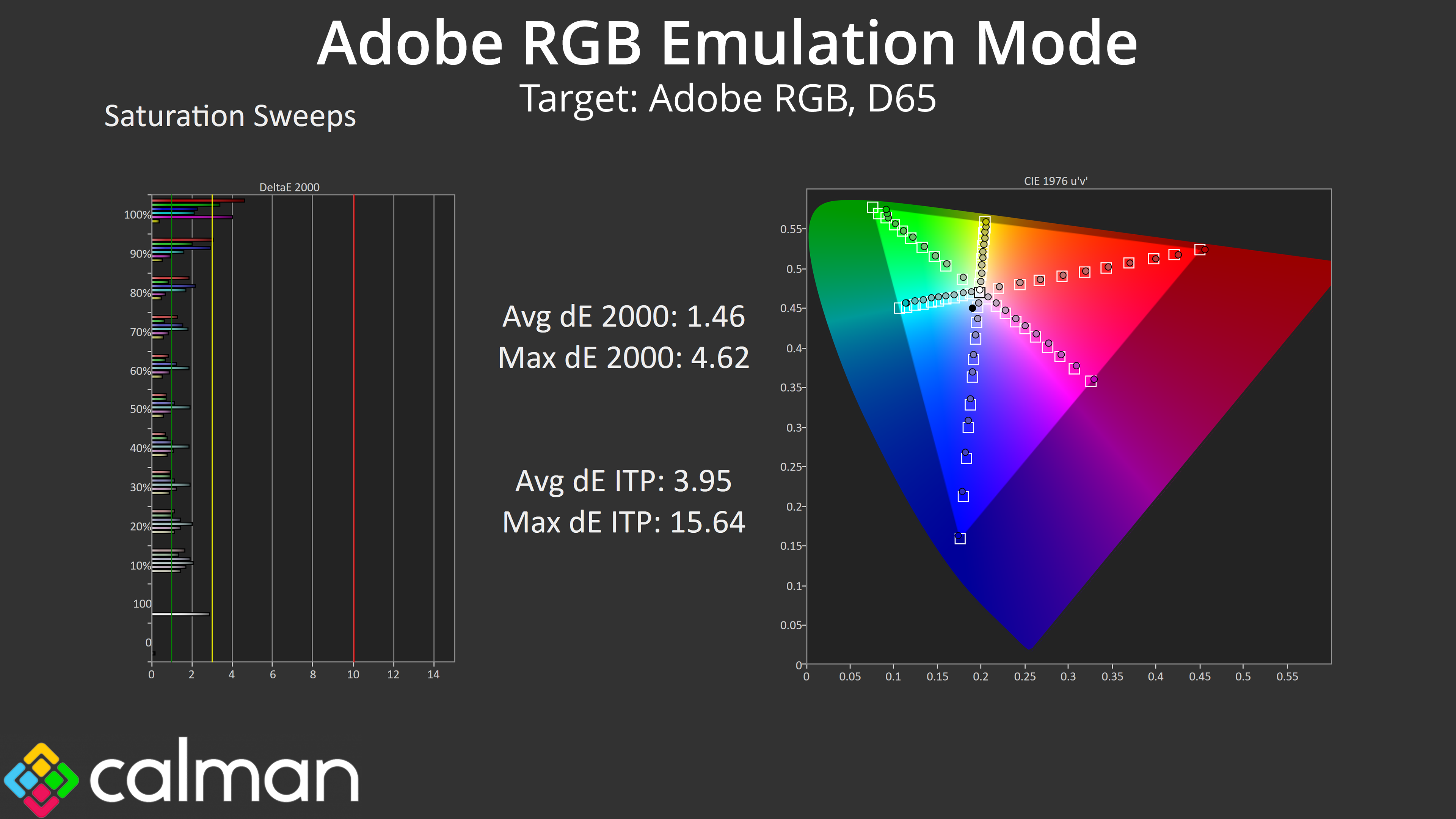

Lastly, the same can be said for the Adobe RGB emulation mode. All three colour space modes we tested are worth using over factory settings if you want to work with one of these colour spaces, as gamut tracking is much improved. However, gamma is too low across the board and that hurts overall accuracy of the screen.
Calibrated Results
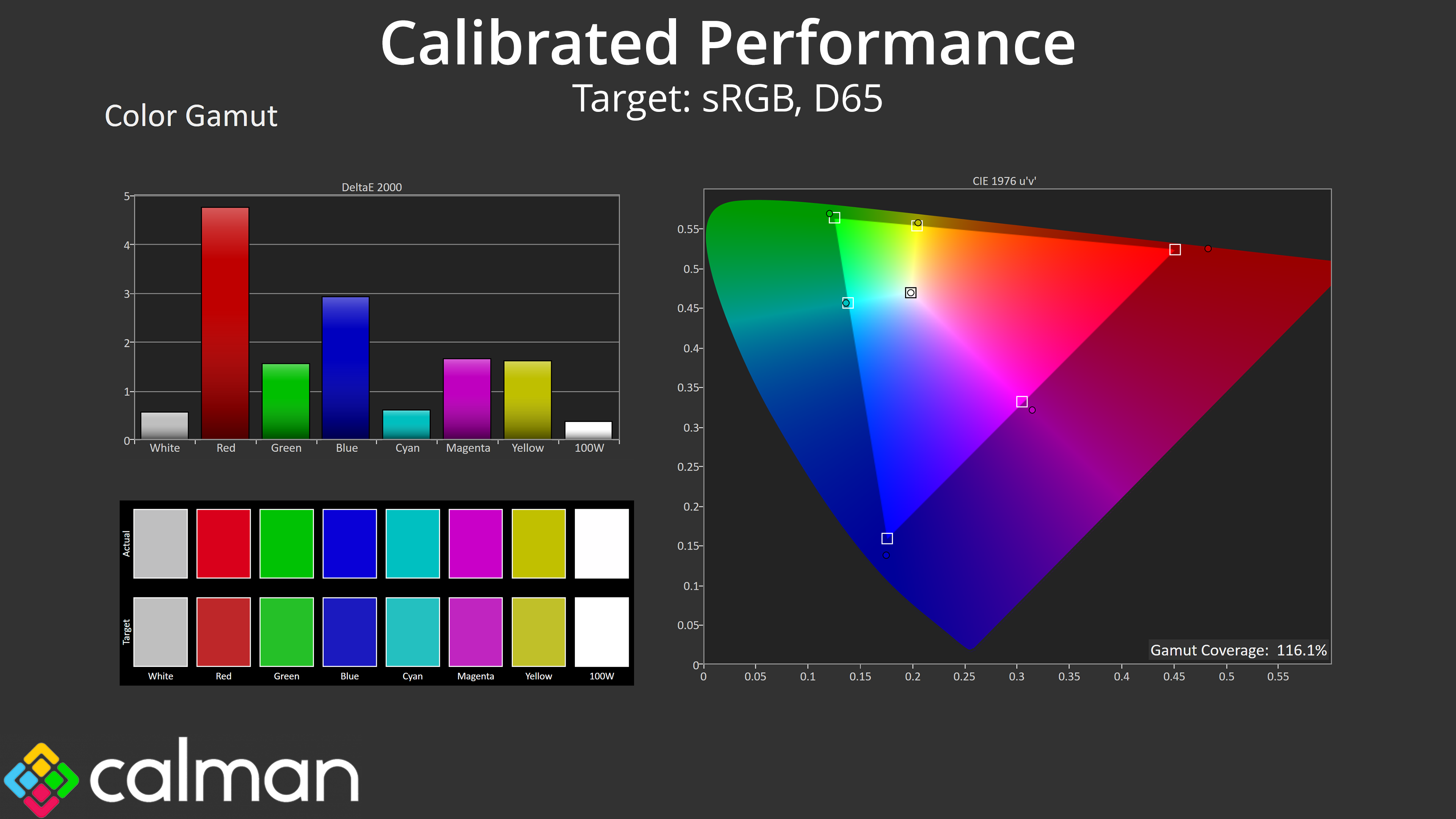
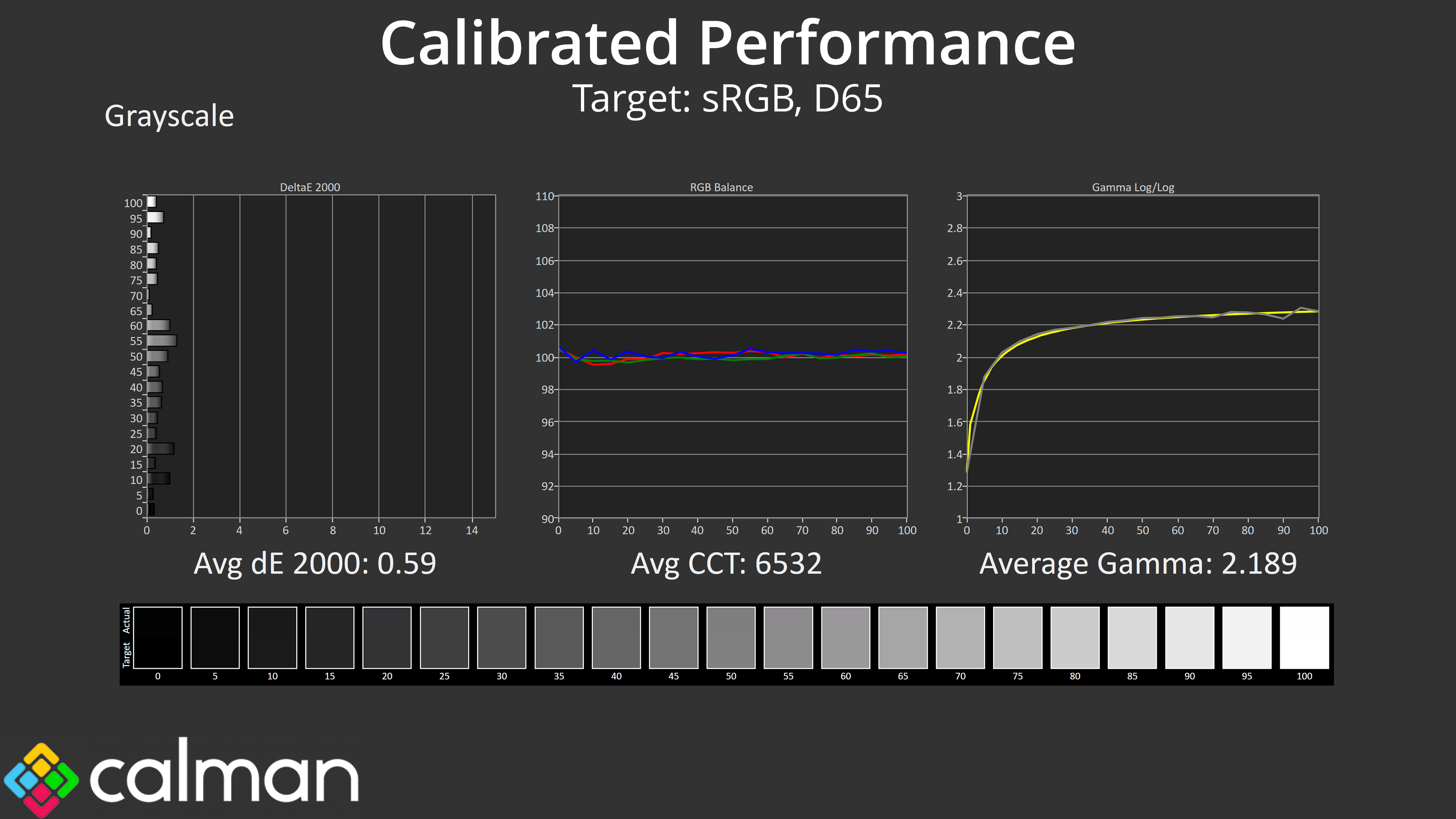


To try and fix that, we did a full calibration using Calman Ultimate. The good news is that it worked – sort of. Greyscale behaviour is basically flawless when calibrated, as you can see the perfectly flat colour balance chart, while gamma tracking is almost perfect, so that's a definite win.
The strange thing is that, for a still unknown reason, the gamut wasn't clamped by my calibration and when using the resulting ICC profile. Usually it locks in perfectly to the sRGB space (which we are targeting here), but not so for the HB2701UHSNP, and I'm not sure if that's because of the monitor or my calibration tools. It's a strange one, so if you have any insight, please do get in touch!
